WCP Widget Server Developer Guide
A practical guide to building widget servers that integrate with Widget Context Protocol hosts. All examples use Python and Flask — the same technology stack as the reference widget implementations.
The guide is written for developers who have not yet read the WCP specification. As you work through each section you will naturally absorb the specification concepts that underpin it. Think of it as wading into a lake — you start at the edge with your feet in the water, and as your confidence grows you wade deeper, until you are swimming comfortably in the full protocol. By the end of the guide you will be ready to read the specification as a reference document rather than an introduction.
How to use this guide
Every section ends with a ↗ Spec ref link pointing to the corresponding section of the WCP specification. Follow those links as you go — the spec is precise, this guide is practical. Together they give you the complete picture.
The examples progress from a 20-line server that does almost nothing, to a full four-component widget with runtime state management, podium integration, and Docker packaging. You can stop at any depth that suits your project.
The WCP vocabulary
Before writing any code, it helps to understand where WCP's terminology comes from and why it uses the words it does. The vocabulary is deliberately implementation-agnostic — it does not name any specific UI control, any particular framework, or any platform convention. This is by design: WCP hosts can be built in Electron, .NET MAUI, a plain browser, or anything else. The terminology must transcend all of them.
Roots in IT: instrumentation and orchestration
Two concepts from the broader information technology landscape inform the WCP model. The first is instrumentation — the practice of presenting live, changing data through visual displays. Server monitoring dashboards, IoT sensor panels, financial trading screens, and telemetry consoles are all instrumentation: each individual display is an instrument, and together they give an operator a comprehensive, real-time view of a system. A WCP widget is, at heart, an instrument — a self-contained visual unit that presents data, accepts interaction, and operates independently of its neighbours.
The second concept is orchestration — the deliberate arrangement and coordination of multiple components into a coherent whole. In IT, orchestration describes how containers, services, or workflows are assembled and managed together. In WCP, an orchestration is a named, saveable arrangement of instruments across the host's surfaces: which widgets are present, where they are placed, how they are sized, and what configuration they carry. Switching orchestrations changes the entire composition. Exporting one shares it with others.
The musical metaphor
With instruments and orchestrations already in our vocabulary, we are naturally drawn toward the musical realm — and it turns out to be a remarkably productive source of abstractions. A symphony orchestra brings together diverse instruments, each with its own character and capability, coordinated by a score into a unified performance. That score is the orchestration. The instruments are the players. And the surface on which the music is written — the horizontal lines of sheet music — are called staves.
WCP adopts this metaphor fully. A stave is the grid surface on which
instruments are placed. It is defined as a 12-column fluid-width grid,
where each column is approximately 8.3% of the available width, and each row is
100px tall. When you see a widget's defaultSize expressed
as {"w": 4, "h": 3}, that means four columns wide (one-third of the stave)
and three rows tall (300px). The word "stave" was chosen precisely because it does not
imply any specific UI control — not a tab, not a panel, not a page, not a window. Any
surface that presents the 12-column grid is a stave, regardless of how the host
implements it.
↗ Spec: Layout Grid
defaultSize in columns and rows, and the host handles the rest. Whether
the host renders your widget inside a tab, a floating window, a scrollable panel, or
a full-screen kiosk — from your server's perspective, it is always a stave.
The host layout model
Continuing the sheet-music analogy, a WCP host has three spatial zones — mirroring the structure of a musical score page:
- Podium — the strip above the staves, always visible. In an
orchestra, the conductor's podium is the elevated platform at the front from which the
entire performance is directed — where control happens, where tempo and dynamics are
set. In a WCP host, the podium holds compact controls and scrolling tickers: a
play/stop button, a live status LED, a "now playing" marquee. Podium components are
narrow, fixed-height, and designed for glanceable information and direct interaction.
The current WCP specification and host implementations refer to this zone as the masthead. In the manifest, podium components use the roles"control"and"ticker", and declare"mastheadCapable": true. - Staves — the main area. One or more stave grids where instruments are placed, sized, and arranged. This is where the music is written — where the rich, interactive content lives. A host may present multiple staves as tabs, as vertically stacked panels, or as any other layout mechanism. The widget does not need to know which.
- Coda Planned — the strip below the staves, reserved for a future WCP version. In music, the coda (Italian for "tail") is the concluding passage that follows the main body of a composition — it provides closure, summary, or final commentary. A WCP coda will serve a similar purpose: persistent status, navigation, or summary components that anchor the bottom of the layout, complementing the main instrument area from below.
This three-zone model — podium, staves, coda — is the complete
spatial vocabulary of a WCP host. Every widget component you build will appear in one of
these zones. The component's role field declares where it belongs:
"widget" for a stave instrument, "control" or
"ticker" for the podium. Coda roles will be defined in a future
specification version.
Orchestration in practice
An orchestration is a named snapshot of the entire host state: which instruments are on which staves, in what positions and sizes, with what configuration; which controls and tickers are on the podium; and what metadata (name, icon, display name) identifies the arrangement. A user might create one orchestration for monitoring their infrastructure (Cloudflare widgets, GitHub repos), another for media (radio player, weather ticker), and a third that serves as a standalone radio application launched from a kiosk. Each orchestration is independent — switching between them replaces the entire composition.
As a widget developer, orchestrations affect you through the
Wcp-Orchestration-Id header. Every request your server receives carries the
orchestration's UUID, telling you which composition is currently active. You use this to
scope runtime state so that two orchestrations containing the same widget don't
contaminate each other — the same principle as two different performances of the same
symphony, each with its own conductor and its own interpretation.
The Container Model
The second layer of vocabulary you need before writing a line of code is containerisation. WCP widget servers are distributed as containers. Every example in this guide that involves running, packaging, or publishing a server will use containers. You do not need prior experience — this section gives you everything you need to understand what is happening and why.
The shipping-container analogy
Before the 1950s, cargo was loaded onto ships piece by piece — every port handled goods differently, loading times were unpredictable, and damage in transit was common. The invention of the standardised intermodal shipping container changed everything. A sealed metal box of standard dimensions could be stacked on a ship, transferred to a train, and placed on a lorry without anyone needing to know or care what was inside. The same box, the same interface, everywhere in the world.
Software containers work on the same principle. A software container packages an application together with everything it needs to run — the runtime, the libraries, the configuration — into a single, sealed unit. That unit behaves identically whether it runs on your laptop, on a colleague's machine, on a server in your office, or on a virtual machine in a data centre on another continent. The same container, the same behaviour, everywhere.
Images and containers
There are two distinct concepts that are easy to conflate at first:
- Image — the blueprint. An image is an immutable, read-only snapshot of your application and all its dependencies, captured at a specific point in time. Think of it like a recipe, or a master recording. You can copy an image, share it, publish it, and store it indefinitely. Nothing runs yet — it is just a description of something that could run.
- Container — the running instance. When you tell Docker to start a container from an image, Docker creates an isolated process on your machine using that image as its starting point. The container has its own filesystem, its own network interface, and its own process space. It is like pressing play on the master recording: the music is the same every time, but each performance is a live, running thing. You can start multiple containers from the same image simultaneously — each independent of the others.
The workflow you will follow in this guide is: write your server code → write a
Dockerfile (a short text file that describes how to build the image) →
run docker build to produce the image → run docker run to
start a container from that image. Once it is running, your widget server is accessible
at http://localhost:PORT — indistinguishable, from the outside, from a
plain Python process. The container is just the envelope it lives in.
Docker Desktop and the CLI
Docker is the dominant toolchain for building and running containers on a single machine. Docker Desktop is the application you install on your Mac or Windows computer. It includes:
- The Docker Engine — the runtime that actually creates and manages containers
- The Docker CLI — the
dockercommand available in your terminal - A graphical interface for viewing running containers, inspecting images, and managing resources
- Docker Compose — a tool for defining and starting multi-container applications from a single configuration file
Once Docker Desktop is installed and running, the docker command is
available in any terminal session — macOS Terminal, iTerm2, Windows PowerShell, WSL,
or any other shell. You do not need to interact with the graphical interface unless you
want to; everything in this guide uses the command line.
↓ Download Docker Desktop — docker.com/products/docker-desktop
Docker Desktop is free for personal use, open-source projects, and small businesses. Installation is straightforward: download, install, launch, and you are ready. No configuration is needed for the examples in this guide.
Docker Hub — the public image registry
A registry is a centralised store where container images are
published and retrieved. Docker Hub is the largest public registry —
think of it as GitHub, but for container images rather than source code. When you run
docker pull docker.io/penrithbeacon/wcp-widget-radio, Docker contacts Docker Hub,
finds the image published under the penrithbeacon account, downloads it
to your machine, and makes it available for docker run.
To publish your own widget so others can pull it, you need a Docker Hub account. The free tier is sufficient — it allows unlimited public image repositories. Paid plans add private repositories and team features, but nothing in this guide requires them.
↗ Create a free Docker Hub account — hub.docker.com/signup
Your Docker Hub username becomes your image namespace. An image published as
yourusername/wcp-widget-mywidget is pullable by anyone in the world with
the command docker pull yourusername/wcp-widget-mywidget. The image name
convention used in this guide is yourusername/wcp-widget-WIDGETNAME —
the wcp-widget- prefix makes widgets easily discoverable and clearly
scoped.
Where containers can run
One of the most powerful properties of containers is that they run identically in different environments. Your widget server can be deployed in any of these contexts without changing a single line of code:
- Local machine — the most common context during development.
The container runs on your own computer and is accessible at
http://localhost:PORT. Only you can reach it (unless you configure otherwise). This is how all the examples in this guide start. - Local network — if you expose the container's port on your
machine's network interface, other devices on the same network (Wi-Fi, office LAN)
can reach it using your machine's IP address:
http://192.168.1.42:PORT. A team can share a single development widget server this way without anyone needing to install anything. - Virtual private server (VPS) or cloud host — the container runs on a remote machine (DigitalOcean, Linode, AWS EC2, or any Linux host) and is accessible at that machine's public IP address or domain name. This makes your widget available to anyone on the internet — or, if the server is inside a VPN or private network, to anyone on that private network. This is the production deployment model.
The host in the WCP model does not care which context your widget is running in — it
simply needs a URL it can reach. A widget URL of
http://localhost:3741 works exactly the same as
http://radio.example.com:3741 from the host's perspective. The container
handles the rest.
The WCP Ecosystem — From Widget to Application
You now understand what a WCP widget server is and how containers work. Before you write your first line of code, look up from the detail and take in the landscape. This section shows you exactly where your widget lands — the end-to-end supply chain that carries your work from a Python server running in a terminal all the way to a native, distributable application installed on someone else's machine.
The architecture rests on three pillars. Each pillar is a distinct application in its own right. Together they form a coherent production chain. And spanning across all three, binding them, is a fourth element — a service that makes the entire system transparent to the end user. We will come to that last.
The reference implementation of this ecosystem is Penrith Beacon. Other organisations are free to build their own hosts that conform to the same WCP specification — the three pillars and the connecting service are architectural patterns, not proprietary lock-in. What follows uses Penrith Beacon as the concrete example because it is the only complete implementation of the full chain today.
Pillar One — Penrith Beacon Design Studio
The Design Studio is the creative environment. It is a host dashboard — a WCP host in the full sense of the specification — and it can consume any widget server that conforms to the WCP specification, regardless of who built it, what language it is written in, or where it is deployed. A widget running on your local machine, on a colleague's server down the hall, or in a container on a cloud VPS is equally accessible from the Design Studio — the URL is the only thing that matters.
Inside the Design Studio, a developer or designer creates orchestrations: named arrangements of instruments across staves and the podium. An orchestration captures which widgets are present, where they are placed, how they are sized, and what configuration they carry. Think of an orchestration as a proto-application — a purposeful composition of widgets that together provide a coherent experience. You might create one orchestration for monitoring your Cloudflare account, another for managing a radio player, and a third that combines a weather display with a live news ticker.
The Orchestration Manager — a utility inside the Design Studio — provides the management layer for all orchestrations. It is where you create, rename, duplicate, switch between, and export orchestrations. It is also where one critical decision is made: a single checkbox on any orchestration designates it as an application. Once checked, the orchestration is ready to leave the Design Studio.
Pillar Two — Penrith Beacon Kiosk
The Kiosk is the bridge between the Design Studio and the end user's hands. It is a separate, lightweight application — analogous to the macOS Dock — that presents all orchestrations marked as applications in a single launcher. Where the Design Studio is the workshop, the Kiosk is the showroom window.
Once an orchestration has been designated as an application in the Design Studio's Orchestration Manager, it automatically appears as a named entry in the Kiosk. The end user — who may have no interest in widgets, containers, or orchestration management — simply sees a list of their applications and launches whichever they need. Each application opens in its own dedicated frame, completely independent of the Design Studio. The Design Studio can be closed; the Kiosk continues to run and launch applications from it.
The Kiosk also serves as a testing environment for the developer. Having built and arranged an orchestration in the Design Studio, the developer can use the Kiosk to verify how it feels as a standalone experience — before committing to distribution.
Pillar Three — The Application Transformer
The Application Transformer is currently in development and will be available in a near-future release.
The Application Transformer is the final step in the supply chain. It takes a .wcpa file — a single orchestration exported as a portable WCP application — and converts it into a native, installable application for the target platform. This is not a traditional software installer; it is a transformation installer. The input is always the same standard format. The output is always the correct format for the chosen platform.
The process is a short wizard: import the .wcpa file, provide the
application name, icons, and other platform metadata, and the transformer outputs:
- A .app bundle for macOS
- An installer package for Windows
- A distribution package for Linux
The resulting application can be installed on any machine of that type — no Docker knowledge, no terminal, no widget awareness required. The end user simply installs and runs it. The Bonjour service (described below) takes care of ensuring the right containers are available behind the scenes.
The WCP file formats — the currency of the supply chain
Each step of the supply chain exchanges data in a standard, portable format. All formats are ZIP archives with a manifest and a defined internal structure. All are managed by the Orchestration Manager in the Design Studio.
| Extension | Name | Contents |
|---|---|---|
.wcpo |
WCP Orchestration | A collection of one or more orchestrations — stave layouts, podium configuration, metadata. Used for backup, sharing, and migration between dashboards. |
.wcpa |
WCP Application | A single orchestration designated as an application. The unit of distribution in the supply chain — importable into any Orchestration Manager anywhere in the world, and transformable into a native application by the Application Transformer. |
.wcpt |
WCP Themes | A named collection of themes with their permanent UUIDs. Used for sharing colour schemes across dashboards and teams. Each theme carries the full set of CSS custom property values. |
.wcpx |
WCP Bundle | An envelope format — can contain any combination of the other official WCP file types. Used for distributing a complete setup: orchestrations, themes, and applications together in a single file. |
The entablature — WCP Bonjour
In classical Greek and Roman temple architecture, three or more columns support a horizontal structure called the entablature — the architrave, frieze, and cornice that span the full width of the colonnade and bind the pillars into a unified whole. A keystone belongs to an arch; what spans pillars is an entablature. The three pillars of the WCP ecosystem have their own entablature: the WCP Bonjour service.
Apple popularised the name Bonjour for zero-configuration network service discovery — a protocol by which devices announce and discover each other's services automatically, without manual configuration. Bonjour is French for "good day" — it is the handshake, the introduction, the hello.
WCP Bonjour works on the same principle. It is a service that runs at a reserved port — port 3737 — and acts as the intelligent intermediary between an application that needs widgets and the containers that serve them. Here is the sequence of events when a user launches a WCP application on a machine they have never used before:
- The application opens and examines its orchestration. It knows which widget components it needs, identified by their permanent UUIDs.
- The application contacts the WCP Bonjour service at
localhost:3737. - Bonjour checks whether any running containers on the machine already serve those component UUIDs — perhaps because the user has run this or a related application before.
- For any UUIDs not yet served locally, Bonjour reads the widget's
"container"block from the manifest — introduced in WCP 2.0.0 as the canonical source of provisioning metadata. Thecontainer.sourcefield (required) declares how to obtain the image: for published widgets it is{"type": "registry"}, andcontainer.imageholds the full OCI path (e.g.docker.io/penrithbeacon/wcp-widget-radio). Thecontainer.portandcontainer.volumesfields tell Bonjour how to start the container. Bonjour pulls the image via the Docker socket and starts the container with the declared configuration. - Bonjour instantiates the downloaded image as a running container on the local machine.
- Bonjour returns the local URLs to the application:
http://localhost:PORT/widget/... - The application loads its widgets from those URLs. To the end user, the application simply opened.
The entire handshake is invisible. The end user sees no Docker commands, no terminal, no container management. They install the application, they open it, it works. The Bonjour service has silently assembled the exact environment the application requires — whether the containers were already present, already running, or needed downloading for the first time.
docker push. From that moment, the infrastructure delivers it.
The Bonjour service is also why the WCP ecosystem is vendor-neutral. Any host can implement the same three-pillar architecture using the same Bonjour protocol. A host built by a different organisation, consuming the same WCP-conformant widgets, would use the same Bonjour service to discover and instantiate containers. The protocol is open; the behaviour is standardised; the widgets are universal.
Prerequisites
- Python 3.11+ and
pip— python.org/downloads - Flask:
pip install flask - Docker Desktop — includes the Docker Engine, the
dockerCLI, and Docker Compose. Free for personal and open-source use. docker.com/products/docker-desktop - A Docker Hub account (free) — needed only if you want to publish your widget so others can pull it. Not required for local development. hub.docker.com/signup
- A WCP host to test against — Penrith Beacon is the reference host and is free to download
docker pull docker.io/penrithbeacon/wcp-widget-radio
docker run -d --name radio -p 3741:3741 --restart unless-stopped \
docker.io/penrithbeacon/wcp-widget-radiohttp://localhost:3741/widget/full— Full Playerhttp://localhost:3741/widget/control/radio— Radio Controlhttp://localhost:3741/widget/led— LED Indicatorhttp://localhost:3741/widget/ticker— Ticker
http://localhost:3741/widget/wcp. The full source is on
Docker Hub
(which links to the GitHub repository).
Your First Widget — Minimal Server
A WCP widget server is any HTTP server that responds to a small set of well-known paths. Let's start with the absolute minimum: a server that identifies itself and serves a single page of content.
🌊 Ankle deep
# app.py — the simplest possible WCP widget server
from flask import Flask, jsonify, render_template, Response

app = Flask(__name__)

# ── CORS — every WCP widget server must send these headers ─────────────────
@app.after_request
def cors(response):
    response.headers['Access-Control-Allow-Origin']  = '*'
    response.headers['Access-Control-Allow-Methods'] = 'GET, POST, DELETE, OPTIONS'
    response.headers['Access-Control-Allow-Headers'] = (
        'Content-Type, Wcp-Instance-Id, Wcp-Dashboard-Id, Wcp-Version, '
        'Wcp-Widget-Id, Wcp-Orchestration-Id, Wcp-Application-Id'
    )
    return response

@app.route('/widget/', methods=['OPTIONS'])
@app.route('/widget/<path:p>', methods=['OPTIONS'])
@app.route('/wcp', methods=['OPTIONS'])
def preflight(p=''):
    return Response('', status=204)

# ── The manifest — your widget's identity card ──────────────────────────────
WCP_MANIFEST = {
    "wcp":         "2.0.0",
    "uuid":        "<generate a UUID v4 here>",
    "name":        "My First Widget",
    "version":     "1.0.0",
    "description": "A simple hello-world widget.",
    "icon":        "/widget/icon.svg",
    "health":      "/widget/health",
    "container": {
        "image":            "your-namespace/wcp-widget-my-first-widget",
        "tag":              "1.0.0-wcp2.0.0",
        "port":             3738,
        "defaultLifecycle": "always",
    },
    "components": [{
        "id":          "hello",
        "uuid":        "<another UUID v4>",
        "name":        "Hello Widget",
        "role":        "widget",
        "path":        "/widget/",
        "renderMode":  "iframe",
        "defaultSize": {"w": 4, "h": 2},
    }],
}

# ── Required WCP endpoints ───────────────────────────────────────────────────
@app.route('/widget/wcp')
def manifest(): return jsonify(WCP_MANIFEST)

@app.route('/widget/health')
def health(): return jsonify({"status": "ok", "name": WCP_MANIFEST["name"]})

@app.route('/widget/')
def widget(): return render_template("widget.html")

if __name__ == "__main__":
    app.run(host="0.0.0.0", port=8080, debug=False)
Two things to notice immediately: the CORS block and the OPTIONS preflight handler.
These are not optional — without them the host cannot make cross-origin requests to your
server, and your widget will silently fail to load. The Wcp-* headers must
all be listed even if you don't use them yet; it is a forward-compatibility requirement.
↗ Spec: CORS
Health endpoint
The host polls GET /widget/health to check whether your server is
reachable. Return a JSON object with at least "status": "ok" and
"name". A non-200 response or a network error marks the widget as
unavailable in the host UI.
Serving the iframe
The host loads your widget by pointing an <iframe> at
/widget/. Serve a complete HTML page from that route — your widget's
visible content. Here is the matching template for the server above:
<!-- templates/widget.html — minimal widget page -->
<!DOCTYPE html>
<html lang="en">
<head>
  <meta charset="UTF-8">
  <meta name="viewport" content="width=device-width, initial-scale=1.0">
  <title>My First Widget</title>
  <style>
    *, *::before, *::after { margin:0; padding:0; box-sizing:border-box; }
    html, body { width:100%; height:100%; overflow:hidden;
                 background:var(--wcp-color-bg, #0d1117); color:var(--wcp-color-text, #e6edf3);
                 font-family:-apple-system, BlinkMacSystemFont, 'Segoe UI', sans-serif; }
    .wrap { display:flex; align-items:center; justify-content:center; height:100%; }
  </style>
</head>
<body>
  <div class="wrap">Hello from my first widget!</div>
</body>
</html>--wcp-) into the iframe.
Use them and your widget will automatically match the host's colour scheme.
Fallback values (e.g. var(--wcp-color-bg, #0d1117)) ensure the
widget looks reasonable even without a host.
The token names follow a systematic pattern —
--wcp-color-bg for backgrounds, --wcp-color-text for text,
--wcp-color-primary for your brand colour — explained fully in the
Theme Studio tutorial below.
See the full token reference.
Running in Docker
Every published WCP widget runs as a Docker container — one port, one container, one widget server. A minimal Dockerfile:
FROM python:3.12-slim
WORKDIR /app
COPY requirements.txt .
RUN pip install --no-cache-dir -r requirements.txt
COPY src/ .
EXPOSE 8080
CMD ["python", "app.py"]
And the matching docker-compose.yml for local development:
services:
  hello:
    build: .
    image: my-widget-hello
    container_name: my-widget-hello
    ports:
      - "8080:8080"
    restart: unless-stopped
Run it with docker compose up --build -d, then open your WCP host and
add the widget at http://localhost:8080.
↗ Spec: Publishing
The Manifest
The manifest is served at GET /widget/wcp and is the host's primary
source of information about your widget. Every field has meaning.
↗ Spec: Manifest
Top-level fields
| Field | Required | Description |
|---|---|---|
| wcp | required | Protocol version string — always set to the current WCP version your server targets (e.g. "2.0.0") |
| uuid | required | A stable UUID v4 that uniquely identifies this widget server. Generate once and never change it — hosts use it to recognise your widget across imports and reinstalls |
| name | required | Display name shown in the host UI |
| version | required | Your widget's own version string (semver recommended) |
| description | required | Short description shown during widget discovery and in the host's widget picker |
| icon | required | Path to an SVG icon served by your server (e.g. "/widget/icon.svg") |
| health | required | Path to your health endpoint — always "/widget/health" by convention |
| container | required | Docker container provisioning metadata. Required fields: image (full OCI path, e.g. docker.io/namespace/image), source (required object — {"type":"registry"} for published widgets, {"type":"local"} during development), tag, port. Tells Bonjour how to obtain and start your container. Required in WCP 2.0.0. See ↗ Spec: Container Block |
| components | required | Array of component definitions — at least one |
| configuration | optional | Configuration form definition — see the Configuration section |
| pages | optional | Named pages accessible via wcp:open-window or wcp:open-tab actions |
| actions | optional | Context-menu actions the host can expose to the user |
Components
A component describes one renderable unit of your widget. Most widgets have a single
component with "role": "widget". Multi-component widgets (like the radio
player) expose additional components with roles "control" or
"ticker" for podium placement.
↗ Spec: Components
| Field | Required | Description |
|---|---|---|
| id | required | Stable string identifier within this widget (e.g. "qr-generator") |
| uuid | required | Stable UUID v4 for this specific component — different from the server UUID |
| name | required | Component display name |
| role | required | "widget" (stave instrument), "control" (podium control), or "ticker" (podium ticker) |
| path | required | URL path where this component's iframe is served (e.g. "/widget/", "/widget/control") |
| renderMode | optional | "iframe" (default) or "html" |
| defaultSize | optional | Default grid size: {"w": 4, "h": 2} — columns out of 12, rows (each 100px) |
| mastheadCapable | optional | true if this component can appear on the podium (the manifest field retains the name mastheadCapable for backward compatibility) |
| masthead | optional | Podium sizing constraints: {"height": {"min": 40, "max": 60}, "width": {"min": 160, "max": 240}} (the manifest field retains the name masthead) |
Pages and Actions
A page is a named URL within your server that can be opened in a utility window or a host tab. A full player is the most common example — a larger view where the user can browse content and make selections that feed back into the compact widget.
"pages": [{
    "id":          "full",
    "path":        "/widget/full",
    "title":       "My Widget — Full View",
    "description": "Browse and interact with full controls.",
    "window":      {"width": 480, "height": 600},
}],
"actions": [
    {"id": "open-full", "type": "wcp:open-window",
     "label": "Open Full View", "page": "full"},
    {"id": "open-tab",  "type": "wcp:open-tab",
     "label": "Open in Tab", "page": "full",
     "tab": {"title": "My Widget", "icon": "/widget/icon.svg"}, "persist": True},
]
The Radio manifest — a complete real-world example
If you have the Radio widget running locally (http://localhost:3741/widget/wcp),
you can fetch this JSON directly. It shows every manifest field in use: a server-level UUID,
four components with different roles and podium sizing, a named page, and two actions.
{
  "wcp": "2.0.0",
  "name": "Radio",
  "version": "1.3.0",
  "description": "Internet radio player. Search thousands of stations, play directly in the dashboard or masthead.",
  "uuid": "f839cffc-573b-48fd-b7d6-1dc2b1aa8699",
  "icon": "/widget/icon.svg",
  "health": "/widget/health",
  "components": [
    {
      "id": "radio-player",
      "uuid": "fb11989e-c443-4171-9387-068025ded7a4",
      "name": "Radio Player",
      "role": "widget",
      "path": "/widget/",
      "renderMode": "iframe",
      "defaultSize": { "w": 4, "h": 4 }
    },
    {
      "id": "radio-control",
      "uuid": "0be9d536-c947-4042-af49-c5d9a2ad2c0f",
      "name": "Radio Control",
      "role": "control",
      "path": "/widget/control/radio",
      "mastheadCapable": true,
      "masthead": { "height": { "min": 40, "max": 60 }, "width": { "min": 160, "max": 240 } }
    },
    {
      "id": "radio-led",
      "uuid": "67c3fb15-eb48-4f60-a7fc-32b9e0a20032",
      "name": "Playing LED",
      "role": "control",
      "path": "/widget/led",
      "mastheadCapable": true,
      "masthead": { "height": { "min": 40, "max": 60 }, "width": { "min": 40, "max": 60 } }
    },
    {
      "id": "radio-ticker",
      "uuid": "5d781e16-5d9c-4b1d-bf0e-85cbd92b08fd",
      "name": "Radio Ticker",
      "role": "ticker",
      "path": "/widget/ticker",
      "mastheadCapable": true,
      "masthead": { "height": { "min": 40, "max": 60 } }
    }
  ],
  "pages": [{
    "id": "full", "path": "/widget/full",
    "title": "Radio — Full Player",
    "window": { "width": 480, "height": 600 }
  }],
  "actions": [
    { "id": "open-full", "type": "wcp:open-window", "label": "Open Full Player", "page": "full" },
    { "id": "open-tab",  "type": "wcp:open-tab",    "label": "Open in Tab",    "page": "full",
      "persist": true, "tab": { "title": "Radio", "icon": "/widget/icon.svg" } }
  ]
}
Widget Endpoints
Every WCP widget server exposes endpoints under the /widget/ namespace.
The host discovers and uses them in a predictable sequence.
↗ Spec: Endpoints
Required endpoints
| Path | Method | Purpose |
|---|---|---|
| /widget/wcp | GET | Returns the WCP manifest JSON. This is how the host learns about your widget. |
| /widget/health | GET | Returns {"status": "ok"}. Polled by the host to monitor availability. |
| /widget/ | GET | The main widget page — served as an iframe in the host stave. |
| /widget/icon.svg | GET | The widget's icon — an SVG. Used in the host UI and widget picker. |
Optional endpoints
| Path | Method | Purpose |
|---|---|---|
| /widget/configure | POST | Receives configuration JSON from the host when the user saves the widget's settings form. See the Configuration section. |
| /widget/full | GET | The full-view page — opened in a utility window or tab via a wcp:open-window action. |
| /widget/api/* | any | Your own data API endpoints. No naming convention is required beyond starting with /widget/. |
| /wcp | GET | Container Directory — lists all widgets in this container. Used for multi-widget containers. See the Container Directory section. |
CORS
The host page is at a different origin from your widget server (e.g.
localhost:3737 vs localhost:8080). All requests from widget
JavaScript to your server's API endpoints are cross-origin. You must handle CORS
correctly or these requests will be silently blocked by the browser.
Critically, you must also handle OPTIONS preflight requests for every
route that accepts custom request headers. The host sends preflight requests before
POST /widget/configure and before any API call that includes
Wcp-* headers.
Access-Control-Allow-Origin: *
Access-Control-Allow-Methods: GET, POST, DELETE, OPTIONS
Access-Control-Allow-Headers: Content-Type, Wcp-Instance-Id, Wcp-Dashboard-Id,
  Wcp-Version, Wcp-Widget-Id, Wcp-Orchestration-Id, Wcp-Application-Id
WCP Request Headers
When a host loads your widget, it sends a set of custom HTTP headers that give your server the context it needs to serve the right content to the right user. These headers are the heart of WCP's multi-instance model — they are what make it possible for a single container to simultaneously serve a hundred independent widget placements. ↗ Spec: WCP Request Headers
Wcp-Instance-Id are instead passed as query parameters on the iframe
src URL (e.g. /widget/?wcpInstanceId=…). Your server should read
them from headers first, falling back to query params. The helper functions below
show this pattern.
Wcp-Instance-Id — configuration isolation
A UUID generated by the host the first time a widget is placed on a stave. It identifies this specific placement of the widget — not the widget server itself, not the user, not the orchestration. One widget, placed three times in three orchestrations, produces three independent instance IDs.
Use it to key your stored configuration so each placement has its own settings:
def get_instance_id():
    iid = request.headers.get("Wcp-Instance-Id", "").strip()
    if not iid:
        iid = (request.args.get("wcpInstanceId", "") or "").strip()
    return iid
Wcp-Orchestration-Id — runtime state isolation
The UUID of the orchestration (named dashboard snapshot) currently displayed by the host. All widget components in the same orchestration share this value. Use it to key runtime state — playback position, live status, session data — so that two orchestrations that both contain your widget don't share each other's state. ↗ Spec: Wcp-Orchestration-Id
def get_orchestration_id():
    oid = request.headers.get("Wcp-Orchestration-Id", "").strip()
    if not oid:
        oid = (request.args.get("wcpOrchestrationId", "") or "").strip()
    return oid
Wcp-Application-Id — application window isolation
A UUID generated once per application window at launch time. Present only when an orchestration is running as a launched standalone application (a kiosk window), not when viewed in the design tool. Its presence distinguishes an application window from the design tool even when both display the same orchestration. ↗ Spec: Wcp-Application-Id
def get_application_id():
    aid = request.headers.get("Wcp-Application-Id", "").strip()
    if not aid:
        aid = (request.args.get("wcpApplicationId", "") or "").strip()
    return aid
The state key pattern
Combine all three context IDs into a single state key function. This gives you the correct isolation for every scenario: different orchestrations, same orchestration in design tool vs. application window, and multiple application windows of the same orchestration. ↗ Spec: Context-scoped runtime state
def get_state_key():
    """WCP 1.5.0 compound state key.
    Groups all components within the same orchestration so they share runtime state,
    while isolating them from other orchestrations and application windows."""
    orch_id = get_orchestration_id()
    app_id  = get_application_id()
    if orch_id and app_id: return f"{orch_id}:"{app_id}"
    if orch_id:            return orch_id
    return "global"  # fallback for hosts that pre-date WCP 1.5.0
Add all four functions to every widget server. They are cheap to include and make your server ready for every deployment context from the start.
Configuration
Widgets that need user-supplied settings (a location, an API key, a display
preference) expose a configuration form via the manifest's configuration
field. The host renders the form; when the user saves it, the host POSTs the values
to POST /widget/configure.
↗ Spec: Widget Configuration
🌊🌊 Knee deep
Declaring the configuration form
Add a configuration key to your manifest. The host reads the field
definitions and renders a form automatically:
"configuration": {
    "submitEndpoint": "/widget/configure",
    "fields": [
        {
            "id":          "location",
            "type":        "autocomplete",     # freetext + server-backed suggestions
            "label":       "Location",
            "placeholder": "City or region",
        },
        {
            "id":      "units",
            "type":    "select",
            "label":   "Temperature units",
            "options": [
                {"value": "celsius",    "label": "Celsius"},
                {"value": "fahrenheit", "label": "Fahrenheit"},
            ],
            "default": "celsius",
        },
    ],
}
Per-instance storage
When the host posts configuration, it includes Wcp-Instance-Id so you
know which placement is being configured. Store the config keyed by that instance ID.
Here is the pattern used by the Weather Ticker widget:
import os, json

DATA_DIR = "/app/data"
os.makedirs(DATA_DIR, exist_ok=True)

def _safe_iid(iid):
    # Defence against path traversal — only alphanumeric and hyphens
    return "".join(c for c in iid if c.isalnum() or c == "-")[:64]

def config_file_for(iid):
    iid = _safe_iid(iid)
    if not iid:
        return os.path.join(DATA_DIR, "config.json")
    return os.path.join(DATA_DIR, f"config-{iid}.json")

def read_config(iid=None):
    path = config_file_for(iid)
    try:
        with open(path) as f: return json.load(f)
    except:
        # Fall back to global config for backward compatibility
        try:
            with open(os.path.join(DATA_DIR, "config.json")) as f:
                return json.load(f)
        except: return {}

def write_config(data, iid=None):
    path = config_file_for(iid)
    os.makedirs(os.path.dirname(path), exist_ok=True)
    with open(path, "w") as f: json.dump(data, f, indent=2)
    return data

@app.route("/widget/configure", methods=["POST"])
def configure():
    iid  = get_instance_id()
    data = request.get_json(force=True) or {}
    write_config(data, iid)
    return jsonify({"success": True})
You now have per-instance configuration storage. Two placements of the same widget can have completely different settings without affecting each other.
Injecting config into templates
When the host loads the widget iframe, it sends the same Wcp-Instance-Id.
Read the stored config and inject it as a JavaScript constant so the widget page
has its settings available immediately — no extra API call needed:
# In Flask route:
@app.route("/widget/")
def widget():
    iid = get_instance_id()
    cfg = read_config(iid)
    return render_template("widget.html",
        config=cfg,
        wcp_instance_id=iid,
        wcp_orchestration_id=get_orchestration_id(),
        wcp_application_id=get_application_id()
    )

<!-- In widget.html: -->
<script>
  const WCP_INSTANCE_ID      = "{{ wcp_instance_id }}";
  const WCP_ORCHESTRATION_ID = "{{ wcp_orchestration_id|default('', true) }}";
  const WCP_APPLICATION_ID   = "{{ wcp_application_id|default('', true) }}";
  const WCP_CONFIG = {{ config | tojson }};  // {"location": "Paris", "units": "celsius"}

  // Now use WCP_CONFIG directly — no async fetch needed
  const units = WCP_CONFIG.units || "celsius";
</script>
The wcpFetch helper
Any fetch calls your widget makes back to its own server should include the
context headers. Define a wcpFetch helper once at the top of each
template's script block and use it everywhere instead of raw fetch:
function wcpFetch(url, opts) {
  opts = opts || {};
  const extra = {};
  if (WCP_ORCHESTRATION_ID) extra['Wcp-Orchestration-Id'] = WCP_ORCHESTRATION_ID;
  if (WCP_APPLICATION_ID)   extra['Wcp-Application-Id']   = WCP_APPLICATION_ID;
  opts.headers = Object.assign({}, opts.headers || {}, extra);
  return fetch(url, opts);
}

// All API calls go through wcpFetch:
const data = await wcpFetch('/widget/api/weather').then(r => r.json());WCP_INSTANCE_ID) and used to key configuration. The orchestration
and application headers identify runtime context — which orchestration is
showing, which application window is active — which is what runtime state needs.
Runtime State
Configuration (covered above) is persistent data the user sets up once. Runtime state is transient data that changes during use — what is currently playing, what is the current live reading, what mode is the widget in. They require different storage strategies. ↗ Spec: Context-scoped runtime state
🌊🌊🌊 Waist deep
Single-component state
For a widget with one component (like QR Generator or Weather Ticker), state is conceptually simple. The component is the only actor — it reads and writes its own state. The state key scopes it to the orchestration so two orchestrations don't bleed into each other:
# Server-side: in-memory state store keyed by orchestration context
_DEFAULT_STATE = {"playing": False, "value": ""}
_states = {}

def _state_for(key):
    if key not in _states:
        _states[key] = dict(_DEFAULT_STATE)
    return key

@app.route("/widget/api/state", methods=["GET", "POST"])
def widget_state():
    key = _state_for(get_state_key())
    if request.method == "POST":
        data = request.get_json(force=True) or {}
        _states[key].update({k: data[k] for k in data if k in _DEFAULT_STATE})
        return jsonify({"ok": True})
    return jsonify(_states[key])
Multi-component state
This is where the compound state key shows its full value. Consider the radio
widget: it has four components — a stave player, a podium control, a LED indicator,
and a ticker. They are all rendered as separate iframes. They each have their own
Wcp-Instance-Id, but they all share the same
Wcp-Orchestration-Id.
When the control plays a station, it writes to the server state using the orchestration key. When the LED polls the same endpoint with the same orchestration key, it sees the playing state and goes green. All four components are automatically coordinated through a single server-side bucket — without any knowledge of each other's instance IDs.
Server-side state store
In-memory state (a Python dict) is sufficient for runtime state — it does not need to survive server restarts. When the container restarts, state resets to defaults; components will repopulate it as they are used. For configuration (user-set values), persist to files as shown in the Configuration section.
# Full pattern from the radio widget:
_DEFAULT_STATE = {
    "playing": False, "station": "", "country": "", "station_url": ""
}
_states = {}  # { state_key: { ...DEFAULT_STATE } }

def _state_for(key):
    if key not in _states:
        _states[key] = dict(_DEFAULT_STATE)
    return key

@app.route("/widget/api/state", methods=["GET", "POST"])
def widget_state():
    key = _state_for(get_state_key())
    if request.method == "POST":
        data = request.get_json(force=True) or {}
        _states[key].update({k: data[k] for k in data if k in _DEFAULT_STATE})
        return jsonify({"ok": True})
    return jsonify(_states[key])
Each component template injects the state key helpers and polls this endpoint via
wcpFetch. Because wcpFetch sends Wcp-Orchestration-Id
and Wcp-Application-Id headers, the server correctly routes each request
to the right state bucket — even when the same widget server is serving two different
orchestrations simultaneously, or when a kiosk application and the design tool both
display the same orchestration.
Podium Components
A masthead component is a widget component with "mastheadCapable": true
in its manifest definition. It is rendered in the host's podium — the thin
strip above the stave — rather than on the stave itself. Controls appear on the left
or right of the podium; tickers fill the centre strip.
↗ Spec: Component Contexts
🌊🌊🌊🌊 Chest deep
Controls
A control is a compact interactive component — a play button, a status indicator,
a toggle. Mark a component as a control with "role": "control". The
host places it in the podium and sizes it according to the masthead
sizing constraints:
{
    "id":            "radio-control",
    "uuid":          "<uuid>",
    "name":          "Radio Control",
    "role":          "control",
    "path":          "/widget/control/radio",
    "mastheadCapable": True,
    "masthead": {
        "height": {"min": 40, "max": 60},
        "width":  {"min": 160, "max": 240},
    },
}
Tickers
A ticker fills the horizontal space between the left and right controls. It scrolls
or displays live information — "Now playing: BBC Radio 4", a weather reading, a
status message. Use "role": "ticker". Tickers have no fixed width — they
expand to fill available space:
{
    "id":            "radio-ticker",
    "uuid":          "<uuid>",
    "name":          "Radio Ticker",
    "role":          "ticker",
    "path":          "/widget/ticker",
    "mastheadCapable": True,
    "masthead": {"height": {"min": 40, "max": 60}},
}
LED indicators
A small square indicator (like the radio's play/stop LED) is also a
"control" with a tight square width constraint:
{
    "id":            "radio-led",
    "role":          "control",
    "path":          "/widget/led",
    "mastheadCapable": True,
    "masthead": {
        "height": {"min": 40, "max": 60},
        "width":  {"min": 40, "max": 60},
    },
}
Each podium component is served as a separate Flask route and HTML template. They receive the same context headers as stave components. Because they share the orchestration ID with the stave player widget, they automatically read from the same state bucket — no special wiring required.
Multi-Component Widgets
The radio widget is the reference implementation for a multi-component widget design. It exposes four components: a stave player, a podium control, a LED, and a ticker. Together they form a cohesive internet radio experience across the stave and podium simultaneously.
🌊🌊🌊🌊🌊 Swimming
Designing a component suite
Each component has its own template and its own Flask route. They all share the
same _states dictionary on the server, keyed by orchestration context.
The user adds components independently from the host's widget picker — they don't need
to be added together. All four components can function independently; when combined,
they enhance each other.
localhost:3741, open all four browser tabs side by side. Search for a
station in the Full Player and press play. You will see the LED turn green, the
ticker begin scrolling the station name, and the Radio Control update to show
"LIVE" — all simultaneously. None of these components communicated directly with
each other; they all read from the shared state store at
/widget/api/state. Now press stop on the compact control instead of
the full player — the same cascade happens in reverse. This is the pattern.
The full player
The full player is a larger view opened in a separate utility window. It is served
at /widget/full and declared as a page in the manifest. From the compact
widget or control, the user opens it, browses content, and makes a selection. The
selection is broadcast to the server state so the control and other components pick it
up on their next poll.
When opening the full player, pass the orchestration and application IDs so the full player's server receives them and can write to the correct state bucket:
// In the widget/control template:
function openFull() {
  let fullUrl = window.location.origin + '/widget/full';
  if (WCP_ORCHESTRATION_ID)
    fullUrl += '?wcpOrchestrationId=' + encodeURIComponent(WCP_ORCHESTRATION_ID);
  if (WCP_APPLICATION_ID)
    fullUrl += '&wcpApplicationId='   + encodeURIComponent(WCP_APPLICATION_ID);

  window.parent?.postMessage({
    type: 'wcp:open-window',
    url:  fullUrl,
    page: 'full',
    width: 480, height: 600,
  }, '*');
}
The full player template also needs the context constants and the
wcpFetch helper — inject them the same way as in other templates. When
the user selects a station and presses play, the full player calls
wcpFetch('/widget/api/state', { method: 'POST', ... }) to write the
playing state to the server, and window.parent?.postMessage(radio:state)
to signal the host. The host can re-broadcast this message to sibling iframes for
immediate UI updates.
postMessage Protocol
Widget components communicate with the host page via window.parent.postMessage.
The host handles specific wcp: message types and acts on the widget's behalf
(opening windows, copying to clipboard, managing tabs). Widgets cannot use
window.open or navigator.clipboard directly because they run
in sandboxed iframes.
↗ Spec: postMessage Protocol
| Message type | Purpose | Key fields |
|---|---|---|
| wcp:open-window | Open a URL in a utility window | url, page, width, height |
| wcp:open-tab | Open a URL as a host tab | url, page, tab.title, tab.icon, persist |
| wcp:copy-to-clipboard | Copy text — bypasses iframe clipboard sandbox | text |
| wcp:download-file | Trigger a file download | filename, dataUrl |
State broadcast pattern
Widget components that maintain shared runtime state (like the radio suite) can broadcast state changes to the host via a custom message. The host may re-broadcast this message to all sibling iframes, giving other components immediate notification without waiting for their next server poll. This is a design pattern — not a WCP protocol requirement — so both server polling (the guaranteed path) and message broadcast (the fast path) should be implemented.
When you pressed play in the Radio masterclass exercise and watched the LED turn
green and the ticker start simultaneously, you were seeing this pattern in action.
The full player called broadcast(), which posted a message to the host
and wrote to /widget/api/state. The LED and ticker — which poll
state on an interval — both picked up the change within their next poll cycle.
The host re-broadcast the postMessage so the response felt instantaneous.
// Broadcast state to host and write to server:
function broadcast() {
  // Signal the host (host re-broadcasts to sibling iframes if supported)
  window.parent?.postMessage({
    type: 'radio:state',
    url: currentStation?.url || '',
    name: currentStation?.name || '',
    playing,
  }, '*');

  // Write to server state (guaranteed path — all components poll this)
  wcpFetch('/widget/api/state', {
    method: 'POST',
    headers: {'Content-Type': 'application/json'},
    body: JSON.stringify({ playing, station: currentStation?.name || '' }),
  }).catch(() => {});
}
Building Your First Application
You've built widgets. Now let's compose one into a standalone application using the Penrith Beacon Design Studio. We'll use the WCP Theme Studio as our example — by the end, you'll have a fully self-contained theme editor running as a kiosk application.
🌊🌊🌊🌊🌊🌊 Deep water
Pull the Theme Studio
If you haven't already, pull and start the Theme Studio container:
docker pull docker.io/penrithbeacon/wcp-widget-theme-studio
docker run -d --name theme-studio -p 3740:3740 --restart unless-stopped \
  docker.io/penrithbeacon/wcp-widget-theme-studio
Verify it's running by opening http://localhost:3740/widget/full in a browser.
You should see the full Theme Studio interface with a palette of built-in themes on the left
and a live preview in the centre.
Create an orchestration
- Open the Orchestration Manager — either from the Design Studio's utility menu or as the standalone Orchestration Manager app.
- Click New Orchestration and name it Theme Studio.
- It appears at the bottom of the sidecar list. You can drag it to reorder if you wish.
- In the right panel, click Switch To to make it the active orchestration. The dashboard will reload and display this new, empty orchestration.
Add the widget to the stave
Your new orchestration has a single empty stave (the default tab). Now add the Theme Studio widget to it:
- Click the + (Add Widget) button on the stave.
- In the URL field, enter
3740. - Click Fetch Manifest — multiple components appear (the Theme Studio exposes several components: a compact widget, a control, and full-page views).
- Select WCP Theme Studio – Full (the full-page editor component).
- Set the size to 12 columns wide and 6 rows high.
- Click Add Widget.
3740) instead of the
full URL. For containers on other devices, use the full address — for example,
http://nas.local:3740.
Lock down the stave for application mode
An orchestration becomes an application when you hide everything the end user doesn't need — toolbars, borders, the sidecar, the add button. What remains is just your widget, presented as a native application.
Step 1 — Configure the stave. Click the ⚙ (Settings) icon next to the Add button on the stave tab:
- Set Instrument Toolbars → Hidden
- Switch on Lock Sidecar Closed
- Switch on Lock Layout — this prevents instruments from being moved or resized
- Switch on Hide Widget Borders
- Switch on Hide Add Button
- Leave Grid Appearance at its defaults (zero cell gap, rounded corners off)
- Click Save
Step 2 — Hide the stave settings icon. The stave settings gear is still visible. To remove it:
- Click the ⚙ icon in the top-right corner of the dashboard (near the Refresh All button) — this opens the dashboard-level settings.
- Select Staves in the settings sidebar.
- Find your stave in the list — toggle its switch to hide the settings icon.
- Close settings.
Return to the stave tab. The widget now fills the entire content area with no dashboard chrome — exactly how it will appear when launched as an application.
Launch as an application
- Open the Orchestration Manager.
- Your "Theme Studio" orchestration is listed — click Launch.
- The Theme Studio opens in a kiosk window with no dashboard chrome — just the widget, running as a standalone application.
Add a second stave — the Guide tab
The Theme Studio ships with a built-in Guide component — a comprehensive reference covering all 81 tokens, naming rationale, and practical tips. Let's place it on a second stave tab so the finished application has both the editor and a help page:
- Click the + button at the stave tab level (the right side of the stave tab bar, same row as the stave tabs). A new stave tab appears automatically.
- Click the new stave tab to switch to it — it's empty.
- Click the + (Add Widget) button on the empty stave.
- In the URL field, enter
3740and click Fetch Manifest. - Three components appear — select WCP Theme Studio — Guide.
- Set the size: 12 columns wide, 6 rows high (fills the entire stave).
- Click Add Widget.
Lock down this second stave the same way as the first — hide toolbars, lock sidecar closed, lock layout, hide borders, and hide the add button. Repeat the stave settings icon hiding step for this tab as well.
Designate as an application
To make this orchestration appear in the Kiosk launcher's app list:
- In the Orchestration Manager, select the orchestration and edit its details.
- Check Application — this flags it as a launchable app.
- Choose Alpha or Beta channel.
- Set an icon (emoji or uploaded image) — this becomes the dock icon and the launcher icon when the application is opened.
The orchestration now appears in the Kiosk launcher. Users can open it with a single click — no knowledge of the dashboard, staves, or widgets required.
Docker and Publishing
WCP widgets are distributed as Docker images. The container exposes a single HTTP port and runs the Flask server. When a user imports a widget, their WCP host pulls the image and starts the container. ↗ Spec: Publishing
🌊🌊🌊🌊🌊🌊 Deep water
Production Dockerfile
FROM python:3.12-slim
WORKDIR /app
COPY requirements.txt .
RUN pip install --no-cache-dir -r requirements.txt
COPY src/ .
EXPOSE 8080
CMD ["python", "app.py"]
Keep the Dockerfile simple. Do not run in debug mode in production. Store any
persistent data in a volume mount (e.g. /app/data) so it survives
container restarts.
Container Directory
If your container hosts more than one widget, expose a Container Directory at
GET /wcp (note: at the root, not under /widget/). The
host queries this endpoint first and presents a picker to the user if multiple widgets
are found.
↗ Spec: Container Directory
@app.route("/wcp")
def container_directory():
    return jsonify({
        "type":    "directory",
        "wcp":     "2.0.0",
        "widgets": [{
            "id":          "my-widget",
            "uuid":        WCP_MANIFEST["uuid"],
            "name":        WCP_MANIFEST["name"],
            "description": WCP_MANIFEST["description"],
            "icon":        WCP_MANIFEST["icon"],
            "manifest":    "/widget/wcp",
        }]
    })
Single-widget containers should implement this endpoint anyway — hosts use it for
discovery. If you have only one widget, the host falls through to
GET /widget/wcp automatically.
Publishing to Docker Hub
Publishing your widget image to Docker Hub makes it available to anyone in the world
with a single docker pull command — no installation instructions, no
dependency lists, no configuration. This is how penrithbeacon/wcp-widget-radio
became available to you earlier in this guide.
You need a free Docker Hub account before you can push. Create one at hub.docker.com/signup if you haven't already. Then log in from your terminal:
docker loginEnter your Docker Hub username and password when prompted. Once authenticated, your
pushes will go to your account's namespace. If your username is alice, your
images will be at docker.io/alice/wcp-widget-mywidget and pullable as
docker pull alice/wcp-widget-mywidget.
Tag your image with both a version tag and a latest tag. The version
tag encodes both the widget version and the WCP version it targets:
docker build \
  -t docker.io/penrithbeacon/wcp-widget-my-widget:1.0.0-wcp2.0.0 \
  -t docker.io/penrithbeacon/wcp-widget-my-widget:latest \
  .

docker push docker.io/penrithbeacon/wcp-widget-my-widget:1.0.0-wcp2.0.0
docker push docker.io/penrithbeacon/wcp-widget-my-widget:latest
This naming convention allows users to pin to a specific WCP-compatible version
while still being able to pull :latest for the most recent release.
Companion Agents
A companion agent is a lightweight native process — typically a macOS menu bar app — that bridges the gap between a WCP widget container (running inside Docker) and the host operating system. Because Docker containers are sandboxed, they cannot directly access the Docker socket, the macOS file system, or native UI services like folder pickers. A companion agent runs outside the sandbox and exposes those capabilities over a local HTTP API that the widget container calls.
Companion agents register their port with the Bonjour Agent, which acts as the port registry for the whole ecosystem. When a widget container starts, it reads the agent port from a well-known file and connects.
| Responsibility | Handled by |
|---|---|
| Docker socket access (start, stop, pull, build) | Bonjour Agent |
| Port allocation for companion agents | Bonjour Agent (registry) |
| macOS file/folder picker | Bonjour Agent |
| Remote Build API (CI/CD trigger) | Bonjour Agent |
| Domain-specific native access | Custom companion agent |
The Bonjour Agent
The Bonjour Agent (Penrith Beacon Bonjour Agent.app) is the
reference companion agent for the WCP ecosystem. It is a macOS menu bar application —
its icon appears in the menu bar at the top of the screen near the clock. Clicking the
icon exposes its status, port, and management options.
The agent is installed from the Settings tab of the Bonjour widget.
Once installed, it starts automatically at every login via a launchd plist at
~/Library/LaunchAgents/com.penrithbeacon.bonjour-agent.plist.
Agent port discovery
The agent chooses a dynamic port at startup, scanning downward from 3737 until a free port is found. It writes the chosen port to a well-known file:
~/Library/Application Support/penrithbeacon/bonjour-agent.portWidget containers and build scripts read this file to discover the current agent port without any manual configuration.
# Shell — read the agent port
AGENT_PORT=$(cat ~/Library/Application\ Support/penrithbeacon/bonjour-agent.port)
echo "Agent is on port $AGENT_PORT"
Port registry
The Bonjour Agent maintains a registry of all companion agents on the machine. When a
companion agent starts, it calls POST /agent/allocate with its name and
service metadata. Bonjour allocates a unique port (scanning upward from the agent port + 1)
and returns it. The caller then binds to that port and registers itself as live.
The registry is persisted at
~/Library/Application Support/penrithbeacon/bonjour-port-registry.json
and is garbage-collected at agent startup — stale entries (containers that no longer
respond to /widget/health) are removed automatically.
Health endpoint
GET http://127.0.0.1:{PORT}/health

200 OK
{
  "status": "ok",
  "name":   "wcp-bonjour-agent",
  "version": "1.0.0",
  "platform": "macOS",
  "port": 3737
}
Remote Build API
The Remote Build API is an optional HTTP interface exposed by the Bonjour Agent that lets external tools — a CI server, a Makefile, a build script, or an AI agent — trigger widget container builds on your development Mac over the local network.
When enabled, the agent exposes four endpoints under its base URL
(http://<mac-ip>:{PORT}):
| Method | Path | Description | Requires toggle? |
|---|---|---|---|
| POST | /api/build | Build & start from docker-compose.yml | Yes |
| POST | /api/start | docker compose up -d (existing image) | Yes |
| POST | /api/stop | docker compose down | Yes |
| GET | /api/status | Container health, port, and image | No — always on |
The toggle is found in the Bonjour widget under Dev Build → Remote Build API.
When Off, calls to /api/build, /api/start, and /api/stop
return 503 Remote Build API is disabled. The /api/status endpoint
is always active regardless of the toggle state.
POST /api/build
Tells the agent to run docker compose build then
docker compose up -d in your widget's source folder. Equivalent to clicking
the Build button in the widget UI, but callable remotely from any HTTP client.
Request
POST http://<mac-ip>:{PORT}/api/build
Content-Type: application/json

{
  "path": "/absolute/path/to/widget/source",
  "tag":  "myorg/wcp-widget-name:dev"   // optional tag override
}| Field | Type | Required | Description |
|---|---|---|---|
path | string | required | Absolute path to the folder containing docker-compose.yml |
tag | string | optional | Override the image tag. Defaults to the tag in docker-compose.yml. |
Response
200 OK
{
  "status":     "ok",           // "ok" or "error"
  "returncode": 0,              // docker compose exit code
  "stdout":     "...",
  "stderr":     "..."
}

503 Service Unavailable        // Remote Build API toggle is Off
{
  "error": "Remote Build API is disabled"
}returncode
(0 = success, non-zero = build failed) and stderr for Docker error output.
POST /api/start
Runs docker compose up -d without rebuilding the image. Use this when
the image already exists and you just need to start (or restart) the container —
for example after a /api/stop, or between test runs.
Request
POST http://<mac-ip>:{PORT}/api/start
Content-Type: application/json

{
  "path": "/absolute/path/to/widget/source"
}
Response
200 OK
{
  "status":     "ok",
  "returncode": 0,
  "stdout":     "...",
  "stderr":     "..."
}

503 Service Unavailable
{
  "error": "Remote Build API is disabled"
}
POST /api/stop
Runs docker compose down — stops and removes the container. The image
is not deleted. Use it to free a port, cleanly shut down before a
rebuild, or as the first step of a test cycle.
Request
POST http://<mac-ip>:{PORT}/api/stop
Content-Type: application/json

{
  "path": "/absolute/path/to/widget/source"
}
Response
200 OK
{
  "status":     "ok",
  "returncode": 0,
  "stdout":     "...",
  "stderr":     "..."
}
GET /api/status
Returns the health, port, and image of a specific container. Unlike the other three endpoints, this endpoint is always active — the Remote Build API toggle does not need to be On. This makes it safe to use in CI pipelines for health checks without enabling the full build capability.
Request
GET http://127.0.0.1:{PORT}/api/status?name=wcp-widget-my-widget
# or
GET http://127.0.0.1:{PORT}/api/status?tag=myorg/wcp-widget-my-widget:dev| Query param | Description |
|---|---|
name | Docker container name (e.g. wcp-widget-my-widget) |
tag | Image tag (e.g. myorg/wcp-widget-my-widget:dev) |
Provide either name or tag — not both.
Response
200 OK
{
  "name":   "wcp-widget-my-widget",
  "status": "running",          // Docker status string
  "port":   3741,               // host port the container is mapped to
  "image":  "myorg/wcp-widget-my-widget:dev"
}

404 Not Found                   // container does not exist
{
  "error": "container not found"
}
CI/CD Integration
The Remote Build API is designed to slot into any CI/CD pipeline that can reach your development Mac over the local network. A typical workflow:
- Developer pushes a commit on a feature branch.
- CI pipeline (or a git hook) triggers a build on the developer's Mac by POSTing
to
/api/build. - The Mac builds the Docker image from the local source, starts the container, and returns the build log.
- CI checks
GET /api/statusto confirm the container is healthy. - Integration tests run against
http://localhost:{container-port}/. - On success, the developer pushes the image to Docker Hub and opens a pull request.
Makefile example
AGENT_PORT := $(shell cat ~/Library/Application\ Support/penrithbeacon/bonjour-agent.port)
SRC        := $(shell pwd)
TAG        := myorg/wcp-widget-my-widget:dev

.PHONY: build start stop status

build:
	curl -s -X POST http://127.0.0.1:$(AGENT_PORT)/api/build \
	  -H 'Content-Type: application/json' \
	  -d '{"path":"$(SRC)","tag":"$(TAG)"}' | python3 -m json.tool

start:
	curl -s -X POST http://127.0.0.1:$(AGENT_PORT)/api/start \
	  -H 'Content-Type: application/json' \
	  -d '{"path":"$(SRC)"}' | python3 -m json.tool

stop:
	curl -s -X POST http://127.0.0.1:$(AGENT_PORT)/api/stop \
	  -H 'Content-Type: application/json' \
	  -d '{"path":"$(SRC)"}' | python3 -m json.tool

status:
	curl -s "http://127.0.0.1:$(AGENT_PORT)/api/status?tag=$(TAG)" | python3 -m json.tool
Shell script example
#!/bin/bash
# trigger-build.sh — call from a git hook or CI step
set -e

PORT=$(cat ~/Library/Application\ Support/penrithbeacon/bonjour-agent.port)
SRC=$(pwd)
TAG="myorg/wcp-widget-my-widget:dev"

echo "▶ Triggering build on Mac agent (port $PORT)…"
RESULT=$(curl -s -X POST "http://127.0.0.1:$PORT/api/build" \
  -H "Content-Type: application/json" \
  -d "{\"path\":\"$SRC\",\"tag\":\"$TAG\"}")

RC=$(echo "$RESULT" | python3 -c "import sys,json; print(json.load(sys.stdin)['returncode'])")

if [ "$RC" -ne 0 ]; then
  echo "✗ Build failed (returncode $RC)"
  echo "$RESULT" | python3 -c "import sys,json; print(json.load(sys.stdin).get('stderr',''))"
  exit 1
fi

echo "✔ Build succeeded"
curl -s "http://127.0.0.1:$PORT/api/status?tag=$TAG" | python3 -m json.tool
Finding the agent IP from a remote machine
If your CI runner is a different machine on the same network, replace
127.0.0.1 with your Mac's local IP address. The agent binds to
0.0.0.0 so it accepts connections from the local network. Find your Mac's
IP with:
ipconfig getifaddr en0Then use http://<mac-local-ip>:{PORT}/api/build from the remote CI runner.
Documentation Standards & AI Automation
Every WCP widget should ship with two standardised documents: a README.md for GitHub and a DOCKER.md for Docker Hub. These are not optional extras — they are the human-readable and AI-readable interface to your widget. A well-structured endpoint table lets a developer (or an AI) understand your widget's full API without reading a line of source code.
The WCP AI Automation repository contains everything needed to produce standards-compliant documentation: endpoint table rules, mandatory section templates, an audit checklist, a release workflow, and a detailed AI skill document.
AI-Assisted Documentation
The fastest way to document a widget is to point your AI at the skill document and let it read your source code. Give your AI a single instruction:
"Read https://github.com/penrithbeacon/wcp-ai-automation/blob/main/AI-SKILL.md and use it to create documentation for my WCP widget."
The AI will extract every route from your app.py, cross-reference them against
the endpoint table rules, generate both README.md and DOCKER.md, and flag anything missing
before you publish.
Masterclass — The Radio Widget
The old masters learned to paint by copying the masters who came before them. Once they could reproduce what they saw with precision, they had the technique to develop their own voice. The Radio widget is your masterclass: a complete, production WCP 2.0.0 widget with four components, runtime state management, podium integration, and Docker packaging — all working, all real, all right-click-viewable.
Pull it, run it, open four browser windows, and read the source. By the time you have done that, you will have a deeper understanding of WCP than any amount of reading can provide alone.
Docker Hub — penrithbeacon/wcp-widget-radio ↗ GitHub — penrithbeacon ↗
Pull and run
docker pull docker.io/penrithbeacon/wcp-widget-radio
docker run -d --name radio -p 3741:3741 --restart unless-stopped \
  docker.io/penrithbeacon/wcp-widget-radio
Open four browser tabs
| URL | Component | Role |
|---|---|---|
http://localhost:3741/widget/full | Full Player | widget (full page) |
http://localhost:3741/widget/control/radio | Radio Control | control |
http://localhost:3741/widget/led | LED Indicator | control |
http://localhost:3741/widget/ticker | Ticker | ticker |
In the Full Player, search for a station (try typing a city name or genre) and press
Play. Watch all four tabs respond simultaneously — the LED turns green, the ticker begins
scrolling the station name, and the control updates to show a live state indicator. Press
Stop on the compact control and everything reverses. You are seeing the shared state
pattern (/widget/api/state) and the postMessage broadcast working together.
Also try the Theme Studio widget to see the host theme system in action:
docker pull docker.io/penrithbeacon/wcp-widget-theme-studio
docker run -d --name theme-studio -p 3740:3740 --restart unless-stopped \
  docker.io/penrithbeacon/wcp-widget-theme-studio
Open http://localhost:3740/widget/full and browse the built-in themes.
Notice the CSS custom property names — these are the variables that every well-behaved
WCP widget reads from :root.
The manifest
Fetched verbatim from http://localhost:3741/widget/wcp. Four components,
a named page, two actions, WCP 2.0.0 container block.
{"wcp":"2.0.0","name":"Radio","version":"1.3.0",
"description":"Internet radio player. Search thousands of stations, play directly in the dashboard or masthead.",
"uuid":"f839cffc-573b-48fd-b7d6-1dc2b1aa8699",
"icon":"/widget/icon.svg","health":"/widget/health",
"container":{"image":"docker.io/penrithbeacon/wcp-widget-radio","source":{"type":"registry"},"tag":"1.3.0-wcp2.0.0","port":3741,"defaultLifecycle":"always"},
"components":[
  {"id":"radio-player","uuid":"fb11989e-c443-4171-9387-068025ded7a4",
    "name":"Radio Player","role":"widget","path":"/widget/",
    "renderMode":"iframe","defaultSize":{"w":4,"h":4}},
  {"id":"radio-control","uuid":"0be9d536-c947-4042-af49-c5d9a2ad2c0f",
    "name":"Radio Control","role":"control","path":"/widget/control/radio",
    "mastheadCapable":true,
    "masthead":{"height":{"min":40,"max":60},"width":{"min":160,"max":240}}},
  {"id":"radio-led","uuid":"67c3fb15-eb48-4f60-a7fc-32b9e0a20032",
    "name":"Playing LED","role":"control","path":"/widget/led",
    "mastheadCapable":true,
    "masthead":{"height":{"min":40,"max":60},"width":{"min":40,"max":60}}},
  {"id":"radio-ticker","uuid":"5d781e16-5d9c-4b1d-bf0e-85cbd92b08fd",
    "name":"Radio Ticker","role":"ticker","path":"/widget/ticker",
    "mastheadCapable":true,
    "masthead":{"height":{"min":40,"max":60}}}
],
"pages":[{"id":"full","path":"/widget/full","title":"Radio — Full Player",
  "description":"Search and play internet radio stations.",
  "window":{"width":480,"height":600}}],
"actions":[
  {"id":"open-full","type":"wcp:open-window","label":"Open Full Player","page":"full"},
  {"id":"open-tab","type":"wcp:open-tab","label":"Open in Tab","page":"full",
    "persist":true,"tab":{"title":"Radio","icon":"/widget/icon.svg"}}
]}
Source: Full Player
The full-page view — search, browse, and play. Opens in a host utility window or tab. Right-click → View Page Source in your browser to see this exactly.
<!DOCTYPE html>
<html lang="en">
<head>
<meta charset="UTF-8">
<meta name="viewport" content="width=device-width, initial-scale=1.0">
<title>Radio — Full Player</title>
<style>
*{margin:0;padding:0;box-sizing:border-box;}
html,body{width:100%;height:100%;overflow:hidden;background:var(--wcp-color-bg,#0d1117);color:var(--wcp-color-text,#e6edf3);font-family:-apple-system,BlinkMacSystemFont,'Segoe UI',sans-serif;font-size:13px;}
.layout{display:flex;flex-direction:column;height:100%;}
.player{padding:16px;background:var(--wcp-color-surface,#161b22);border-bottom:1px solid var(--wcp-color-border,#30363d);display:flex;flex-direction:column;gap:8px;}
.now-playing{font-weight:600;font-size:15px;white-space:nowrap;overflow:hidden;text-overflow:ellipsis;}
.now-meta{font-size:12px;color:var(--wcp-color-text-muted,#8b949e);white-space:nowrap;overflow:hidden;text-overflow:ellipsis;}
.ctrl-row{display:flex;gap:8px;align-items:center;}
.btn-play{background:var(--wcp-color-primary,#f0883e);border:none;border-radius:50%;width:40px;height:40px;cursor:pointer;color:#0d1117;font-size:18px;display:flex;align-items:center;justify-content:center;flex-shrink:0;}
.btn-play:hover{opacity:.85;}
.vol{flex:1;accent-color:var(--wcp-color-primary,#f0883e);}
.status{font-size:11px;color:var(--wcp-color-text-muted,#8b949e);}
.status.playing{color:var(--wcp-color-success,#3fb950);}
.status.error{color:var(--wcp-color-danger,#f85149);}
.search-bar{display:flex;gap:6px;padding:10px 12px;border-bottom:1px solid var(--wcp-color-border,#30363d);}
.search-bar input{flex:1;background:var(--wcp-color-surface-raised,#1c2128);border:1px solid var(--wcp-color-border,#30363d);border-radius:6px;color:var(--wcp-color-text,#e6edf3);padding:6px 10px;font-size:13px;font-family:inherit;}
.search-bar input::placeholder{color:var(--wcp-color-text-muted,#8b949e);}
.search-bar button{background:var(--wcp-color-primary,#f0883e);border:none;border-radius:6px;color:#0d1117;font-weight:600;padding:6px 14px;cursor:pointer;font-size:12px;font-family:inherit;}
.list{flex:1;overflow-y:auto;padding:6px;}
.station{display:flex;align-items:center;gap:10px;padding:8px 10px;border-radius:6px;cursor:pointer;transition:background .15s;}
.station:hover,.station.active{background:rgba(240,136,62,.1);}
.station.active{border-left:2px solid var(--wcp-color-primary,#f0883e);}
.sfav{width:28px;height:28px;border-radius:4px;object-fit:cover;flex-shrink:0;background:var(--wcp-color-surface-raised,#1c2128);}
.sname{font-weight:500;font-size:13px;white-space:nowrap;overflow:hidden;text-overflow:ellipsis;}
.smeta{font-size:11px;color:var(--wcp-color-text-muted,#8b949e);}
.loading{text-align:center;padding:24px;color:var(--wcp-color-text-muted,#8b949e);}
</style>
</head>
<body>
<div class="layout">
  <div class="player">
    <div class="now-playing" id="np-name">No station selected</div>
    <div class="now-meta" id="np-meta">Search below to find a station</div>
    <div class="ctrl-row">
      <button class="btn-play" id="btn-play" onclick="togglePlay()">▶</button>
      <input class="vol" type="range" id="vol" min="0" max="1" step="0.05" value="0.8" oninput="setVol(this.value)">
    </div>
    <div class="status" id="status">—</div>
  </div>
  <div class="search-bar">
    <input id="q" type="text" placeholder="Search stations…" onkeydown="if(event.key==='Enter')search()">
    <button onclick="search()">Search</button>
  </div>
  <div class="list" id="list"><div class="loading">Loading popular stations…</div></div>
</div>
<audio id="audio" preload="none"></audio>
<script>
const WCP_ORCHESTRATION_ID = "";
const WCP_APPLICATION_ID   = "";
function wcpFetch(url, opts) {
  opts = opts || {};
  const extra = {};
  if (WCP_ORCHESTRATION_ID) extra['Wcp-Orchestration-Id'] = WCP_ORCHESTRATION_ID;
  if (WCP_APPLICATION_ID)   extra['Wcp-Application-Id']   = WCP_APPLICATION_ID;
  opts.headers = Object.assign({}, opts.headers || {}, extra);
  return fetch(url, opts);
}
const audio = document.getElementById('audio');
const btnPlay = document.getElementById('btn-play');
const statusEl = document.getElementById('status');
let currentStation = null, playing = false, activeEl = null;

async function loadTop() {
  try {
    const r = await fetch('/widget/api/top');
    const d = await r.json();
    renderList(d.results || []);
  } catch { document.getElementById('list').innerHTML = '<div class="loading">Could not load stations</div>'; }
}

async function search() {
  const q = document.getElementById('q').value.trim();
  if (!q) return;
  document.getElementById('list').innerHTML = '<div class="loading">Searching…</div>';
  try {
    const r = await fetch('/widget/api/search?q=' + encodeURIComponent(q));
    const d = await r.json();
    renderList(d.results || []);
  } catch { document.getElementById('list').innerHTML = '<div class="loading">Search failed</div>'; }
}

function renderList(stations) {
  const list = document.getElementById('list');
  if (!stations.length) { list.innerHTML = '<div class="loading">No stations found</div>'; return; }
  list.innerHTML = stations.map(s => `
    <div class="station" data-uuid="${s.stationuuid}" data-url="${s.url_resolved}" data-name="${s.name}" onclick="selectStation(this)">
      <img class="sfav" src="${s.favicon||''}" onerror="this.style.display='none'" alt="">
      <div>
        <div class="sname">${s.name}</div>
        <div class="smeta">${s.country||''}${s.bitrate?` · ${s.bitrate}kbps`:''}${s.tags?' · '+s.tags.split(',')[0]:''}</div>
      </div>
    </div>`).join('');
}

function selectStation(el) {
  if (activeEl) activeEl.classList.remove('active');
  activeEl = el;
  el.classList.add('active');
  currentStation = { url: el.dataset.url, name: el.dataset.name };
  document.getElementById('np-name').textContent = currentStation.name;
  document.getElementById('np-meta').textContent = '';
  play();
}

function play() {
  if (!currentStation) return;
  audio.src = currentStation.url;
  audio.volume = parseFloat(document.getElementById('vol').value);
  audio.play().catch(() => setStatus('error', 'Stream error'));
  playing = true;
  btnPlay.textContent = '⏸';
  setStatus('playing', '● Live');
  broadcast();
}
function stop() {
  audio.pause(); audio.src = '';
  playing = false; btnPlay.textContent = '▶';
  setStatus('', '—'); broadcast();
}
function togglePlay() { playing ? stop() : (currentStation ? play() : null); }
function setVol(v) { audio.volume = parseFloat(v); }
function setStatus(cls, txt) { statusEl.className = 'status ' + cls; statusEl.textContent = txt; }
function broadcast() {
  window.parent?.postMessage({ type: 'radio:state', url: currentStation?.url||'', name: currentStation?.name||'', playing }, '*');
  wcpFetch('/widget/api/state', { method: 'POST', headers: {'Content-Type':'application/json'},
    body: JSON.stringify({ playing, station: currentStation?.name||'', station_url: currentStation?.url||'' }) }).catch(()=>{});
}
audio.addEventListener('error', () => setStatus('error', 'Stream unavailable'));
audio.addEventListener('playing', () => setStatus('playing', '● Live'));
audio.addEventListener('waiting', () => setStatus('', 'Buffering…'));
// Clear server state when this tab/window is closed so LED goes red
window.addEventListener('beforeunload', () => {
  wcpFetch('/widget/api/state', { method: 'POST', keepalive: true,
    headers: {'Content-Type':'application/json'},
    body: JSON.stringify({ playing: false, station: currentStation?.name||'' }) });
});
loadTop();
</script>
</body>
</html>
Source: Compact Widget
The compact stave instrument — 4×4 default. Shows current station and play/stop controls.
<!DOCTYPE html>
<html lang="en">
<head>
<meta charset="UTF-8">
<meta name="viewport" content="width=device-width, initial-scale=1.0">
<title>Radio</title>
<style>
*{margin:0;padding:0;box-sizing:border-box;}
html,body{width:100%;height:100%;overflow:hidden;background:var(--wcp-color-bg,#0d1117);color:var(--wcp-color-text,#e6edf3);font-family:-apple-system,BlinkMacSystemFont,'Segoe UI',sans-serif;font-size:13px;}
.wrap{display:flex;flex-direction:column;height:100%;padding:10px;}
.station-name{font-weight:600;font-size:14px;margin-bottom:2px;white-space:nowrap;overflow:hidden;text-overflow:ellipsis;}
.station-meta{font-size:11px;color:var(--wcp-color-text-muted,#8b949e);margin-bottom:8px;white-space:nowrap;overflow:hidden;text-overflow:ellipsis;}
.controls{display:flex;gap:6px;align-items:center;margin-bottom:8px;}
.btn-play{background:var(--wcp-color-primary,#f0883e);border:none;border-radius:50%;width:36px;height:36px;cursor:pointer;color:#0d1117;font-size:16px;display:flex;align-items:center;justify-content:center;flex-shrink:0;}
.btn-play:hover{opacity:.85;}
.volume{flex:1;accent-color:var(--wcp-color-primary,#f0883e);}
.btn-full{background:none;border:1px solid var(--wcp-color-border,#30363d);border-radius:6px;color:var(--wcp-color-text-muted,#8b949e);cursor:pointer;padding:4px 8px;font-size:11px;font-family:inherit;}
.btn-full:hover{color:var(--wcp-color-text,#e6edf3);}
.status{font-size:11px;color:var(--wcp-color-text-muted,#8b949e);margin-bottom:6px;}
.status.playing{color:var(--wcp-color-success,#3fb950);}
.status.error{color:var(--wcp-color-danger,#f85149);}
</style>
</head>
<body>
<div class="wrap">
  <div class="station-name" id="sname">No station selected</div>
  <div class="station-meta" id="smeta">Click full player to search stations</div>
  <div class="controls">
    <button class="btn-play" id="btn-play" onclick="togglePlay()">▶</button>
    <input class="volume" type="range" id="vol" min="0" max="1" step="0.05" value="0.8" oninput="setVol(this.value)">
    <button class="btn-full" onclick="openFull()">⤢</button>
  </div>
  <div class="status" id="status">—</div>
</div>
<audio id="audio" preload="none"></audio>
<script>
const WCP_ORCHESTRATION_ID = "";
const WCP_APPLICATION_ID   = "";
function wcpFetch(url, opts) {
  opts = opts || {};
  const extra = {};
  if (WCP_ORCHESTRATION_ID) extra['Wcp-Orchestration-Id'] = WCP_ORCHESTRATION_ID;
  if (WCP_APPLICATION_ID)   extra['Wcp-Application-Id']   = WCP_APPLICATION_ID;
  opts.headers = Object.assign({}, opts.headers || {}, extra);
  return fetch(url, opts);
}
const audio = document.getElementById('audio');
const btnPlay = document.getElementById('btn-play');
const statusEl = document.getElementById('status');
let currentUrl = '', currentName = '', playing = false;

// Listen for station selection from full player
window.addEventListener('message', e => {
  if (e.data?.type === 'radio:play') {
    currentUrl = e.data.url;
    currentName = e.data.name;
    document.getElementById('sname').textContent = currentName;
    document.getElementById('smeta').textContent = (e.data.country||'') + (e.data.tags ? ' · ' + e.data.tags : '');
    play();
  }
  if (e.data?.type === 'radio:state') {
    // Sync state from control/ticker
    if (e.data.url && e.data.url !== currentUrl) {
      currentUrl = e.data.url;
      currentName = e.data.name || '';
      document.getElementById('sname').textContent = currentName;
    }
  }
});

function play() {
  if (!currentUrl) return;
  audio.src = currentUrl;
  audio.volume = parseFloat(document.getElementById('vol').value);
  audio.play().catch(() => setStatus('error', 'Stream error'));
  playing = true;
  btnPlay.textContent = '⏸';
  setStatus('playing', '● Live');
  broadcast();
}
function stop() {
  audio.pause();
  audio.src = '';
  playing = false;
  btnPlay.textContent = '▶';
  setStatus('', '—');
  broadcast();
}
function togglePlay() { playing ? stop() : (currentUrl ? play() : openFull()); }
function setVol(v) { audio.volume = parseFloat(v); }
function setStatus(cls, txt) { statusEl.className = 'status ' + cls; statusEl.textContent = txt; }
function openFull() {
  let fullUrl = window.location.origin + '/widget/full';
  if (WCP_ORCHESTRATION_ID) fullUrl += '?wcpOrchestrationId=' + encodeURIComponent(WCP_ORCHESTRATION_ID);
  if (WCP_APPLICATION_ID)   fullUrl += (fullUrl.includes('?') ? '&' : '?') + 'wcpApplicationId=' + encodeURIComponent(WCP_APPLICATION_ID);
  window.parent.postMessage({ type: 'wcp:open-window', url: fullUrl, page: 'full', width: 480, height: 600 }, '*');
}
function broadcast() {
  window.parent.postMessage({ type: 'radio:state', url: currentUrl, name: currentName, playing }, '*');
  wcpFetch('/widget/api/state', { method: 'POST', headers: {'Content-Type':'application/json'},
    body: JSON.stringify({ playing, station: currentName }) }).catch(()=>{});
}
audio.addEventListener('error', () => setStatus('error', 'Stream unavailable'));
audio.addEventListener('playing', () => setStatus('playing', '● Live'));
audio.addEventListener('waiting', () => setStatus('', 'Buffering…'));
// Poll server state so compact view reflects any playing component
async function pollState() {
  try {
    const r = await wcpFetch('/widget/api/state');
    const d = await r.json();
    if (d.station && d.station !== currentName) {
      document.getElementById('sname').textContent = d.station;
      document.getElementById('smeta').textContent = d.playing ? '● Playing via another component' : 'Last played';
      currentName = d.station;
    }
  } catch {}
}
setInterval(pollState, 4000);
</script>
</body>
</html>
Source: LED Indicator
The smallest component — a 40×40 minimum masthead control. Red when idle, green when playing. Notice there is no background colour: it is designed to sit on the host's podium.
<!DOCTYPE html>
<html lang="en">
<head>
<meta charset="UTF-8">
<meta name="viewport" content="width=device-width, initial-scale=1.0">
<title>Playing LED</title>
<style>
*{margin:0;padding:0;box-sizing:border-box;}
html,body{width:100%;height:100%;overflow:hidden;background:transparent;display:flex;align-items:center;justify-content:center;}
.led{width:16px;height:16px;border-radius:50%;background:#f85149;box-shadow:0 0 6px rgba(248,81,73,.5);transition:background .4s,box-shadow .4s;}
.led.playing{background:#3fb950;box-shadow:0 0 8px rgba(63,185,80,.7);animation:pulse 1.8s ease-in-out infinite;}
@keyframes pulse{0%,100%{box-shadow:0 0 6px rgba(63,185,80,.5)}50%{box-shadow:0 0 16px rgba(63,185,80,.9)}}
</style>
</head>
<body>
<div class="led" id="led"></div>
<script>
const WCP_ORCHESTRATION_ID = "";
const WCP_APPLICATION_ID   = "";
function wcpFetch(url, opts) {
  opts = opts || {};
  const extra = {};
  if (WCP_ORCHESTRATION_ID) extra['Wcp-Orchestration-Id'] = WCP_ORCHESTRATION_ID;
  if (WCP_APPLICATION_ID)   extra['Wcp-Application-Id']   = WCP_APPLICATION_ID;
  opts.headers = Object.assign({}, opts.headers || {}, extra);
  return fetch(url, opts);
}
async function poll() {
  try {
    const r = await wcpFetch('/widget/api/state');
    const d = await r.json();
    document.getElementById('led').className = d.playing ? 'led playing' : 'led';
  } catch {}
}
poll();
setInterval(poll, 3000);
</script>
</body>
</html>
Source: Radio Control
A wider podium control (160–240px) showing the current station name and play/stop. Like the LED, it has no background — it inherits from the host theme.
<!DOCTYPE html>
<html lang="en">
<head>
<meta charset="UTF-8">
<meta name="viewport" content="width=device-width, initial-scale=1.0">
<title>Radio Control</title>
<style>
*{margin:0;padding:0;box-sizing:border-box;}
html,body{width:100%;height:100%;overflow:hidden;background:transparent;color:var(--wcp-color-text,#e6edf3);font-family:-apple-system,BlinkMacSystemFont,'Segoe UI',sans-serif;font-size:12px;}
.ctrl{display:flex;align-items:center;gap:8px;height:100%;padding:0 10px;}
.btn{background:none;border:1px solid var(--wcp-color-border,#30363d);border-radius:6px;color:var(--wcp-color-text,#e6edf3);cursor:pointer;width:32px;height:32px;display:flex;align-items:center;justify-content:center;font-size:14px;flex-shrink:0;transition:background .15s;}
.btn:hover{background:rgba(240,136,62,.15);}
.btn.playing{color:var(--wcp-color-primary,#f0883e);border-color:var(--wcp-color-primary,#f0883e);}
.info{flex:1;min-width:0;}
.sname{font-size:12px;font-weight:500;white-space:nowrap;overflow:hidden;text-overflow:ellipsis;}
.status{font-size:10px;color:var(--wcp-color-text-muted,#8b949e);}
.status.playing{color:var(--wcp-color-success,#3fb950);}
.btn-open{background:none;border:none;color:var(--wcp-color-text-muted,#8b949e);cursor:pointer;font-size:16px;padding:0 2px;flex-shrink:0;}
.btn-open:hover{color:var(--wcp-color-primary,#f0883e);}
</style>
</head>
<body>
<div class="ctrl">
  <button class="btn" id="btn-play" onclick="togglePlay()">▶</button>
  <div class="info">
    <div class="sname" id="sname">Radio</div>
    <div class="status" id="status">No station</div>
  </div>
  <button class="btn-open" onclick="openFull()" title="Open full player">⤢</button>
</div>
<audio id="audio" preload="none"></audio>
<script>
const WCP_ORCHESTRATION_ID = "";
const WCP_APPLICATION_ID   = "";
function wcpFetch(url, opts) {
  opts = opts || {};
  const extra = {};
  if (WCP_ORCHESTRATION_ID) extra['Wcp-Orchestration-Id'] = WCP_ORCHESTRATION_ID;
  if (WCP_APPLICATION_ID)   extra['Wcp-Application-Id']   = WCP_APPLICATION_ID;
  opts.headers = Object.assign({}, opts.headers || {}, extra);
  return fetch(url, opts);
}
const audio = document.getElementById('audio');
let currentUrl = '', playing = false;

window.addEventListener('message', e => {
  if (e.data?.type === 'radio:state') {
    currentUrl = e.data.url;
    document.getElementById('sname').textContent = e.data.name || 'Radio';
    if (e.data.playing !== playing) {
      playing = e.data.playing;
      sync();
    }
  }
});

function togglePlay() {
  if (!currentUrl) { openFull(); return; }
  playing ? stop() : play();
}
function play() {
  audio.src = currentUrl;
  audio.play().catch(() => {});
  playing = true; sync();
  window.parent?.postMessage({ type: 'radio:state', url: currentUrl, playing: true }, '*');
  wcpFetch('/widget/api/state', { method: 'POST', headers: {'Content-Type':'application/json'},
    body: JSON.stringify({ playing: true, station: document.getElementById('sname').textContent, station_url: currentUrl }) }).catch(()=>{});
}
function stop() {
  audio.pause(); audio.src = '';
  playing = false; sync();
  window.parent?.postMessage({ type: 'radio:state', url: currentUrl, playing: false }, '*');
  wcpFetch('/widget/api/state', { method: 'POST', headers: {'Content-Type':'application/json'},
    body: JSON.stringify({ playing: false, station: document.getElementById('sname').textContent }) }).catch(()=>{});
}
function sync() {
  const btn = document.getElementById('btn-play');
  const st = document.getElementById('status');
  btn.textContent = playing ? '⏸' : '▶';
  btn.className = playing ? 'btn playing' : 'btn';
  st.className = playing ? 'status playing' : 'status';
  st.textContent = playing ? '● Live' : (currentUrl ? 'Stopped' : 'No station');
}
function openFull() {
  let fullUrl = window.location.origin + '/widget/full';
  if (WCP_ORCHESTRATION_ID) fullUrl += '?wcpOrchestrationId=' + encodeURIComponent(WCP_ORCHESTRATION_ID);
  if (WCP_APPLICATION_ID)   fullUrl += (fullUrl.includes('?') ? '&' : '?') + 'wcpApplicationId=' + encodeURIComponent(WCP_APPLICATION_ID);
  window.parent?.postMessage({ type: 'wcp:open-window', url: fullUrl, page: 'full', width: 480, height: 600 }, '*');
}
audio.addEventListener('error', () => { playing = false; sync(); });
// Poll server state — only update display/URL if WE are not playing
async function pollState() {
  try {
    const r = await wcpFetch('/widget/api/state');
    const d = await r.json();
    if (!playing) {
      // Not playing locally — reflect server state
      if (d.station) document.getElementById('sname').textContent = d.station;
      if (d.station_url) currentUrl = d.station_url;
    }
    // If WE are playing but server says stopped (e.g. full player closed),
    // re-assert our state so LED and ticker stay green
    if (playing && !d.playing) {
      wcpFetch('/widget/api/state', { method: 'POST', headers: {'Content-Type':'application/json'},
        body: JSON.stringify({ playing: true, station: document.getElementById('sname').textContent, station_url: currentUrl }) }).catch(()=>{});
    }
  } catch {}
}
setInterval(pollState, 4000);
window.addEventListener('beforeunload', () => {
  wcpFetch('/widget/api/state', { method: 'POST', keepalive: true,
    headers: {'Content-Type':'application/json'},
    body: JSON.stringify({ playing: false }) });
});
</script>
</body>
</html>
Source: Ticker
A scrolling podium ticker. Polls /widget/api/state and scrolls the
station name when playing. Stops and clears when idle.
<!DOCTYPE html>
<html lang="en">
<head>
<meta charset="UTF-8">
<meta name="viewport" content="width=device-width, initial-scale=1.0">
<title>Radio Ticker</title>
<style>
*{margin:0;padding:0;box-sizing:border-box;}
html,body{width:100%;height:100%;overflow:hidden;background:transparent;color:var(--wcp-color-text,#e6edf3);font-family:-apple-system,BlinkMacSystemFont,'Segoe UI',sans-serif;font-size:12px;}
.ticker{display:flex;align-items:center;height:100%;gap:8px;padding:0 10px;overflow:hidden;}
.icon{color:var(--wcp-color-primary,#f0883e);font-size:14px;flex-shrink:0;}
.marquee{flex:1;overflow:hidden;white-space:nowrap;}
.marquee-inner{display:inline-block;animation:scroll 20s linear infinite;}
.marquee-inner:hover{animation-play-state:paused;}
@keyframes scroll{0%{transform:translateX(100%)}100%{transform:translateX(-100%)}}
.dot{width:6px;height:6px;border-radius:50%;background:var(--wcp-color-success,#3fb950);flex-shrink:0;display:none;}
.dot.visible{display:block;}
</style>
</head>
<body>
<div class="ticker">
  <div class="dot" id="dot"></div>
  <span class="icon">📻</span>
  <div class="marquee"><span class="marquee-inner" id="text">No station playing — click Radio to get started</span></div>
</div>
<script>
const WCP_ORCHESTRATION_ID = "";
const WCP_APPLICATION_ID   = "";
function wcpFetch(url, opts) {
  opts = opts || {};
  const extra = {};
  if (WCP_ORCHESTRATION_ID) extra['Wcp-Orchestration-Id'] = WCP_ORCHESTRATION_ID;
  if (WCP_APPLICATION_ID)   extra['Wcp-Application-Id']   = WCP_APPLICATION_ID;
  opts.headers = Object.assign({}, opts.headers || {}, extra);
  return fetch(url, opts);
}
function updateTicker(playing, name) {
  const dot = document.getElementById('dot');
  const text = document.getElementById('text');
  if (playing && name) {
    dot.className = 'dot visible';
    text.textContent = '● Now playing: ' + name;
  } else {
    dot.className = 'dot';
    text.textContent = name ? name + ' — stopped' : 'No station playing — click Radio to get started';
  }
}
// Listen for in-page messages
window.addEventListener('message', e => {
  if (e.data?.type === 'radio:state') updateTicker(e.data.playing, e.data.name);
});
// Also poll server state directly (works when full player is in separate window)
async function pollState() {
  try {
    const r = await wcpFetch('/widget/api/state');
    const d = await r.json();
    updateTicker(d.playing, d.station);
  } catch {}
}
pollState();
setInterval(pollState, 3000);
</script>
</body>
</html>
CSS Theme Variables
WCP-compliant hosts inject a set of CSS custom properties into :root before
rendering any widget iframe. Widgets that reference these variables using var(--name)
automatically inherit the host's current theme — dark mode, light mode, high contrast — without
any change to widget code.
The Theme Studio widget (penrithbeacon/wcp-widget-theme-studio on Docker Hub)
is the canonical reference for these variables. Pull it, run it on port 3740, and open
http://localhost:3740/widget/full in your browser. Browse the built-in themes
and you will see exactly how the palette shifts across themes while the variable names stay
constant.
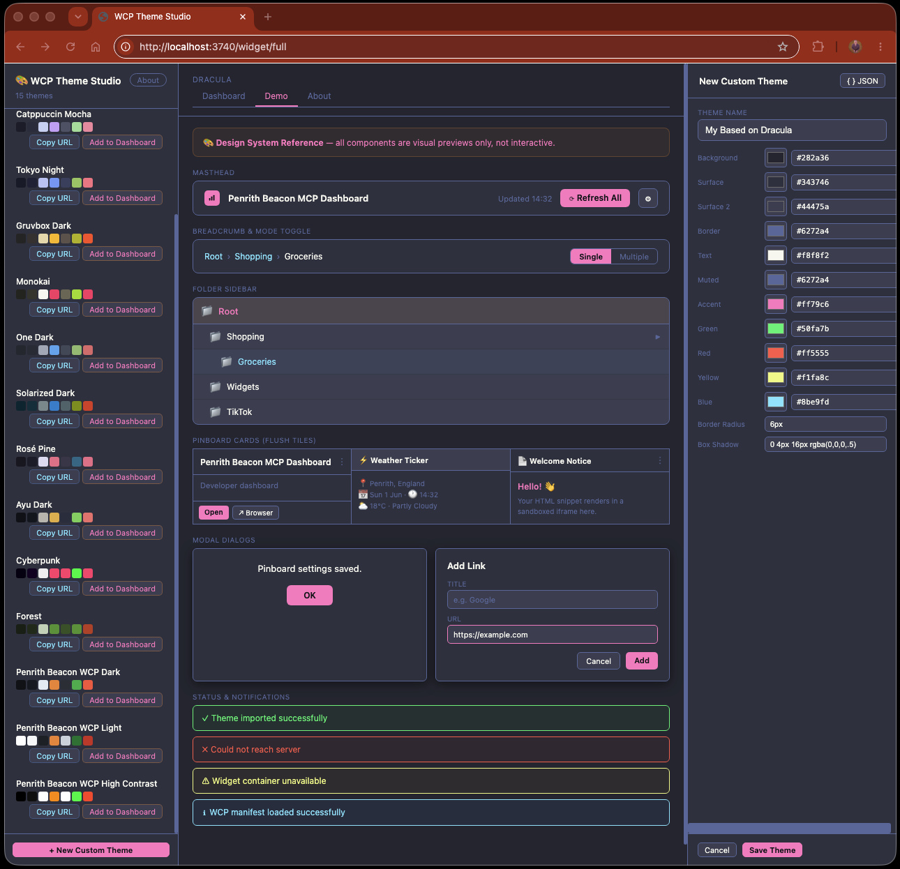
The WCP Theme Studio full page. Left panel: the built-in theme palette — each entry is a complete set of the 13 CSS custom properties. Centre: a live preview of the selected theme applied to standard HTML controls (buttons, inputs, badges, cards) — exactly what your widget will look like inside a host using this theme. Right panel: the theme editor where you can modify any variable value or create an entirely new theme from scratch.
Once you have a theme you want to use or distribute, click the export button. A modal appears showing the complete CSS block ready to copy or download:
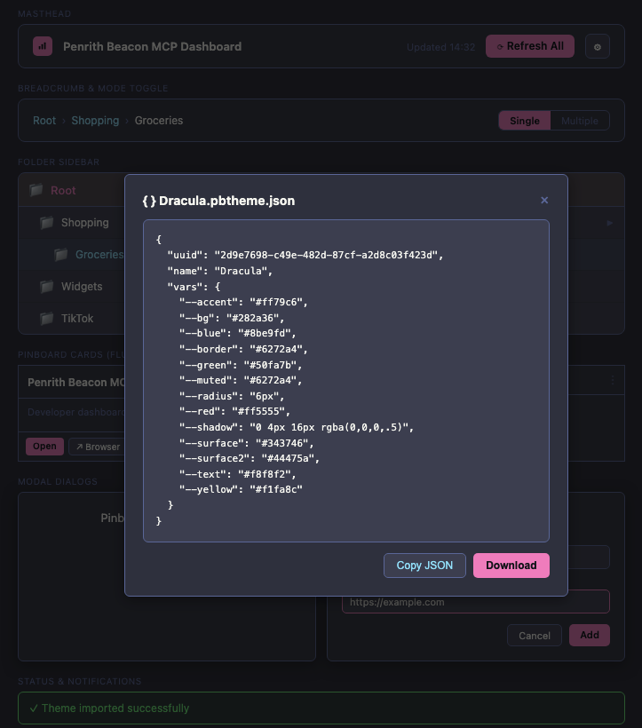
Exporting a theme's CSS.
The modal shows the full set of CSS custom property declarations for the selected theme.
Click Copy to paste directly into your widget's stylesheet, or
Download to save it as a .json file for sharing or
importing into another dashboard. These are exactly the variable names your widget should
reference using var(--wcp-color-bg), var(--wcp-color-primary), and so on.
All 81 WCP tokens are prefixed with --wcp-. The
full token reference
lists every variable, grouped by category.
The most commonly used tokens:
| Variable | Purpose | Typical dark value |
|---|---|---|
--wcp-color-bg | Page / outermost background | #0d1117 |
--wcp-color-surface | Card and panel backgrounds | #161b22 |
--wcp-color-surface-raised | Inputs, secondary surfaces | #1c2128 |
--wcp-color-border | Dividers and input borders | #30363d |
--wcp-color-text | Primary text colour | #e6edf3 |
--wcp-color-text-muted | Secondary / placeholder text | #8b949e |
--wcp-color-primary | Primary action colour (buttons, highlights) | #f0883e |
--wcp-color-primary-on | Text on primary background | #ffffff |
--wcp-color-success | Success / playing / live states | #3fb950 |
--wcp-color-success-on | Text on success background | #ffffff |
--wcp-color-danger | Error / stopped states | #f85149 |
--wcp-color-warning | Warning / pending states | #d29922 |
--wcp-color-info | Informational / link colour | #58a6ff |
--wcp-radius-md | Border radius for rounded elements | 8px |
--wcp-shadow-sm | Box shadow for elevated elements | 0 1px 3px rgba(0,0,0,.15) |
To use them in your widget:
/* In your widget's CSS: */
body { background: var(--wcp-color-bg); color: var(--wcp-color-text); }
button { background: var(--wcp-color-primary); color: var(--wcp-color-primary-on); border-radius: var(--wcp-radius-md); }
input { background: var(--wcp-color-surface-raised); border: 1px solid var(--wcp-color-border); color: var(--wcp-color-text); }
If the host does not inject these variables (for example, when you open the widget
directly in a browser), the values fall back to the browser defaults. Design accordingly —
either set a sensible fallback in var(--wcp-color-bg, #0d1117) or accept that the widget
will look different when viewed outside a host. The Radio widget opts for no background
on its podium components, so they work on any host surface.
Understanding the token names
Every WCP token follows a three-part pattern: prefix – category – role. Once you understand the pattern, you can predict the right token without looking it up.
The surface stack
Surface tokens describe layers stacked on top of each other — like sheets of paper on a desk:
┌────────────────────────── bg (the page) ──────────────┐
│                                                        │
│   ┌────────────────── surface (a card) ──────────────┐ │
│   │                                                   │ │
│   │   ┌────────── surface-raised (an input) ───────┐ │ │
│   │   │                                             │ │ │
│   │   └─────────────────────────────────────────────┘ │ │
│   │                                                   │ │
│   └───────────────────────────────────────────────────┘ │
│                                                        │
└────────────────────────────────────────────────────────┘--wcp-color-bg— the deepest layer: the page or window background.--wcp-color-surface— a card or panel sitting on that page.--wcp-color-surface-raised— an input field or nested panel sitting on that card.--wcp-color-surface-sunken— a recessed well (less common).--wcp-color-overlay— a semi-transparent sheet laid over everything for a modal backdrop.
In the Theme Studio editor, these appear under the Surfaces section.
When creating a theme, set bg first (your base colour), then make
surface slightly lighter (or darker for light themes), and
surface-raised another step lighter. The visual result is depth — cards appear
to float above the page, and inputs appear to sit within the card.
The text hierarchy
Text tokens control legibility across the surface stack:
--wcp-color-text— primary body text, headings, labels. Must be legible on bothbgandsurface.--wcp-color-text-muted— secondary information: descriptions, timestamps, placeholders. Readable but subdued.--wcp-color-text-disabled— greyed-out, non-interactive text. Semi-transparent by default.--wcp-color-text-inverse— text on a coloured solid background (often the same value asbg).--wcp-color-link— clickable text. Typically the same asinfo.
In the Theme Studio editor, these appear under the Text section.
The -on pattern — text on coloured backgrounds
When a coloured element (a button, a badge) needs legible text, the -on
variant provides it. Think of it as "the text colour that goes on this background":
| Background token | Text-on token | Typical use |
|---|---|---|
--wcp-color-primary | --wcp-color-primary-on | Brand action buttons — the button is coloured with primary, and its label text uses primary-on |
--wcp-color-success | --wcp-color-success-on | Launch / confirm buttons — the button is green with success, and its label uses success-on |
Without the -on token, button text would default to white — which is fine on
dark backgrounds, but illegible on light or pastel ones. By giving the theme author an
explicit -on field, they can guarantee legibility for any colour combination.
In the Theme Studio editor, primary-on appears under Brand
(labelled "On Primary") and success-on under Status
(labelled "On Success").
Status colours and their three variants
Each status colour (success, warning, danger,
info) has three tokens for different contexts:
| Variant | Purpose | Example |
|---|---|---|
--wcp-color-success | The colour itself | Button background, icon fill, status dot |
--wcp-color-success-on | Text on that colour | Button label, text on a success-coloured badge |
--wcp-color-success-surface | Subtle tinted background | Status banner, notification background, badge fill |
The -surface variant is typically the base colour at 12% opacity — a faint
wash that tints the background without overpowering the text. Use it for status indicators
that need to be visible but not dominant.
Mapping tokens to what you see
This table shows which Theme Studio editor field controls which part of a typical widget UI. Use it as a reference when creating themes — change a value in the editor, export the theme, and see the result in your application.
| UI element | Background | Text | Border | Editor section |
|---|---|---|---|---|
| Page background | bg | text | — | Surfaces / Text |
| Card / panel | surface | text | border | Surfaces / Borders |
| Card hover state | surface-raised | text | primary | Surfaces / Brand |
| Input field | surface-raised | text | border | Surfaces / Borders |
| Input focus ring | — | — | primary | Brand |
| Primary action button | primary | primary-on | — | Brand |
| Success / Launch button | success | success-on | — | Status |
| Error message | — | danger | — | Status |
| Status badge | success-surface | success | — | Status |
| Secondary text / footer | — | text-muted | border | Text / Borders |
| Toggle switch (on) | success | text | — | Status / Text |
| Toggle switch (off) | border | text | — | Borders / Text |
| Scrollbar | surface | — | border | Surfaces / Borders |
.wcpt file, import it
into your application's settings — you'll see immediately which field controls which
element. This is the fastest way to learn the token-to-UI mapping for your specific widget.
Token Resolution Engine
If you're building a WCP-compatible host (a dashboard, launcher, or any application that renders WCP widgets), you must implement the token resolution engine. This is the algorithm that takes a theme's 13 seed values and derives the full 81-token set.
The 13 seeds
A minimal WCP theme provides these 13 values. If any are absent, the engine uses the fallback default (Penrith Beacon WCP Dark):
| # | Key in vars | Local variable | Fallback |
|---|---|---|---|
| 1 | --wcp-color-bg | bg | #0d1117 |
| 2 | --wcp-color-surface | sur | #161b22 |
| 3 | --wcp-color-surface-raised | sr2 | #1c2128 |
| 4 | --wcp-color-border | bdr | #30363d |
| 5 | --wcp-color-text | txt | #e6edf3 |
| 6 | --wcp-color-text-muted | mut | #8b949e |
| 7 | --wcp-color-primary | acc | #f0883e |
| 8 | --wcp-color-success | grn | #3fb950 |
| 9 | --wcp-color-danger | red | #f85149 |
| 10 | --wcp-color-warning | yel | #d29922 |
| 11 | --wcp-color-info | blu | #58a6ff |
| 12 | --wcp-radius-md | rad | 8px |
| 13 | --wcp-shadow-sm | shd | 0 1px 3px rgba(0,0,0,.15) |
Two additional optional seeds are read if present:
--wcp-color-primary-on→ local variableprimary_on, default"#ffffff"--wcp-color-success-on→ local variablesuccess_on, default"#ffffff"
The hex2rgba procedure
This procedure converts a 6-digit hex colour string to an RGBA string at a given alpha. Your implementation must produce byte-identical output:
PROCEDURE hex2rgba(hex_string, alpha):
    IF hex_string is null OR hex_string is empty:
        RETURN "rgba(0,0,0," + alpha + ")"
    IF the first character of hex_string is NOT "#":
        RETURN "rgba(0,0,0," + alpha + ")"
    IF the length of hex_string is less than 7:
        RETURN "rgba(0,0,0," + alpha + ")"

    R = parse characters at positions 1-2 (after the #) as hexadecimal → integer
    G = parse characters at positions 3-4 (after the #) as hexadecimal → integer
    B = parse characters at positions 5-6 (after the #) as hexadecimal → integer

    RETURN "rgba(" + R + "," + G + "," + B + "," + alpha + ")"
Critical formatting rules:
- No spaces anywhere in the output string.
- R, G, B are decimal integers (0–255), never padded with leading zeros.
- Alpha is written exactly as passed in (e.g.
0.75not.75,0.5not0.50).
Example: hex2rgba("#4c566a", 0.25)
- Positions 1-2:
"4c"→ hex 4c → decimal 76 - Positions 3-4:
"56"→ hex 56 → decimal 86 - Positions 5-6:
"6a"→ hex 6a → decimal 106 - Result:
"rgba(76,86,106,0.25)"
Complete derivation rules
After reading the seeds, produce the 81 output tokens using these rules:
// ─── Surfaces (5) ─────────────────────────────────────────────────
"--wcp-color-bg"              = bg
"--wcp-color-surface"         = sur
"--wcp-color-surface-raised"  = sr2
"--wcp-color-surface-sunken"  = bg
"--wcp-color-overlay"         = hex2rgba(bg, 0.75)

// ─── Borders (2) ──────────────────────────────────────────────────
"--wcp-color-border"          = bdr
"--wcp-color-border-strong"   = hex2rgba(txt, 0.25)

// ─── Text (5) ─────────────────────────────────────────────────────
"--wcp-color-text"            = txt
"--wcp-color-text-muted"      = mut
"--wcp-color-text-disabled"   = hex2rgba(mut, 0.5)
"--wcp-color-text-inverse"    = bg
"--wcp-color-link"            = blu

// ─── Brand (3) ────────────────────────────────────────────────────
"--wcp-color-primary"         = acc
"--wcp-color-primary-dim"     = hex2rgba(acc, 0.15)
"--wcp-color-primary-on"      = primary_on

// ─── Status (9) ───────────────────────────────────────────────────
"--wcp-color-success"         = grn
"--wcp-color-success-on"      = success_on
"--wcp-color-success-surface" = hex2rgba(grn, 0.12)
"--wcp-color-warning"         = yel
"--wcp-color-warning-surface" = hex2rgba(yel, 0.12)
"--wcp-color-danger"          = red
"--wcp-color-danger-surface"  = hex2rgba(red, 0.12)
"--wcp-color-info"            = blu
"--wcp-color-info-surface"    = hex2rgba(blu, 0.12)

// ─── Typography (16) — all fixed values ───────────────────────────
"--wcp-font-family"           = "-apple-system,BlinkMacSystemFont,'Segoe UI',sans-serif"
"--wcp-font-mono"             = "ui-monospace,'SF Mono','Fira Code',monospace"
"--wcp-font-size-xs"          = "0.70rem"
"--wcp-font-size-sm"          = "0.80rem"
"--wcp-font-size-md"          = "0.875rem"
"--wcp-font-size-lg"          = "1rem"
"--wcp-font-size-xl"          = "1.125rem"
"--wcp-font-size-2xl"         = "1.375rem"
"--wcp-font-size-3xl"         = "1.75rem"
"--wcp-font-weight-normal"    = "400"
"--wcp-font-weight-medium"    = "500"
"--wcp-font-weight-semibold"  = "600"
"--wcp-font-weight-bold"      = "700"
"--wcp-line-height-tight"     = "1.2"
"--wcp-line-height-normal"    = "1.5"
"--wcp-line-height-relaxed"   = "1.75"

// ─── Spacing (8) — 4px base grid ─────────────────────────────────
"--wcp-space-1"               = "4px"
"--wcp-space-2"               = "8px"
"--wcp-space-3"               = "12px"
"--wcp-space-4"               = "16px"
"--wcp-space-5"               = "24px"
"--wcp-space-6"               = "32px"
"--wcp-space-7"               = "48px"
"--wcp-space-8"               = "64px"

// ─── Shape (5) ────────────────────────────────────────────────────
"--wcp-radius-sm"             = "4px"
"--wcp-radius-md"             = rad
"--wcp-radius-lg"             = "12px"
"--wcp-radius-xl"             = "16px"
"--wcp-radius-round"          = "9999px"

// ─── Shadow (4) ───────────────────────────────────────────────────
"--wcp-shadow-sm"             = shd
"--wcp-shadow-md"             = "0 4px 12px rgba(0,0,0,.2)"
"--wcp-shadow-lg"             = "0 8px 24px rgba(0,0,0,.25)"
"--wcp-shadow-xl"             = "0 16px 40px rgba(0,0,0,.3)"

// ─── Motion (7) — all fixed ───────────────────────────────────────
"--wcp-duration-fast"         = "100ms"
"--wcp-duration-normal"       = "200ms"
"--wcp-duration-slow"         = "350ms"
"--wcp-easing-standard"       = "ease"
"--wcp-easing-out"            = "ease-out"
"--wcp-easing-in"             = "ease-in"
"--wcp-easing-spring"         = "cubic-bezier(0.34,1.56,0.64,1)"

// ─── Z-Index (7) — all fixed ─────────────────────────────────────
"--wcp-z-base"                = "0"
"--wcp-z-raised"              = "10"
"--wcp-z-dropdown"            = "1000"
"--wcp-z-sticky"              = "1100"
"--wcp-z-modal"               = "1200"
"--wcp-z-toast"               = "1300"
"--wcp-z-tooltip"             = "1400"

// ─── Focus & Accessibility (4) ────────────────────────────────────
"--wcp-focus-ring-width"      = "2px"
"--wcp-focus-ring-offset"     = "2px"
"--wcp-focus-ring-color"      = acc
"--wcp-touch-target-min"      = "44px"

// ─── Widget Defaults (6) ──────────────────────────────────────────
"--wcp-widget-bg"             = sur
"--wcp-widget-border"         = bdr
"--wcp-widget-radius"         = rad
"--wcp-widget-padding"        = "16px"
"--wcp-widget-gap"            = "12px"
"--wcp-widget-shadow"         = shd
The override pass
After generating all 81 tokens, iterate over every key-value pair in the original input
vars object:
FOR EACH (key, value) IN original_input_vars:
    IF key starts with the string "--wcp-":
        output[key] = value
This ensures that any explicit --wcp-* value in the theme — beyond the 13
seeds — overwrites its derived counterpart. A fully custom theme (81 explicit values)
effectively replaces all derivations. A minimal theme (13 seeds) sees no change from this
pass because the seeds are already set to the same values.
Worked example: Nord theme
Input — 13 seed values:
"--wcp-color-bg":             "#2e3440"
"--wcp-color-surface":        "#3b4252"
"--wcp-color-surface-raised": "#434c5e"
"--wcp-color-border":         "#4c566a"
"--wcp-color-text":           "#eceff4"
"--wcp-color-text-muted":     "#d8dee9"
"--wcp-color-primary":        "#88c0d0"
"--wcp-color-success":        "#a3be8c"
"--wcp-color-danger":         "#bf616a"
"--wcp-color-warning":        "#ebcb8b"
"--wcp-color-info":           "#81a1c1"
"--wcp-radius-md":            "8px"
"--wcp-shadow-sm":            "0 4px 12px rgba(0,0,0,.4)"
Selected derivation steps (showing the hex2rgba arithmetic):
| Token | Rule | Hex breakdown | Result |
|---|---|---|---|
--wcp-color-overlay | hex2rgba(bg, 0.75) | #2e3440 → R:46 G:52 B:64 | rgba(46,52,64,0.75) |
--wcp-color-border-strong | hex2rgba(txt, 0.25) | #eceff4 → R:236 G:239 B:244 | rgba(236,239,244,0.25) |
--wcp-color-text-disabled | hex2rgba(mut, 0.5) | #d8dee9 → R:216 G:222 B:233 | rgba(216,222,233,0.5) |
--wcp-color-primary-dim | hex2rgba(acc, 0.15) | #88c0d0 → R:136 G:192 B:208 | rgba(136,192,208,0.15) |
--wcp-color-success-surface | hex2rgba(grn, 0.12) | #a3be8c → R:163 G:190 B:140 | rgba(163,190,140,0.12) |
--wcp-color-warning-surface | hex2rgba(yel, 0.12) | #ebcb8b → R:235 G:203 B:139 | rgba(235,203,139,0.12) |
--wcp-color-danger-surface | hex2rgba(red, 0.12) | #bf616a → R:191 G:97 B:106 | rgba(191,97,106,0.12) |
--wcp-color-info-surface | hex2rgba(blu, 0.12) | #81a1c1 → R:129 G:161 B:193 | rgba(129,161,193,0.12) |
--wcp-color-text-inverse | = bg | — | #2e3440 |
--wcp-color-link | = blu | — | #81a1c1 |
--wcp-focus-ring-color | = acc | — | #88c0d0 |
--wcp-widget-bg | = sur | — | #3b4252 |
Every other token uses its fixed default value (see the full derivation rules above).
For the complete 81-token expected output for this input, verification procedures, edge
cases, and extended pseudocode, see
WCP-TOKEN-RESOLUTION.md
in the source repository.
Edge cases
- Empty input: All seeds use fallbacks → output is Penrith Beacon WCP Dark.
- Uppercase hex (
#2E3440):hex2rgbamust handle both cases.parseInt("2E", 16)=parseInt("2e", 16)= 46. - Shorthand hex (
#abc): Not supported. Length < 7, sohex2rgbareturnsrgba(0,0,0,alpha). - Extra
--wcp-*keys in input: The override pass adds them to the output. A theme with 15 keys produces 83 output tokens (81 standard + 2 custom extensions). - Theme provides all 81 values explicitly: Derivation runs, then override pass replaces every derived value with the explicit one. Result = the theme's explicit values verbatim.
--wcp-color-overlay is rgba(46,52,64,0.75) (no spaces, exact
alpha), your hex2rgba is correct. Verify all 9 opacity-derived tokens against
the table to confirm full compliance.
See the WCP Specification §Token Resolution
for the normative rules.
Theme Adoption for Web Pages
WCP theme injection isn't limited to widgets running in Docker containers. Any external website can adopt the host dashboard's active theme — dark mode, light mode, custom palettes — by using WCP CSS variable names in its stylesheet and including a small JavaScript snippet.
The website continues to work normally in any browser. Its :root block provides
sensible default values for all the WCP variables it uses. When the page is loaded inside
a WCP host (either in an iframe or in a standalone window), the host injects the active
theme's token values, and the page transforms to match.
How it works — four-channel injection
Theme tokens reach the page through four complementary channels:
| Channel | When it fires | Mechanism |
|---|---|---|
| URL fragment | Page opened in a new window by a host | Host appends #wcp-theme=<base64 JSON> to the URL before loading |
| Query string | Themed URL shared via bookmark, link, or social post | ?com.widgetcontextprotocol.theme=<base64 JSON> — reverse-domain key avoids clashes |
| Session storage | User clicks an internal link within the site | Snippet stores the theme in sessionStorage on apply; subsequent pages read it on load |
| postMessage | Page embedded as an iframe, or theme changes while page is open | Host sends { type: 'wcp:theme', vars: { ... } } to the iframe's contentWindow |
The URL fragment channel handles host-initiated injection — the page has the theme before the first paint. The query string channel allows themed URLs to be shared outside a host (bookmarks, documentation links, social posts). The session storage channel handles navigation — when the user clicks internal links, each new page picks up the persisted theme without the host needing to re-inject. The postMessage channel handles live updates — when the user switches themes in the dashboard, every iframe receives the new tokens immediately.
Example themed URLs
Copy any of these URLs to view the Hyperpolyglot site in a specific Penrith Beacon theme. The full 81-token WCP theme is encoded in the query string.
Penrith Beacon Dark
https://hyperpolyglot.kingarthursroundtable.com/?com.widgetcontextprotocol.theme=eyJ1dWlkIjoiYTFiMmMzZDQtZTVmNi03ODkwLWFiY2QtZWYxMjM0NTY3ODkwIiwibmFtZSI6IlBlbnJpdGggQmVhY29uIFdDUCBEYXJrIiwidmFycyI6eyItLXdjcC1jb2xvci1iZyI6IiMwZDExMTciLCItLXdjcC1jb2xvci1zdXJmYWNlIjoiIzE2MWIyMiIsIi0td2NwLWNvbG9yLXN1cmZhY2UtcmFpc2VkIjoiIzFjMjEyOCIsIi0td2NwLWNvbG9yLXN1cmZhY2Utc3Vua2VuIjoiIzBkMTExNyIsIi0td2NwLWNvbG9yLW92ZXJsYXkiOiJyZ2JhKDEzLDE3LDIzLDAuNzUpIiwiLS13Y3AtY29sb3ItYm9yZGVyIjoiIzMwMzYzZCIsIi0td2NwLWNvbG9yLWJvcmRlci1zdHJvbmciOiJyZ2JhKDIzMCwyMzcsMjQzLDAuMjUpIiwiLS13Y3AtY29sb3ItdGV4dCI6IiNlNmVkZjMiLCItLXdjcC1jb2xvci10ZXh0LW11dGVkIjoiIzhiOTQ5ZSIsIi0td2NwLWNvbG9yLXRleHQtZGlzYWJsZWQiOiJyZ2JhKDEzOSwxNDgsMTU4LDAuNSkiLCItLXdjcC1jb2xvci10ZXh0LWludmVyc2UiOiIjMGQxMTE3IiwiLS13Y3AtY29sb3ItbGluayI6IiM1OGE2ZmYiLCItLXdjcC1jb2xvci1wcmltYXJ5IjoiI2YwODgzZSIsIi0td2NwLWNvbG9yLXByaW1hcnktZGltIjoicmdiYSgyNDAsMTM2LDYyLDAuMTUpIiwiLS13Y3AtY29sb3ItcHJpbWFyeS1vbiI6IiNmZmZmZmYiLCItLXdjcC1jb2xvci1zdWNjZXNzIjoiIzNmYjk1MCIsIi0td2NwLWNvbG9yLXN1Y2Nlc3Mtb24iOiIjZmZmZmZmIiwiLS13Y3AtY29sb3Itc3VjY2Vzcy1zdXJmYWNlIjoicmdiYSg2MywxODUsODAsMC4xMikiLCItLXdjcC1jb2xvci13YXJuaW5nIjoiI2QyOTkyMiIsIi0td2NwLWNvbG9yLXdhcm5pbmctc3VyZmFjZSI6InJnYmEoMjEwLDE1MywzNCwwLjEyKSIsIi0td2NwLWNvbG9yLWRhbmdlciI6IiNmODUxNDkiLCItLXdjcC1jb2xvci1kYW5nZXItc3VyZmFjZSI6InJnYmEoMjQ4LDgxLDczLDAuMTIpIiwiLS13Y3AtY29sb3ItaW5mbyI6IiM1OGE2ZmYiLCItLXdjcC1jb2xvci1pbmZvLXN1cmZhY2UiOiJyZ2JhKDg4LDE2NiwyNTUsMC4xMikiLCItLXdjcC1mb250LWZhbWlseSI6Ii1hcHBsZS1zeXN0ZW0sQmxpbmtNYWNTeXN0ZW1Gb250LCdTZWdvZSBVSScsc2Fucy1zZXJpZiIsIi0td2NwLWZvbnQtbW9ubyI6InVpLW1vbm9zcGFjZSwnU0YgTW9ubycsJ0ZpcmEgQ29kZScsbW9ub3NwYWNlIiwiLS13Y3AtZm9udC1zaXplLXhzIjoiMC43MHJlbSIsIi0td2NwLWZvbnQtc2l6ZS1zbSI6IjAuODByZW0iLCItLXdjcC1mb250LXNpemUtbWQiOiIwLjg3NXJlbSIsIi0td2NwLWZvbnQtc2l6ZS1sZyI6IjFyZW0iLCItLXdjcC1mb250LXNpemUteGwiOiIxLjEyNXJlbSIsIi0td2NwLWZvbnQtc2l6ZS0yeGwiOiIxLjM3NXJlbSIsIi0td2NwLWZvbnQtc2l6ZS0zeGwiOiIxLjc1cmVtIiwiLS13Y3AtZm9udC13ZWlnaHQtbm9ybWFsIjoiNDAwIiwiLS13Y3AtZm9udC13ZWlnaHQtbWVkaXVtIjoiNTAwIiwiLS13Y3AtZm9udC13ZWlnaHQtc2VtaWJvbGQiOiI2MDAiLCItLXdjcC1mb250LXdlaWdodC1ib2xkIjoiNzAwIiwiLS13Y3AtbGluZS1oZWlnaHQtdGlnaHQiOiIxLjIiLCItLXdjcC1saW5lLWhlaWdodC1ub3JtYWwiOiIxLjUiLCItLXdjcC1saW5lLWhlaWdodC1yZWxheGVkIjoiMS43NSIsIi0td2NwLXNwYWNlLTEiOiI0cHgiLCItLXdjcC1zcGFjZS0yIjoiOHB4IiwiLS13Y3Atc3BhY2UtMyI6IjEycHgiLCItLXdjcC1zcGFjZS00IjoiMTZweCIsIi0td2NwLXNwYWNlLTUiOiIyNHB4IiwiLS13Y3Atc3BhY2UtNiI6IjMycHgiLCItLXdjcC1zcGFjZS03IjoiNDhweCIsIi0td2NwLXNwYWNlLTgiOiI2NHB4IiwiLS13Y3AtcmFkaXVzLXNtIjoiNHB4IiwiLS13Y3AtcmFkaXVzLW1kIjoiOHB4IiwiLS13Y3AtcmFkaXVzLWxnIjoiMTJweCIsIi0td2NwLXJhZGl1cy14bCI6IjE2cHgiLCItLXdjcC1yYWRpdXMtcm91bmQiOiI5OTk5cHgiLCItLXdjcC1zaGFkb3ctc20iOiIwIDRweCAxNnB4IHJnYmEoMCwwLDAsLjQ1KSIsIi0td2NwLXNoYWRvdy1tZCI6IjAgNHB4IDEycHggcmdiYSgwLDAsMCwuMikiLCItLXdjcC1zaGFkb3ctbGciOiIwIDhweCAyNHB4IHJnYmEoMCwwLDAsLjI1KSIsIi0td2NwLXNoYWRvdy14bCI6IjAgMTZweCA0MHB4IHJnYmEoMCwwLDAsLjMpIiwiLS13Y3AtZHVyYXRpb24tZmFzdCI6IjEwMG1zIiwiLS13Y3AtZHVyYXRpb24tbm9ybWFsIjoiMjAwbXMiLCItLXdjcC1kdXJhdGlvbi1zbG93IjoiMzUwbXMiLCItLXdjcC1lYXNpbmctc3RhbmRhcmQiOiJlYXNlIiwiLS13Y3AtZWFzaW5nLW91dCI6ImVhc2Utb3V0IiwiLS13Y3AtZWFzaW5nLWluIjoiZWFzZS1pbiIsIi0td2NwLWVhc2luZy1zcHJpbmciOiJjdWJpYy1iZXppZXIoMC4zNCwxLjU2LDAuNjQsMSkiLCItLXdjcC16LWJhc2UiOiIwIiwiLS13Y3Atei1yYWlzZWQiOiIxMCIsIi0td2NwLXotZHJvcGRvd24iOiIxMDAwIiwiLS13Y3Atei1zdGlja3kiOiIxMTAwIiwiLS13Y3Atei1tb2RhbCI6IjEyMDAiLCItLXdjcC16LXRvYXN0IjoiMTMwMCIsIi0td2NwLXotdG9vbHRpcCI6IjE0MDAiLCItLXdjcC1mb2N1cy1yaW5nLXdpZHRoIjoiMnB4IiwiLS13Y3AtZm9jdXMtcmluZy1vZmZzZXQiOiIycHgiLCItLXdjcC1mb2N1cy1yaW5nLWNvbG9yIjoiI2YwODgzZSIsIi0td2NwLXRvdWNoLXRhcmdldC1taW4iOiI0NHB4IiwiLS13Y3Atd2lkZ2V0LWJnIjoiIzE2MWIyMiIsIi0td2NwLXdpZGdldC1ib3JkZXIiOiIjMzAzNjNkIiwiLS13Y3Atd2lkZ2V0LXJhZGl1cyI6IjhweCIsIi0td2NwLXdpZGdldC1wYWRkaW5nIjoiMTZweCIsIi0td2NwLXdpZGdldC1nYXAiOiIxMnB4IiwiLS13Y3Atd2lkZ2V0LXNoYWRvdyI6IjAgNHB4IDE2cHggcmdiYSgwLDAsMCwuNDUpIn19Penrith Beacon Light
https://hyperpolyglot.kingarthursroundtable.com/?com.widgetcontextprotocol.theme=eyJ1dWlkIjoiYjJjM2Q0ZTUtZjZhNy04OTAxLWJjZGUtZjEyMzQ1Njc4OTAxIiwibmFtZSI6IlBlbnJpdGggQmVhY29uIFdDUCBMaWdodCIsInZhcnMiOnsiLS13Y3AtY29sb3ItYmciOiIjZmZmZmZmIiwiLS13Y3AtY29sb3Itc3VyZmFjZSI6IiNmNmY4ZmEiLCItLXdjcC1jb2xvci1zdXJmYWNlLXJhaXNlZCI6IiNlYWVlZjIiLCItLXdjcC1jb2xvci1zdXJmYWNlLXN1bmtlbiI6IiNmZmZmZmYiLCItLXdjcC1jb2xvci1vdmVybGF5IjoicmdiYSgyNTUsMjU1LDI1NSwwLjc1KSIsIi0td2NwLWNvbG9yLWJvcmRlciI6IiNkMGQ3ZGUiLCItLXdjcC1jb2xvci1ib3JkZXItc3Ryb25nIjoicmdiYSgzMSwzNSw0MCwwLjI1KSIsIi0td2NwLWNvbG9yLXRleHQiOiIjMWYyMzI4IiwiLS13Y3AtY29sb3ItdGV4dC1tdXRlZCI6IiM2MzZjNzYiLCItLXdjcC1jb2xvci10ZXh0LWRpc2FibGVkIjoicmdiYSg5OSwxMDgsMTE4LDAuNSkiLCItLXdjcC1jb2xvci10ZXh0LWludmVyc2UiOiIjZmZmZmZmIiwiLS13Y3AtY29sb3ItbGluayI6IiMwOTY5ZGEiLCItLXdjcC1jb2xvci1wcmltYXJ5IjoiI2YwODgzZSIsIi0td2NwLWNvbG9yLXByaW1hcnktZGltIjoicmdiYSgyNDAsMTM2LDYyLDAuMTUpIiwiLS13Y3AtY29sb3ItcHJpbWFyeS1vbiI6IiNmZmZmZmYiLCItLXdjcC1jb2xvci1zdWNjZXNzIjoiIzFhN2YzNyIsIi0td2NwLWNvbG9yLXN1Y2Nlc3Mtb24iOiIjZmZmZmZmIiwiLS13Y3AtY29sb3Itc3VjY2Vzcy1zdXJmYWNlIjoicmdiYSgyNiwxMjcsNTUsMC4xMikiLCItLXdjcC1jb2xvci13YXJuaW5nIjoiIzlhNjcwMCIsIi0td2NwLWNvbG9yLXdhcm5pbmctc3VyZmFjZSI6InJnYmEoMTU0LDEwMywwLDAuMTIpIiwiLS13Y3AtY29sb3ItZGFuZ2VyIjoiI2NmMjIyZSIsIi0td2NwLWNvbG9yLWRhbmdlci1zdXJmYWNlIjoicmdiYSgyMDcsMzQsNDYsMC4xMikiLCItLXdjcC1jb2xvci1pbmZvIjoiIzA5NjlkYSIsIi0td2NwLWNvbG9yLWluZm8tc3VyZmFjZSI6InJnYmEoOSwxMDUsMjE4LDAuMTIpIiwiLS13Y3AtZm9udC1mYW1pbHkiOiItYXBwbGUtc3lzdGVtLEJsaW5rTWFjU3lzdGVtRm9udCwnU2Vnb2UgVUknLHNhbnMtc2VyaWYiLCItLXdjcC1mb250LW1vbm8iOiJ1aS1tb25vc3BhY2UsJ1NGIE1vbm8nLCdGaXJhIENvZGUnLG1vbm9zcGFjZSIsIi0td2NwLWZvbnQtc2l6ZS14cyI6IjAuNzByZW0iLCItLXdjcC1mb250LXNpemUtc20iOiIwLjgwcmVtIiwiLS13Y3AtZm9udC1zaXplLW1kIjoiMC44NzVyZW0iLCItLXdjcC1mb250LXNpemUtbGciOiIxcmVtIiwiLS13Y3AtZm9udC1zaXplLXhsIjoiMS4xMjVyZW0iLCItLXdjcC1mb250LXNpemUtMnhsIjoiMS4zNzVyZW0iLCItLXdjcC1mb250LXNpemUtM3hsIjoiMS43NXJlbSIsIi0td2NwLWZvbnQtd2VpZ2h0LW5vcm1hbCI6IjQwMCIsIi0td2NwLWZvbnQtd2VpZ2h0LW1lZGl1bSI6IjUwMCIsIi0td2NwLWZvbnQtd2VpZ2h0LXNlbWlib2xkIjoiNjAwIiwiLS13Y3AtZm9udC13ZWlnaHQtYm9sZCI6IjcwMCIsIi0td2NwLWxpbmUtaGVpZ2h0LXRpZ2h0IjoiMS4yIiwiLS13Y3AtbGluZS1oZWlnaHQtbm9ybWFsIjoiMS41IiwiLS13Y3AtbGluZS1oZWlnaHQtcmVsYXhlZCI6IjEuNzUiLCItLXdjcC1zcGFjZS0xIjoiNHB4IiwiLS13Y3Atc3BhY2UtMiI6IjhweCIsIi0td2NwLXNwYWNlLTMiOiIxMnB4IiwiLS13Y3Atc3BhY2UtNCI6IjE2cHgiLCItLXdjcC1zcGFjZS01IjoiMjRweCIsIi0td2NwLXNwYWNlLTYiOiIzMnB4IiwiLS13Y3Atc3BhY2UtNyI6IjQ4cHgiLCItLXdjcC1zcGFjZS04IjoiNjRweCIsIi0td2NwLXJhZGl1cy1zbSI6IjRweCIsIi0td2NwLXJhZGl1cy1tZCI6IjhweCIsIi0td2NwLXJhZGl1cy1sZyI6IjEycHgiLCItLXdjcC1yYWRpdXMteGwiOiIxNnB4IiwiLS13Y3AtcmFkaXVzLXJvdW5kIjoiOTk5OXB4IiwiLS13Y3Atc2hhZG93LXNtIjoiMCA0cHggOHB4IHJnYmEoMCwwLDAsLjEyKSIsIi0td2NwLXNoYWRvdy1tZCI6IjAgNHB4IDEycHggcmdiYSgwLDAsMCwuMikiLCItLXdjcC1zaGFkb3ctbGciOiIwIDhweCAyNHB4IHJnYmEoMCwwLDAsLjI1KSIsIi0td2NwLXNoYWRvdy14bCI6IjAgMTZweCA0MHB4IHJnYmEoMCwwLDAsLjMpIiwiLS13Y3AtZHVyYXRpb24tZmFzdCI6IjEwMG1zIiwiLS13Y3AtZHVyYXRpb24tbm9ybWFsIjoiMjAwbXMiLCItLXdjcC1kdXJhdGlvbi1zbG93IjoiMzUwbXMiLCItLXdjcC1lYXNpbmctc3RhbmRhcmQiOiJlYXNlIiwiLS13Y3AtZWFzaW5nLW91dCI6ImVhc2Utb3V0IiwiLS13Y3AtZWFzaW5nLWluIjoiZWFzZS1pbiIsIi0td2NwLWVhc2luZy1zcHJpbmciOiJjdWJpYy1iZXppZXIoMC4zNCwxLjU2LDAuNjQsMSkiLCItLXdjcC16LWJhc2UiOiIwIiwiLS13Y3Atei1yYWlzZWQiOiIxMCIsIi0td2NwLXotZHJvcGRvd24iOiIxMDAwIiwiLS13Y3Atei1zdGlja3kiOiIxMTAwIiwiLS13Y3Atei1tb2RhbCI6IjEyMDAiLCItLXdjcC16LXRvYXN0IjoiMTMwMCIsIi0td2NwLXotdG9vbHRpcCI6IjE0MDAiLCItLXdjcC1mb2N1cy1yaW5nLXdpZHRoIjoiMnB4IiwiLS13Y3AtZm9jdXMtcmluZy1vZmZzZXQiOiIycHgiLCItLXdjcC1mb2N1cy1yaW5nLWNvbG9yIjoiI2YwODgzZSIsIi0td2NwLXRvdWNoLXRhcmdldC1taW4iOiI0NHB4IiwiLS13Y3Atd2lkZ2V0LWJnIjoiI2Y2ZjhmYSIsIi0td2NwLXdpZGdldC1ib3JkZXIiOiIjZDBkN2RlIiwiLS13Y3Atd2lkZ2V0LXJhZGl1cyI6IjhweCIsIi0td2NwLXdpZGdldC1wYWRkaW5nIjoiMTZweCIsIi0td2NwLXdpZGdldC1nYXAiOiIxMnB4IiwiLS13Y3Atd2lkZ2V0LXNoYWRvdyI6IjAgNHB4IDhweCByZ2JhKDAsMCwwLC4xMikifX0=Penrith Beacon High Contrast
https://hyperpolyglot.kingarthursroundtable.com/?com.widgetcontextprotocol.theme=eyJ1dWlkIjoiYzNkNGU1ZjYtYTdiOC05MDEyLWNkZWYtMTIzNDU2Nzg5MDEyIiwibmFtZSI6IlBlbnJpdGggQmVhY29uIFdDUCBIaWdoIENvbnRyYXN0IiwidmFycyI6eyItLXdjcC1jb2xvci1iZyI6IiMwMDAwMDAiLCItLXdjcC1jb2xvci1zdXJmYWNlIjoiIzBkMGQwZCIsIi0td2NwLWNvbG9yLXN1cmZhY2UtcmFpc2VkIjoiIzFhMWExYSIsIi0td2NwLWNvbG9yLXN1cmZhY2Utc3Vua2VuIjoiIzAwMDAwMCIsIi0td2NwLWNvbG9yLW92ZXJsYXkiOiJyZ2JhKDAsMCwwLDAuNzUpIiwiLS13Y3AtY29sb3ItYm9yZGVyIjoiI2ZmZmZmZiIsIi0td2NwLWNvbG9yLWJvcmRlci1zdHJvbmciOiJyZ2JhKDI1NSwyNTUsMjU1LDAuMjUpIiwiLS13Y3AtY29sb3ItdGV4dCI6IiNmZmZmZmYiLCItLXdjcC1jb2xvci10ZXh0LW11dGVkIjoiI2NjY2NjYyIsIi0td2NwLWNvbG9yLXRleHQtZGlzYWJsZWQiOiJyZ2JhKDIwNCwyMDQsMjA0LDAuNSkiLCItLXdjcC1jb2xvci10ZXh0LWludmVyc2UiOiIjMDAwMDAwIiwiLS13Y3AtY29sb3ItbGluayI6IiMwMGI0ZmYiLCItLXdjcC1jb2xvci1wcmltYXJ5IjoiI2ZmOGMwMCIsIi0td2NwLWNvbG9yLXByaW1hcnktZGltIjoicmdiYSgyNTUsMTQwLDAsMC4xNSkiLCItLXdjcC1jb2xvci1wcmltYXJ5LW9uIjoiI2ZmZmZmZiIsIi0td2NwLWNvbG9yLXN1Y2Nlc3MiOiIjMDBmZjQxIiwiLS13Y3AtY29sb3Itc3VjY2Vzcy1vbiI6IiNmZmZmZmYiLCItLXdjcC1jb2xvci1zdWNjZXNzLXN1cmZhY2UiOiJyZ2JhKDAsMjU1LDY1LDAuMTIpIiwiLS13Y3AtY29sb3Itd2FybmluZyI6IiNmZmZmMDAiLCItLXdjcC1jb2xvci13YXJuaW5nLXN1cmZhY2UiOiJyZ2JhKDI1NSwyNTUsMCwwLjEyKSIsIi0td2NwLWNvbG9yLWRhbmdlciI6IiNmZjMzMzMiLCItLXdjcC1jb2xvci1kYW5nZXItc3VyZmFjZSI6InJnYmEoMjU1LDUxLDUxLDAuMTIpIiwiLS13Y3AtY29sb3ItaW5mbyI6IiMwMGI0ZmYiLCItLXdjcC1jb2xvci1pbmZvLXN1cmZhY2UiOiJyZ2JhKDAsMTgwLDI1NSwwLjEyKSIsIi0td2NwLWZvbnQtZmFtaWx5IjoiLWFwcGxlLXN5c3RlbSxCbGlua01hY1N5c3RlbUZvbnQsJ1NlZ29lIFVJJyxzYW5zLXNlcmlmIiwiLS13Y3AtZm9udC1tb25vIjoidWktbW9ub3NwYWNlLCdTRiBNb25vJywnRmlyYSBDb2RlJyxtb25vc3BhY2UiLCItLXdjcC1mb250LXNpemUteHMiOiIwLjcwcmVtIiwiLS13Y3AtZm9udC1zaXplLXNtIjoiMC44MHJlbSIsIi0td2NwLWZvbnQtc2l6ZS1tZCI6IjAuODc1cmVtIiwiLS13Y3AtZm9udC1zaXplLWxnIjoiMXJlbSIsIi0td2NwLWZvbnQtc2l6ZS14bCI6IjEuMTI1cmVtIiwiLS13Y3AtZm9udC1zaXplLTJ4bCI6IjEuMzc1cmVtIiwiLS13Y3AtZm9udC1zaXplLTN4bCI6IjEuNzVyZW0iLCItLXdjcC1mb250LXdlaWdodC1ub3JtYWwiOiI0MDAiLCItLXdjcC1mb250LXdlaWdodC1tZWRpdW0iOiI1MDAiLCItLXdjcC1mb250LXdlaWdodC1zZW1pYm9sZCI6IjYwMCIsIi0td2NwLWZvbnQtd2VpZ2h0LWJvbGQiOiI3MDAiLCItLXdjcC1saW5lLWhlaWdodC10aWdodCI6IjEuMiIsIi0td2NwLWxpbmUtaGVpZ2h0LW5vcm1hbCI6IjEuNSIsIi0td2NwLWxpbmUtaGVpZ2h0LXJlbGF4ZWQiOiIxLjc1IiwiLS13Y3Atc3BhY2UtMSI6IjRweCIsIi0td2NwLXNwYWNlLTIiOiI4cHgiLCItLXdjcC1zcGFjZS0zIjoiMTJweCIsIi0td2NwLXNwYWNlLTQiOiIxNnB4IiwiLS13Y3Atc3BhY2UtNSI6IjI0cHgiLCItLXdjcC1zcGFjZS02IjoiMzJweCIsIi0td2NwLXNwYWNlLTciOiI0OHB4IiwiLS13Y3Atc3BhY2UtOCI6IjY0cHgiLCItLXdjcC1yYWRpdXMtc20iOiI0cHgiLCItLXdjcC1yYWRpdXMtbWQiOiI0cHgiLCItLXdjcC1yYWRpdXMtbGciOiIxMnB4IiwiLS13Y3AtcmFkaXVzLXhsIjoiMTZweCIsIi0td2NwLXJhZGl1cy1yb3VuZCI6Ijk5OTlweCIsIi0td2NwLXNoYWRvdy1zbSI6Im5vbmUiLCItLXdjcC1zaGFkb3ctbWQiOiIwIDRweCAxMnB4IHJnYmEoMCwwLDAsLjIpIiwiLS13Y3Atc2hhZG93LWxnIjoiMCA4cHggMjRweCByZ2JhKDAsMCwwLC4yNSkiLCItLXdjcC1zaGFkb3cteGwiOiIwIDE2cHggNDBweCByZ2JhKDAsMCwwLC4zKSIsIi0td2NwLWR1cmF0aW9uLWZhc3QiOiIxMDBtcyIsIi0td2NwLWR1cmF0aW9uLW5vcm1hbCI6IjIwMG1zIiwiLS13Y3AtZHVyYXRpb24tc2xvdyI6IjM1MG1zIiwiLS13Y3AtZWFzaW5nLXN0YW5kYXJkIjoiZWFzZSIsIi0td2NwLWVhc2luZy1vdXQiOiJlYXNlLW91dCIsIi0td2NwLWVhc2luZy1pbiI6ImVhc2UtaW4iLCItLXdjcC1lYXNpbmctc3ByaW5nIjoiY3ViaWMtYmV6aWVyKDAuMzQsMS41NiwwLjY0LDEpIiwiLS13Y3Atei1iYXNlIjoiMCIsIi0td2NwLXotcmFpc2VkIjoiMTAiLCItLXdjcC16LWRyb3Bkb3duIjoiMTAwMCIsIi0td2NwLXotc3RpY2t5IjoiMTEwMCIsIi0td2NwLXotbW9kYWwiOiIxMjAwIiwiLS13Y3Atei10b2FzdCI6IjEzMDAiLCItLXdjcC16LXRvb2x0aXAiOiIxNDAwIiwiLS13Y3AtZm9jdXMtcmluZy13aWR0aCI6IjJweCIsIi0td2NwLWZvY3VzLXJpbmctb2Zmc2V0IjoiMnB4IiwiLS13Y3AtZm9jdXMtcmluZy1jb2xvciI6IiNmZjhjMDAiLCItLXdjcC10b3VjaC10YXJnZXQtbWluIjoiNDRweCIsIi0td2NwLXdpZGdldC1iZyI6IiMwZDBkMGQiLCItLXdjcC13aWRnZXQtYm9yZGVyIjoiI2ZmZmZmZiIsIi0td2NwLXdpZGdldC1yYWRpdXMiOiI0cHgiLCItLXdjcC13aWRnZXQtcGFkZGluZyI6IjE2cHgiLCItLXdjcC13aWRnZXQtZ2FwIjoiMTJweCIsIi0td2NwLXdpZGdldC1zaGFkb3ciOiJub25lIn19Tutorial: Building a WCP-themed website from scratch
This walkthrough shows how to build a website that adopts the host application's theme from the very first line of CSS. The Hyperpolyglot programming language comparison site was built this way and serves as the canonical reference implementation.
Step 1: Define your :root variables using WCP names
Start your CSS with WCP-standard variable names in your :root block. The
values you set here are your site's default appearance — what visitors see
in a normal browser. When a WCP host injects a theme, these defaults are overridden.
:root {
  /* ── Core surfaces ── */
  --wcp-color-bg:             #0d1117;   /* page background */
  --wcp-color-surface:        #161b22;   /* cards, panels */
  --wcp-color-surface-raised: #1c2128;   /* elevated elements, table headers */

  /* ── Text ── */
  --wcp-color-text:           #e6edf3;   /* primary body text */
  --wcp-color-text-muted:     #8b949e;   /* secondary / caption text */
  --wcp-color-link:           #58a6ff;   /* hyperlinks */

  /* ── Accents ── */
  --wcp-color-primary:        #f0883e;   /* buttons, active states */
  --wcp-color-secondary:      #d4a017;   /* secondary accent */

  /* ── Structural ── */
  --wcp-color-border:         #30363d;   /* dividers, table borders */
}Step 2: Use WCP variables throughout your CSS
Reference these variables everywhere you would normally hard-code a colour. This is the key step — it makes every element on the page responsive to theme injection.
/* Page background and text */
body {
  background: var(--wcp-color-bg);
  color: var(--wcp-color-text);
}

/* Links */
a { color: var(--wcp-color-link); }

/* Cards and panels */
.card {
  background: var(--wcp-color-surface);
  border: 1px solid var(--wcp-color-border);
}

/* Table headers */
th {
  background: var(--wcp-color-surface-raised);
  color: var(--wcp-color-text);
}

/* Muted caption text */
.caption { color: var(--wcp-color-text-muted); }

/* Buttons */
.btn-primary {
  background: var(--wcp-color-primary);
  color: #fff;
}

/* Horizontal rules and dividers */
hr { border-color: var(--wcp-color-border); }
For colours that are specific to your site's content — for example, syntax highlighting
or data visualisation palettes — use your own variable namespace (e.g.
--mysite-color-green). These are yours to control and are unaffected by
theme injection.
Step 3: Protect your branding with exempt variables
If your site has a branded wordmark or logo with fixed colours, those colours must not
change when a theme is injected. Declare them with the --wcp-exempt-* prefix:
:root {
  /* ... WCP theme variables from Step 1 ... */

  /* ── Brand colours (never overridden by themes) ── */
  --wcp-exempt-color-brand-bg:    #0d1117;
  --wcp-exempt-color-brand-red:   #d63333;
  --wcp-exempt-color-brand-white: #e6edf3;
  --wcp-exempt-color-brand-blue:  #4a8fd4;
}
Then use these exempt variables in your brand HTML, wrapped in a lockup container with a fixed background:
<span class="nav-brand-lockup">
  <span style="color:var(--wcp-exempt-color-brand-red)">Hyper</span><!--
  --><span style="color:var(--wcp-exempt-color-brand-white)">Poly</span><!--
  --><span style="color:var(--wcp-exempt-color-brand-blue)">Glot</span>
  <span style="color:var(--wcp-exempt-color-brand-white)">™</span>
</span>
.nav-brand-lockup {
background: var(--wcp-exempt-color-brand-bg);
padding: 1px 6px;
border-radius: 3px;
display: inline;
}The adoption snippet (Step 4) automatically skips any variable containing
-exempt- in its name, so your brand always renders identically regardless of
the injected theme. See Exempt Variables below for
the full specification.
Step 4: Add the adoption snippet
Place the following JavaScript block before </body> on every page.
This is the bridge between the host application and your CSS — it receives the theme tokens
and applies them to :root, overriding your defaults.
The full annotated snippet is in the next section. In summary, it listens on four channels:
- URL fragment (
#wcp-theme=<base64>) — used by Electron hosts opening pages in new windows - Query string (
?com.widgetcontextprotocol.theme=<base64>) — shareable themed URLs for any browser - sessionStorage — persists the theme across same-site navigation (clicking internal links)
- postMessage (
wcp:theme) — live updates from the host when the user changes theme
Step 5: Add the WCP Compliant badge (optional)
Signal to users and developers that your site supports WCP Theme Adoption by adding a badge to your footer. See the Badge section below for copy-paste snippets.
That's it
Your site now works in three contexts:
- Normal browser — renders with your default colours from Step 1
- WCP host (iframe) — the host broadcasts its theme via postMessage; your site adopts it live
- WCP host (new window) — the host appends the theme to the URL; your site reads it on load
- Shared themed URL — anyone with a themed link sees the site in that theme, in any browser
The Hyperpolyglot site is a live working example — try it with the themed URLs above to see WCP Theme Adoption in action.
The Adoption Snippet
<script>
(function() {
var SK = 'wcp-theme';
// Apply a WCP token map to :root, skipping exempt variables
function applyWcpTheme(vars) {
var root = document.documentElement;
for (var k in vars) {
// --wcp-exempt-* variables are brand-locked — never override
if (k.indexOf('-exempt-') !== -1) continue;
root.style.setProperty(k, vars[k]);
}
// Persist for same-site navigation (clicking internal links)
try { sessionStorage.setItem(SK, JSON.stringify(vars)); } catch(e) {}
// Propagate to nested iframes (if this page embeds other WCP-aware pages)
document.querySelectorAll('iframe').forEach(function(f) {
try {
f.contentWindow.postMessage({ type: 'wcp:theme', vars: vars }, '*');
} catch(e) {}
});
}
// Query string key — reverse-domain to avoid clashes with existing params
var QK = 'com.widgetcontextprotocol.theme';
var qp = new URLSearchParams(location.search).get(QK);
// Channel 1: URL fragment — host appends #wcp-theme=<base64 JSON>
if (location.hash.startsWith('#wcp-theme=')) {
try {
applyWcpTheme(JSON.parse(atob(location.hash.slice(11))));
} catch(e) {}
}
// Channel 2: Query string — shareable themed URLs (?com.widgetcontextprotocol.theme=<base64>)
else if (qp) {
try {
applyWcpTheme(JSON.parse(atob(qp)));
} catch(e) {}
}
// Channel 3: sessionStorage — persists theme across same-site navigation
else {
try {
var s = sessionStorage.getItem(SK);
if (s) applyWcpTheme(JSON.parse(s));
} catch(e) {}
}
// Channel 4: postMessage — host sends { type: 'wcp:theme', vars: {...} }
window.addEventListener('message', function(e) {
if (e.data && e.data.type === 'wcp:theme' && e.data.vars) {
applyWcpTheme(e.data.vars);
}
});
})();
</script>var,
function) to maximize compatibility. It runs on the consumer's site, which
may target older browsers. Arrow functions and const/let are fine
if your site already requires modern browsers.
Nested iframes
If your page embeds other WCP-aware pages in iframes, the snippet automatically
propagates the theme downward using postMessage. Each nested page runs
its own copy of the snippet and listens for the wcp:theme message. This
creates a cascade:
Host dashboard
└─ iframe: your-site.com (receives theme via fragment or postMessage)
└─ iframe: embedded-tool.com (receives theme via postMessage from your-site.com)
└─ iframe: ... (and so on)The try/catch around each postMessage handles cross-origin
frames that block access — the propagation silently skips those frames.
Exempt Variables — Branding Protection
Some colours must never change. A brand logo, a wordmark, a legal notice — these have fixed colours that are part of the site's identity contract. If the host injects a light theme and your brand text is white, it vanishes.
WCP solves this with the --wcp-exempt-* convention. Any CSS
variable whose name contains -exempt- is skipped by the adoption snippet.
The variable follows WCP naming for discoverability, but its value is always the site's
own default.
Naming pattern
--wcp-exempt-color-<purpose>
/* Examples from Hyperpolyglot: */
--wcp-exempt-color-brand-bg: #0d1117; /* dark pill behind the wordmark */
--wcp-exempt-color-brand-red: #d63333; /* "Hyper" */
--wcp-exempt-color-brand-white: #e6edf3; /* "Poly" and "™" */
--wcp-exempt-color-brand-blue: #4a8fd4; /* "Glot" */Case study: the HyperPolyGlot™ wordmark
The HyperPolyGlot™ brand uses four colours: red, white, blue text on a dark background. Without protection, a light theme turns the white text invisible. A red-tinted theme absorbs the "Hyper" text.
The solution: wrap the wordmark in a brand lockup — a container with a fixed exempt background:
/* CSS */
.nav-brand-lockup {
  background: var(--wcp-exempt-color-brand-bg);
  padding: 1px 6px;
  border-radius: 3px;
  display: inline;
}
/* HTML */
<span class="nav-brand-lockup">
<span style="color:var(--wcp-exempt-color-brand-red)">Hyper</span><!--
--><span style="color:var(--wcp-exempt-color-brand-white)">Poly</span><!--
--><span style="color:var(--wcp-exempt-color-brand-blue)">Glot</span>
<span style="color:var(--wcp-exempt-color-brand-white)">™</span>
</span>The lockup renders identically in every theme — the exempt background isolates the brand colours from the theme's surface. This is Best Practice BP-1.
Best Practices: Theme Washout Mitigation
Theme adoption introduces a class of visual bugs called washout — elements that become invisible or illegible when the theme's colours match the element's own colours. This section catalogues known patterns and their mitigations.
BP-1: Branded text — exempt colour lockup
Risk: Multi-coloured brand text becomes invisible when a theme background matches one of the text colours.
Mitigation: Wrap the brand in a container with a --wcp-exempt-color-*-bg
background. All foreground colours within the lockup also use exempt variables. The brand
always renders on its own fixed background regardless of theme. See the
Hyperpolyglot case study above for the full implementation.
BP-2: Icons and monochrome glyphs — theme-responsive contrast ring
Risk: A light-grey icon on a dark background becomes invisible when the theme switches to a similarly light background. The icon "washes out."
Mitigation: Enclose the icon in a container with a
theme-responsive border using a WCP "on-surface" colour like
--wcp-color-text-muted. This ring is not exempt — it changes
with the theme, which is exactly what makes it safe.
The principle is the same as button design: the WCP token system guarantees that text/muted colours always contrast with surface colours. The ring uses the on-surface colour, so contrast is inherent.
/* CSS */
.wcp-icon-safe {
  display: inline-flex;
  align-items: center;
  justify-content: center;
  border: 1.5px solid var(--wcp-color-text-muted);
  border-radius: 50%;
  padding: 3px;
}

/* HTML */
<span class="wcp-icon-safe">
  <span style="color:var(--wcp-color-text-muted)">ⓘ</span>
</span>
For non-circular icons, use box-shadow instead:
.wcp-icon-safe-rect {
  box-shadow: 0 0 0 1.5px var(--wcp-color-text-muted);
  border-radius: 4px;
  padding: 2px;
}--wcp-exempt-*
(fixed) because brand colours are an identity contract that must never change. Icon rings
use standard --wcp-color-* (theme-responsive) because they need to adapt —
an exempt ring could itself wash out against a matching theme background.
Future patterns
This section will grow as adoption reveals new edge cases. Each best practice follows the pattern: Risk (what goes wrong), Mitigation (the CSS/HTML pattern), Example (concrete code). Candidates for future entries include:
- Gradient overlays that rely on specific background colour assumptions
- Background images with text overlaid (may need a scrim layer)
- Third-party embedded content (maps, videos) with fixed chrome colours
WCP Compliant Badge
Sites that implement WCP Theme Adoption can display a WCP Compliant badge in their footer. The badge links to widgetcontextprotocol.com and signals to users and developers that the site responds to WCP theme injection.
Badge variants
Two variants are available, hosted on the WCP Developer Guide CDN:
| Variant | Size | Use case |
|---|---|---|
| Full badge — icon + text | 140 × 28 | Footers, about pages, documentation |
| Icon only — "W" mark | 24 × 24 | Compact footers, nav bars, icon rows |
Copy-paste snippets
Full badge (recommended)
<a href="https://widgetcontextprotocol.com"
   title="WCP Theme Compliant"
   style="text-decoration:none">
  <img src="https://dev.widgetcontextprotocol.com/images/wcp-compliant-badge.svg"
       alt="WCP Compliant" height="20">
</a>
Icon only
<a href="https://widgetcontextprotocol.com"
   title="WCP Theme Compliant"
   style="text-decoration:none">
  <img src="https://dev.widgetcontextprotocol.com/images/wcp-compliant-icon.svg"
       alt="WCP Compliant" width="20" height="20">
</a>
Inline SVG (no external dependency)
<a href="https://widgetcontextprotocol.com" title="WCP Theme Compliant">
  <svg xmlns="http://www.w3.org/2000/svg" viewBox="0 0 24 24" width="20" height="20">
    <rect width="24" height="24" rx="5" fill="#1a2035" stroke="#2a3347" stroke-width="1"/>
    <text x="12" y="17" font-family="system-ui,sans-serif" font-size="13"
          font-weight="800" fill="#4f8ef7" text-anchor="middle">W</text>
  </svg>
</a>User Theme Management
Theme Adoption lets a host inject a theme into your page. User Theme Management
goes further — it gives your visitors a persistent "Theme" panel where they can import themes
from .wcpt files, switch between saved themes, and restore the site's built-in default.
This is an act of customer service. People read documentation and reference sites under varying conditions:
| Scenario | What helps |
|---|---|
| Fatigue — long reading sessions, late at night | Softer, lower-contrast palettes reduce eye strain |
| Bright outdoor light — laptop on a train, bench, café terrace | High-contrast or light themes improve readability in direct sunlight |
| Accessibility — visual sensitivities, colour blindness | Themes with specific contrast ratios and colour-blind-safe palettes |
| Mood & focus — some people focus better in warm tones, others in cool | Personal preference matters — let the reader decide |
| Professional context — presenting, screen sharing, corporate branding | A light theme for slides, a branded palette for demos |
Offering a theme selector requires two things on your homepage:
- The adoption snippet v2 (on every page — handles persistence and a
window._wcpThemeAPI) - The theme modal (homepage only — UI for switching, importing, and deleting)
The adoption snippet v1 (shown earlier in this guide) handles injection only. The v2 snippet
adds localStorage persistence and the window._wcpTheme API that the
modal uses. Deploy v2 on every page, and the modal only on your homepage.
Adoption Snippet v2
Replace the basic snippet on every page with this version. It handles all four injection channels
plus localStorage persistence and exposes the window._wcpTheme API.
<script>
(function(){
  var SK='wcp-theme', LK='wcp-user-themes', AK='wcp-selected-theme';

  // Apply a WCP token map to :root, skipping exempt variables
  function applyVars(vars){
    var root=document.documentElement;
    for(var k in vars){
      if(k.indexOf("-exempt-")!==-1) continue;
      root.style.setProperty(k, vars[k]);
    }
    try{ sessionStorage.setItem(SK, JSON.stringify(vars)); }catch(e){}
    document.querySelectorAll("iframe").forEach(function(f){
      try{ f.contentWindow.postMessage({type:"wcp:theme", vars:vars}, "*"); }catch(e){}
    });
  }

  // Remove all --wcp-* overrides (except --wcp-exempt-*), restoring the site's defaults
  function restoreBuiltin(){
    var s=document.documentElement.style;
    for(var i=s.length-1; i>=0; i--){
      var p=s[i];
      if(p.startsWith("--wcp-") && p.indexOf("-exempt-")===-1) s.removeProperty(p);
    }
    try{ sessionStorage.removeItem(SK); }catch(e){}
  }

  // localStorage helpers — theme list and selected theme
  function getThemes(){ try{ return JSON.parse(localStorage.getItem(LK))||[]; }catch(e){ return []; }}
  function saveThemes(arr){ try{ localStorage.setItem(LK, JSON.stringify(arr)); }catch(e){}}
  function selectTheme(uuid){ try{ localStorage.setItem(AK, uuid); }catch(e){}}
  function getSelected(){ try{ return localStorage.getItem(AK)||'built-in'; }catch(e){ return 'built-in'; }}

  // Import a theme object — deduplicates by UUID
  function importTheme(obj){
    if(!obj || !obj.uuid) return false;
    var themes=getThemes(), idx=themes.findIndex(function(t){ return t.uuid===obj.uuid; });
    if(idx>=0){ themes[idx]={uuid:obj.uuid, name:obj.name, vars:obj.vars}; }
    else{ themes.push({uuid:obj.uuid, name:obj.name, vars:obj.vars}); }
    saveThemes(themes); selectTheme(obj.uuid); return true;
  }

  // Apply whichever theme the user last selected
  function applySelected(){
    var sel=getSelected();
    if(sel==='built-in'){ restoreBuiltin(); return; }
    var themes=getThemes(), t=themes.find(function(x){ return x.uuid===sel; });
    if(t){ applyVars(t.vars); } else { restoreBuiltin(); selectTheme('built-in'); }
  }

  // Parse URL payload — new format: { uuid, name, vars }; fallback: raw vars
  function handlePayload(b64){
    try{
      var obj=JSON.parse(atob(b64));
      if(obj.vars && obj.uuid){ importTheme(obj); applyVars(obj.vars); return; }
      if(typeof obj==='object' && !obj.vars){ applyVars(obj); }  // backward compat
    }catch(e){}
  }

  // Four channels
  var QK='com.widgetcontextprotocol.theme';
  var qp=new URLSearchParams(location.search).get(QK);
  if(location.hash.startsWith("#wcp-theme=")){ handlePayload(location.hash.slice(11)); }
  else if(qp){ handlePayload(qp); }
  else{
    try{ var s=sessionStorage.getItem(SK); if(s){ applyVars(JSON.parse(s)); }}catch(e){}
    if(!sessionStorage.getItem(SK)){ applySelected(); }
  }

  // postMessage channel
  window.addEventListener("message", function(e){
    if(e.data && e.data.type==="wcp:theme" && e.data.vars) applyVars(e.data.vars);
  });

  // Expose API for theme modal
  window._wcpTheme = {
    getThemes: getThemes, saveThemes: saveThemes,
    selectTheme: selectTheme, getSelected: getSelected,
    importTheme: importTheme, applySelected: applySelected,
    applyVars: applyVars, restoreBuiltin: restoreBuiltin
  };
})();
</script>.vars wrapper), the snippet still applies it. URLs generated before
the theme-object format continue to work.
The window._wcpTheme API
The snippet exposes eight functions on window._wcpTheme:
| Function | Purpose |
|---|---|
getThemes() | Returns the array of imported theme objects from localStorage |
saveThemes(arr) | Writes the theme array to localStorage |
selectTheme(uuid) | Sets the given UUID as the active theme (or 'built-in') |
getSelected() | Returns the UUID of the active theme, or 'built-in' |
importTheme(obj) | Adds or updates a theme by UUID, sets it as selected |
applySelected() | Reads the selected theme from localStorage and applies it |
applyVars(vars) | Applies a raw token map to :root |
restoreBuiltin() | Removes all --wcp-* overrides (except -exempt-) |
The modal communicates with the snippet entirely through this API — it never touches
localStorage or :root directly. This means you can build your own custom
theme UI using the same API.
Theme Modal — Copy-Paste Code
Add this to your homepage only. It provides the Theme panel UI — a list of themes with radio selection, a .wcpt file import with an optional wizard for multi-theme files, and delete buttons for imported themes.
Prerequisites:
- The adoption snippet v2 must be on the page (provides
window._wcpTheme) - JSZip from CDN for .wcpt parsing — add before the modal script:
<script src="https://cdnjs.cloudflare.com/ajax/libs/jszip/3.10.1/jszip.min.js" crossorigin="anonymous"></script> - A "Theme" link in your nav that calls
wcpOpenThemeModal()
Nav link
<a href="#" onclick="wcpOpenThemeModal();return false;">Theme</a>Modal CSS
<style>
.wcp-theme-backdrop{position:fixed;inset:0;background:rgba(0,0,0,.55);z-index:2000;display:none;
  align-items:center;justify-content:center;}
.wcp-theme-backdrop.open{display:flex;}
.wcp-theme-panel{background:var(--wcp-color-surface);border:1px solid var(--wcp-color-border);
  border-radius:12px;padding:1.5rem;width:min(480px,90vw);max-height:80vh;overflow-y:auto;
  box-shadow:0 8px 32px rgba(0,0,0,.4);}
.wcp-theme-header{display:flex;justify-content:space-between;align-items:center;margin-bottom:1rem;}
.wcp-theme-header h3{margin:0;font-size:16px;color:var(--wcp-color-text);}
.wcp-theme-close{background:none;border:none;color:var(--wcp-color-text-muted);cursor:pointer;
  font-size:20px;line-height:1;padding:4px;}
.wcp-theme-close:hover{color:var(--wcp-color-text);}
.wcp-theme-list{display:flex;flex-direction:column;gap:2px;margin-bottom:1rem;}
.wcp-theme-item{display:flex;align-items:center;gap:10px;padding:8px 10px;border-radius:8px;
  cursor:pointer;transition:background .12s;}
.wcp-theme-item:hover{background:var(--wcp-color-surface-raised);}
.wcp-theme-item input[type=radio]{accent-color:var(--wcp-color-primary);margin:0;cursor:pointer;}
.wcp-theme-item label{flex:1;cursor:pointer;font-size:13px;color:var(--wcp-color-text);}
.wcp-theme-item .wcp-theme-builtin{font-size:10px;color:var(--wcp-color-text-muted);margin-left:4px;}
.wcp-theme-delete{background:none;border:none;color:var(--wcp-color-danger);cursor:pointer;
  font-size:15px;line-height:1;padding:2px 6px;border-radius:4px;opacity:.6;transition:opacity .12s;}
.wcp-theme-delete:hover{opacity:1;}
.wcp-theme-divider{border:none;border-top:1px solid var(--wcp-color-border);margin:4px 0 12px;}
.wcp-theme-import-label{font-size:12px;font-weight:600;color:var(--wcp-color-text);margin-bottom:8px;}
.wcp-theme-file-btn{display:inline-block;background:var(--wcp-color-surface-raised);
  border:1px solid var(--wcp-color-border);border-radius:6px;padding:6px 14px;font-size:12px;
  color:var(--wcp-color-text-muted);cursor:pointer;transition:border-color .15s;}
.wcp-theme-file-btn:hover{border-color:var(--wcp-color-primary);color:var(--wcp-color-text);}
.wcp-theme-wizard{background:var(--wcp-color-surface-raised);border:1px solid var(--wcp-color-border);
  border-radius:8px;padding:12px;margin-top:10px;display:none;}
.wcp-theme-wizard.open{display:block;}
.wcp-theme-wizard-title{font-size:12px;font-weight:600;color:var(--wcp-color-text);margin-bottom:8px;}
.wcp-theme-wizard-list{display:flex;flex-direction:column;gap:4px;max-height:180px;overflow-y:auto;
  margin-bottom:10px;}
.wcp-theme-wizard-item{display:flex;align-items:center;gap:8px;font-size:12px;
  color:var(--wcp-color-text);padding:4px 2px;}
.wcp-theme-wizard-item input{accent-color:var(--wcp-color-primary);cursor:pointer;}
.wcp-theme-wizard-actions{display:flex;gap:8px;align-items:center;}
.wcp-theme-wizard-actions button{font-size:11px;padding:5px 12px;border-radius:5px;cursor:pointer;
  border:1px solid var(--wcp-color-border);background:var(--wcp-color-surface);
  color:var(--wcp-color-text-muted);transition:all .12s;}
.wcp-theme-wizard-actions button:hover{color:var(--wcp-color-text);border-color:var(--wcp-color-primary);}
.wcp-theme-wizard-actions .wcp-btn-import{background:var(--wcp-color-primary);color:#fff;
  border-color:transparent;margin-left:auto;}
.wcp-theme-wizard-actions .wcp-btn-import:hover{opacity:.9;}
.wcp-theme-error{background:var(--wcp-color-danger);color:#fff;font-size:12px;padding:8px 12px;
  border-radius:6px;margin-top:8px;display:none;}
.wcp-theme-error.show{display:block;}
</style>
Modal HTML
<div class="wcp-theme-backdrop" id="wcp-theme-backdrop">
<div class="wcp-theme-panel" id="wcp-theme-panel">
<div class="wcp-theme-header">
<h3>Theme</h3>
<button class="wcp-theme-close" onclick="wcpCloseThemeModal()" aria-label="Close">×</button>
</div>
<div class="wcp-theme-list" id="wcp-theme-list"></div>
<hr class="wcp-theme-divider">
<div class="wcp-theme-import-label">Import theme (.wcpt)</div>
<label class="wcp-theme-file-btn">
Choose file…
<input type="file" accept=".wcpt" id="wcp-theme-file" style="display:none"
onchange="wcpHandleFile(this)">
</label>
<div class="wcp-theme-wizard" id="wcp-theme-wizard">
<div class="wcp-theme-wizard-title">Select themes to import:</div>
<div class="wcp-theme-wizard-list" id="wcp-theme-wizard-list"></div>
<div class="wcp-theme-wizard-actions">
<button onclick="wcpWizardSelectAll(true)">Select All</button>
<button onclick="wcpWizardSelectAll(false)">Deselect All</button>
<button class="wcp-btn-import" onclick="wcpWizardImport()">Import</button>
</div>
</div>
<div class="wcp-theme-error" id="wcp-theme-error"></div>
</div>
</div>Modal JavaScript
<script>
(function(){
var backdrop=document.getElementById('wcp-theme-backdrop');
var listEl=document.getElementById('wcp-theme-list');
var wizardEl=document.getElementById('wcp-theme-wizard');
var wizardListEl=document.getElementById('wcp-theme-wizard-list');
var errorEl=document.getElementById('wcp-theme-error');
var _pendingThemes=[];
function WT(){ return window._wcpTheme || {}; }
window.wcpOpenThemeModal=function(){
backdrop.classList.add('open');
renderList();
wizardEl.classList.remove('open');
errorEl.classList.remove('show');
document.getElementById('wcp-theme-file').value='';
};
window.wcpCloseThemeModal=function(){ backdrop.classList.remove('open'); };
backdrop.addEventListener('click', function(e){
if(e.target===backdrop) wcpCloseThemeModal();
});
var WCP_BUILTIN_UUIDS=['a1b2c3d4-e5f6-7890-abcd-ef1234567890','b2c3d4e5-f6a7-8901-bcde-f12345678901','c3d4e5f6-a7b8-9012-cdef-123456789012'];
var WCP_BUILTIN_THEMES=(function(){try{return[
JSON.parse(atob('eyJ1dWlkIjoiYTFiMmMzZDQtZTVmNi03ODkwLWFiY2QtZWYxMjM0NTY3ODkwIiwibmFtZSI6IlBlbnJpdGggQmVhY29uIFdDUCBEYXJrIiwidmFycyI6eyItLXdjcC1jb2xvci1iZyI6IiMwZDExMTciLCItLXdjcC1jb2xvci1zdXJmYWNlIjoiIzE2MWIyMiIsIi0td2NwLWNvbG9yLXN1cmZhY2UtcmFpc2VkIjoiIzFjMjEyOCIsIi0td2NwLWNvbG9yLXN1cmZhY2Utc3Vua2VuIjoiIzBkMTExNyIsIi0td2NwLWNvbG9yLW92ZXJsYXkiOiJyZ2JhKDEzLDE3LDIzLDAuNzUpIiwiLS13Y3AtY29sb3ItYm9yZGVyIjoiIzMwMzYzZCIsIi0td2NwLWNvbG9yLWJvcmRlci1zdHJvbmciOiJyZ2JhKDIzMCwyMzcsMjQzLDAuMjUpIiwiLS13Y3AtY29sb3ItdGV4dCI6IiNlNmVkZjMiLCItLXdjcC1jb2xvci10ZXh0LW11dGVkIjoiIzhiOTQ5ZSIsIi0td2NwLWNvbG9yLXRleHQtZGlzYWJsZWQiOiJyZ2JhKDEzOSwxNDgsMTU4LDAuNSkiLCItLXdjcC1jb2xvci10ZXh0LWludmVyc2UiOiIjMGQxMTE3IiwiLS13Y3AtY29sb3ItbGluayI6IiM1OGE2ZmYiLCItLXdjcC1jb2xvci1wcmltYXJ5IjoiI2YwODgzZSIsIi0td2NwLWNvbG9yLXByaW1hcnktZGltIjoicmdiYSgyNDAsMTM2LDYyLDAuMTUpIiwiLS13Y3AtY29sb3ItcHJpbWFyeS1vbiI6IiNmZmZmZmYiLCItLXdjcC1jb2xvci1zdWNjZXNzIjoiIzNmYjk1MCIsIi0td2NwLWNvbG9yLXN1Y2Nlc3Mtb24iOiIjZmZmZmZmIiwiLS13Y3AtY29sb3Itc3VjY2Vzcy1zdXJmYWNlIjoicmdiYSg2MywxODUsODAsMC4xMikiLCItLXdjcC1jb2xvci13YXJuaW5nIjoiI2QyOTkyMiIsIi0td2NwLWNvbG9yLXdhcm5pbmctc3VyZmFjZSI6InJnYmEoMjEwLDE1MywzNCwwLjEyKSIsIi0td2NwLWNvbG9yLWRhbmdlciI6IiNmODUxNDkiLCItLXdjcC1jb2xvci1kYW5nZXItc3VyZmFjZSI6InJnYmEoMjQ4LDgxLDczLDAuMTIpIiwiLS13Y3AtY29sb3ItaW5mbyI6IiM1OGE2ZmYiLCItLXdjcC1jb2xvci1pbmZvLXN1cmZhY2UiOiJyZ2JhKDg4LDE2NiwyNTUsMC4xMikiLCItLXdjcC1mb250LWZhbWlseSI6Ii1hcHBsZS1zeXN0ZW0sQmxpbmtNYWNTeXN0ZW1Gb250LCdTZWdvZSBVSScsc2Fucy1zZXJpZiIsIi0td2NwLWZvbnQtbW9ubyI6InVpLW1vbm9zcGFjZSwnU0YgTW9ubycsJ0ZpcmEgQ29kZScsbW9ub3NwYWNlIiwiLS13Y3AtZm9udC1zaXplLXhzIjoiMC43MHJlbSIsIi0td2NwLWZvbnQtc2l6ZS1zbSI6IjAuODByZW0iLCItLXdjcC1mb250LXNpemUtbWQiOiIwLjg3NXJlbSIsIi0td2NwLWZvbnQtc2l6ZS1sZyI6IjFyZW0iLCItLXdjcC1mb250LXNpemUteGwiOiIxLjEyNXJlbSIsIi0td2NwLWZvbnQtc2l6ZS0yeGwiOiIxLjM3NXJlbSIsIi0td2NwLWZvbnQtc2l6ZS0zeGwiOiIxLjc1cmVtIiwiLS13Y3AtZm9udC13ZWlnaHQtbm9ybWFsIjoiNDAwIiwiLS13Y3AtZm9udC13ZWlnaHQtbWVkaXVtIjoiNTAwIiwiLS13Y3AtZm9udC13ZWlnaHQtc2VtaWJvbGQiOiI2MDAiLCItLXdjcC1mb250LXdlaWdodC1ib2xkIjoiNzAwIiwiLS13Y3AtbGluZS1oZWlnaHQtdGlnaHQiOiIxLjIiLCItLXdjcC1saW5lLWhlaWdodC1ub3JtYWwiOiIxLjUiLCItLXdjcC1saW5lLWhlaWdodC1yZWxheGVkIjoiMS43NSIsIi0td2NwLXNwYWNlLTEiOiI0cHgiLCItLXdjcC1zcGFjZS0yIjoiOHB4IiwiLS13Y3Atc3BhY2UtMyI6IjEycHgiLCItLXdjcC1zcGFjZS00IjoiMTZweCIsIi0td2NwLXNwYWNlLTUiOiIyNHB4IiwiLS13Y3Atc3BhY2UtNiI6IjMycHgiLCItLXdjcC1zcGFjZS03IjoiNDhweCIsIi0td2NwLXNwYWNlLTgiOiI2NHB4IiwiLS13Y3AtcmFkaXVzLXNtIjoiNHB4IiwiLS13Y3AtcmFkaXVzLW1kIjoiOHB4IiwiLS13Y3AtcmFkaXVzLWxnIjoiMTJweCIsIi0td2NwLXJhZGl1cy14bCI6IjE2cHgiLCItLXdjcC1yYWRpdXMtcm91bmQiOiI5OTk5cHgiLCItLXdjcC1zaGFkb3ctc20iOiIwIDRweCAxNnB4IHJnYmEoMCwwLDAsLjQ1KSIsIi0td2NwLXNoYWRvdy1tZCI6IjAgNHB4IDEycHggcmdiYSgwLDAsMCwuMikiLCItLXdjcC1zaGFkb3ctbGciOiIwIDhweCAyNHB4IHJnYmEoMCwwLDAsLjI1KSIsIi0td2NwLXNoYWRvdy14bCI6IjAgMTZweCA0MHB4IHJnYmEoMCwwLDAsLjMpIiwiLS13Y3AtZHVyYXRpb24tZmFzdCI6IjEwMG1zIiwiLS13Y3AtZHVyYXRpb24tbm9ybWFsIjoiMjAwbXMiLCItLXdjcC1kdXJhdGlvbi1zbG93IjoiMzUwbXMiLCItLXdjcC1lYXNpbmctc3RhbmRhcmQiOiJlYXNlIiwiLS13Y3AtZWFzaW5nLW91dCI6ImVhc2Utb3V0IiwiLS13Y3AtZWFzaW5nLWluIjoiZWFzZS1pbiIsIi0td2NwLWVhc2luZy1zcHJpbmciOiJjdWJpYy1iZXppZXIoMC4zNCwxLjU2LDAuNjQsMSkiLCItLXdjcC16LWJhc2UiOiIwIiwiLS13Y3Atei1yYWlzZWQiOiIxMCIsIi0td2NwLXotZHJvcGRvd24iOiIxMDAwIiwiLS13Y3Atei1zdGlja3kiOiIxMTAwIiwiLS13Y3Atei1tb2RhbCI6IjEyMDAiLCItLXdjcC16LXRvYXN0IjoiMTMwMCIsIi0td2NwLXotdG9vbHRpcCI6IjE0MDAiLCItLXdjcC1mb2N1cy1yaW5nLXdpZHRoIjoiMnB4IiwiLS13Y3AtZm9jdXMtcmluZy1vZmZzZXQiOiIycHgiLCItLXdjcC1mb2N1cy1yaW5nLWNvbG9yIjoiI2YwODgzZSIsIi0td2NwLXRvdWNoLXRhcmdldC1taW4iOiI0NHB4IiwiLS13Y3Atd2lkZ2V0LWJnIjoiIzE2MWIyMiIsIi0td2NwLXdpZGdldC1ib3JkZXIiOiIjMzAzNjNkIiwiLS13Y3Atd2lkZ2V0LXJhZGl1cyI6IjhweCIsIi0td2NwLXdpZGdldC1wYWRkaW5nIjoiMTZweCIsIi0td2NwLXdpZGdldC1nYXAiOiIxMnB4IiwiLS13Y3Atd2lkZ2V0LXNoYWRvdyI6IjAgNHB4IDE2cHggcmdiYSgwLDAsMCwuNDUpIn19')),
JSON.parse(atob('eyJ1dWlkIjoiYjJjM2Q0ZTUtZjZhNy04OTAxLWJjZGUtZjEyMzQ1Njc4OTAxIiwibmFtZSI6IlBlbnJpdGggQmVhY29uIFdDUCBMaWdodCIsInZhcnMiOnsiLS13Y3AtY29sb3ItYmciOiIjZmZmZmZmIiwiLS13Y3AtY29sb3Itc3VyZmFjZSI6IiNmNmY4ZmEiLCItLXdjcC1jb2xvci1zdXJmYWNlLXJhaXNlZCI6IiNlYWVlZjIiLCItLXdjcC1jb2xvci1zdXJmYWNlLXN1bmtlbiI6IiNmZmZmZmYiLCItLXdjcC1jb2xvci1vdmVybGF5IjoicmdiYSgyNTUsMjU1LDI1NSwwLjc1KSIsIi0td2NwLWNvbG9yLWJvcmRlciI6IiNkMGQ3ZGUiLCItLXdjcC1jb2xvci1ib3JkZXItc3Ryb25nIjoicmdiYSgzMSwzNSw0MCwwLjI1KSIsIi0td2NwLWNvbG9yLXRleHQiOiIjMWYyMzI4IiwiLS13Y3AtY29sb3ItdGV4dC1tdXRlZCI6IiM2MzZjNzYiLCItLXdjcC1jb2xvci10ZXh0LWRpc2FibGVkIjoicmdiYSg5OSwxMDgsMTE4LDAuNSkiLCItLXdjcC1jb2xvci10ZXh0LWludmVyc2UiOiIjZmZmZmZmIiwiLS13Y3AtY29sb3ItbGluayI6IiMwOTY5ZGEiLCItLXdjcC1jb2xvci1wcmltYXJ5IjoiI2YwODgzZSIsIi0td2NwLWNvbG9yLXByaW1hcnktZGltIjoicmdiYSgyNDAsMTM2LDYyLDAuMTUpIiwiLS13Y3AtY29sb3ItcHJpbWFyeS1vbiI6IiNmZmZmZmYiLCItLXdjcC1jb2xvci1zdWNjZXNzIjoiIzFhN2YzNyIsIi0td2NwLWNvbG9yLXN1Y2Nlc3Mtb24iOiIjZmZmZmZmIiwiLS13Y3AtY29sb3Itc3VjY2Vzcy1zdXJmYWNlIjoicmdiYSgyNiwxMjcsNTUsMC4xMikiLCItLXdjcC1jb2xvci13YXJuaW5nIjoiIzlhNjcwMCIsIi0td2NwLWNvbG9yLXdhcm5pbmctc3VyZmFjZSI6InJnYmEoMTU0LDEwMywwLDAuMTIpIiwiLS13Y3AtY29sb3ItZGFuZ2VyIjoiI2NmMjIyZSIsIi0td2NwLWNvbG9yLWRhbmdlci1zdXJmYWNlIjoicmdiYSgyMDcsMzQsNDYsMC4xMikiLCItLXdjcC1jb2xvci1pbmZvIjoiIzA5NjlkYSIsIi0td2NwLWNvbG9yLWluZm8tc3VyZmFjZSI6InJnYmEoOSwxMDUsMjE4LDAuMTIpIiwiLS13Y3AtZm9udC1mYW1pbHkiOiItYXBwbGUtc3lzdGVtLEJsaW5rTWFjU3lzdGVtRm9udCwnU2Vnb2UgVUknLHNhbnMtc2VyaWYiLCItLXdjcC1mb250LW1vbm8iOiJ1aS1tb25vc3BhY2UsJ1NGIE1vbm8nLCdGaXJhIENvZGUnLG1vbm9zcGFjZSIsIi0td2NwLWZvbnQtc2l6ZS14cyI6IjAuNzByZW0iLCItLXdjcC1mb250LXNpemUtc20iOiIwLjgwcmVtIiwiLS13Y3AtZm9udC1zaXplLW1kIjoiMC44NzVyZW0iLCItLXdjcC1mb250LXNpemUtbGciOiIxcmVtIiwiLS13Y3AtZm9udC1zaXplLXhsIjoiMS4xMjVyZW0iLCItLXdjcC1mb250LXNpemUtMnhsIjoiMS4zNzVyZW0iLCItLXdjcC1mb250LXNpemUtM3hsIjoiMS43NXJlbSIsIi0td2NwLWZvbnQtd2VpZ2h0LW5vcm1hbCI6IjQwMCIsIi0td2NwLWZvbnQtd2VpZ2h0LW1lZGl1bSI6IjUwMCIsIi0td2NwLWZvbnQtd2VpZ2h0LXNlbWlib2xkIjoiNjAwIiwiLS13Y3AtZm9udC13ZWlnaHQtYm9sZCI6IjcwMCIsIi0td2NwLWxpbmUtaGVpZ2h0LXRpZ2h0IjoiMS4yIiwiLS13Y3AtbGluZS1oZWlnaHQtbm9ybWFsIjoiMS41IiwiLS13Y3AtbGluZS1oZWlnaHQtcmVsYXhlZCI6IjEuNzUiLCItLXdjcC1zcGFjZS0xIjoiNHB4IiwiLS13Y3Atc3BhY2UtMiI6IjhweCIsIi0td2NwLXNwYWNlLTMiOiIxMnB4IiwiLS13Y3Atc3BhY2UtNCI6IjE2cHgiLCItLXdjcC1zcGFjZS01IjoiMjRweCIsIi0td2NwLXNwYWNlLTYiOiIzMnB4IiwiLS13Y3Atc3BhY2UtNyI6IjQ4cHgiLCItLXdjcC1zcGFjZS04IjoiNjRweCIsIi0td2NwLXJhZGl1cy1zbSI6IjRweCIsIi0td2NwLXJhZGl1cy1tZCI6IjhweCIsIi0td2NwLXJhZGl1cy1sZyI6IjEycHgiLCItLXdjcC1yYWRpdXMteGwiOiIxNnB4IiwiLS13Y3AtcmFkaXVzLXJvdW5kIjoiOTk5OXB4IiwiLS13Y3Atc2hhZG93LXNtIjoiMCA0cHggOHB4IHJnYmEoMCwwLDAsLjEyKSIsIi0td2NwLXNoYWRvdy1tZCI6IjAgNHB4IDEycHggcmdiYSgwLDAsMCwuMikiLCItLXdjcC1zaGFkb3ctbGciOiIwIDhweCAyNHB4IHJnYmEoMCwwLDAsLjI1KSIsIi0td2NwLXNoYWRvdy14bCI6IjAgMTZweCA0MHB4IHJnYmEoMCwwLDAsLjMpIiwiLS13Y3AtZHVyYXRpb24tZmFzdCI6IjEwMG1zIiwiLS13Y3AtZHVyYXRpb24tbm9ybWFsIjoiMjAwbXMiLCItLXdjcC1kdXJhdGlvbi1zbG93IjoiMzUwbXMiLCItLXdjcC1lYXNpbmctc3RhbmRhcmQiOiJlYXNlIiwiLS13Y3AtZWFzaW5nLW91dCI6ImVhc2Utb3V0IiwiLS13Y3AtZWFzaW5nLWluIjoiZWFzZS1pbiIsIi0td2NwLWVhc2luZy1zcHJpbmciOiJjdWJpYy1iZXppZXIoMC4zNCwxLjU2LDAuNjQsMSkiLCItLXdjcC16LWJhc2UiOiIwIiwiLS13Y3Atei1yYWlzZWQiOiIxMCIsIi0td2NwLXotZHJvcGRvd24iOiIxMDAwIiwiLS13Y3Atei1zdGlja3kiOiIxMTAwIiwiLS13Y3Atei1tb2RhbCI6IjEyMDAiLCItLXdjcC16LXRvYXN0IjoiMTMwMCIsIi0td2NwLXotdG9vbHRpcCI6IjE0MDAiLCItLXdjcC1mb2N1cy1yaW5nLXdpZHRoIjoiMnB4IiwiLS13Y3AtZm9jdXMtcmluZy1vZmZzZXQiOiIycHgiLCItLXdjcC1mb2N1cy1yaW5nLWNvbG9yIjoiI2YwODgzZSIsIi0td2NwLXRvdWNoLXRhcmdldC1taW4iOiI0NHB4IiwiLS13Y3Atd2lkZ2V0LWJnIjoiI2Y2ZjhmYSIsIi0td2NwLXdpZGdldC1ib3JkZXIiOiIjZDBkN2RlIiwiLS13Y3Atd2lkZ2V0LXJhZGl1cyI6IjhweCIsIi0td2NwLXdpZGdldC1wYWRkaW5nIjoiMTZweCIsIi0td2NwLXdpZGdldC1nYXAiOiIxMnB4IiwiLS13Y3Atd2lkZ2V0LXNoYWRvdyI6IjAgNHB4IDhweCByZ2JhKDAsMCwwLC4xMikifX0=')),
JSON.parse(atob('eyJ1dWlkIjoiYzNkNGU1ZjYtYTdiOC05MDEyLWNkZWYtMTIzNDU2Nzg5MDEyIiwibmFtZSI6IlBlbnJpdGggQmVhY29uIFdDUCBIaWdoIENvbnRyYXN0IiwidmFycyI6eyItLXdjcC1jb2xvci1iZyI6IiMwMDAwMDAiLCItLXdjcC1jb2xvci1zdXJmYWNlIjoiIzBkMGQwZCIsIi0td2NwLWNvbG9yLXN1cmZhY2UtcmFpc2VkIjoiIzFhMWExYSIsIi0td2NwLWNvbG9yLXN1cmZhY2Utc3Vua2VuIjoiIzAwMDAwMCIsIi0td2NwLWNvbG9yLW92ZXJsYXkiOiJyZ2JhKDAsMCwwLDAuNzUpIiwiLS13Y3AtY29sb3ItYm9yZGVyIjoiI2ZmZmZmZiIsIi0td2NwLWNvbG9yLWJvcmRlci1zdHJvbmciOiJyZ2JhKDI1NSwyNTUsMjU1LDAuMjUpIiwiLS13Y3AtY29sb3ItdGV4dCI6IiNmZmZmZmYiLCItLXdjcC1jb2xvci10ZXh0LW11dGVkIjoiI2NjY2NjYyIsIi0td2NwLWNvbG9yLXRleHQtZGlzYWJsZWQiOiJyZ2JhKDIwNCwyMDQsMjA0LDAuNSkiLCItLXdjcC1jb2xvci10ZXh0LWludmVyc2UiOiIjMDAwMDAwIiwiLS13Y3AtY29sb3ItbGluayI6IiMwMGI0ZmYiLCItLXdjcC1jb2xvci1wcmltYXJ5IjoiI2ZmOGMwMCIsIi0td2NwLWNvbG9yLXByaW1hcnktZGltIjoicmdiYSgyNTUsMTQwLDAsMC4xNSkiLCItLXdjcC1jb2xvci1wcmltYXJ5LW9uIjoiI2ZmZmZmZiIsIi0td2NwLWNvbG9yLXN1Y2Nlc3MiOiIjMDBmZjQxIiwiLS13Y3AtY29sb3Itc3VjY2Vzcy1vbiI6IiNmZmZmZmYiLCItLXdjcC1jb2xvci1zdWNjZXNzLXN1cmZhY2UiOiJyZ2JhKDAsMjU1LDY1LDAuMTIpIiwiLS13Y3AtY29sb3Itd2FybmluZyI6IiNmZmZmMDAiLCItLXdjcC1jb2xvci13YXJuaW5nLXN1cmZhY2UiOiJyZ2JhKDI1NSwyNTUsMCwwLjEyKSIsIi0td2NwLWNvbG9yLWRhbmdlciI6IiNmZjMzMzMiLCItLXdjcC1jb2xvci1kYW5nZXItc3VyZmFjZSI6InJnYmEoMjU1LDUxLDUxLDAuMTIpIiwiLS13Y3AtY29sb3ItaW5mbyI6IiMwMGI0ZmYiLCItLXdjcC1jb2xvci1pbmZvLXN1cmZhY2UiOiJyZ2JhKDAsMTgwLDI1NSwwLjEyKSIsIi0td2NwLWZvbnQtZmFtaWx5IjoiLWFwcGxlLXN5c3RlbSxCbGlua01hY1N5c3RlbUZvbnQsJ1NlZ29lIFVJJyxzYW5zLXNlcmlmIiwiLS13Y3AtZm9udC1tb25vIjoidWktbW9ub3NwYWNlLCdTRiBNb25vJywnRmlyYSBDb2RlJyxtb25vc3BhY2UiLCItLXdjcC1mb250LXNpemUteHMiOiIwLjcwcmVtIiwiLS13Y3AtZm9udC1zaXplLXNtIjoiMC44MHJlbSIsIi0td2NwLWZvbnQtc2l6ZS1tZCI6IjAuODc1cmVtIiwiLS13Y3AtZm9udC1zaXplLWxnIjoiMXJlbSIsIi0td2NwLWZvbnQtc2l6ZS14bCI6IjEuMTI1cmVtIiwiLS13Y3AtZm9udC1zaXplLTJ4bCI6IjEuMzc1cmVtIiwiLS13Y3AtZm9udC1zaXplLTN4bCI6IjEuNzVyZW0iLCItLXdjcC1mb250LXdlaWdodC1ub3JtYWwiOiI0MDAiLCItLXdjcC1mb250LXdlaWdodC1tZWRpdW0iOiI1MDAiLCItLXdjcC1mb250LXdlaWdodC1zZW1pYm9sZCI6IjYwMCIsIi0td2NwLWZvbnQtd2VpZ2h0LWJvbGQiOiI3MDAiLCItLXdjcC1saW5lLWhlaWdodC10aWdodCI6IjEuMiIsIi0td2NwLWxpbmUtaGVpZ2h0LW5vcm1hbCI6IjEuNSIsIi0td2NwLWxpbmUtaGVpZ2h0LXJlbGF4ZWQiOiIxLjc1IiwiLS13Y3Atc3BhY2UtMSI6IjRweCIsIi0td2NwLXNwYWNlLTIiOiI4cHgiLCItLXdjcC1zcGFjZS0zIjoiMTJweCIsIi0td2NwLXNwYWNlLTQiOiIxNnB4IiwiLS13Y3Atc3BhY2UtNSI6IjI0cHgiLCItLXdjcC1zcGFjZS02IjoiMzJweCIsIi0td2NwLXNwYWNlLTciOiI0OHB4IiwiLS13Y3Atc3BhY2UtOCI6IjY0cHgiLCItLXdjcC1yYWRpdXMtc20iOiI0cHgiLCItLXdjcC1yYWRpdXMtbWQiOiI0cHgiLCItLXdjcC1yYWRpdXMtbGciOiIxMnB4IiwiLS13Y3AtcmFkaXVzLXhsIjoiMTZweCIsIi0td2NwLXJhZGl1cy1yb3VuZCI6Ijk5OTlweCIsIi0td2NwLXNoYWRvdy1zbSI6Im5vbmUiLCItLXdjcC1zaGFkb3ctbWQiOiIwIDRweCAxMnB4IHJnYmEoMCwwLDAsLjIpIiwiLS13Y3Atc2hhZG93LWxnIjoiMCA4cHggMjRweCByZ2JhKDAsMCwwLC4yNSkiLCItLXdjcC1zaGFkb3cteGwiOiIwIDE2cHggNDBweCByZ2JhKDAsMCwwLC4zKSIsIi0td2NwLWR1cmF0aW9uLWZhc3QiOiIxMDBtcyIsIi0td2NwLWR1cmF0aW9uLW5vcm1hbCI6IjIwMG1zIiwiLS13Y3AtZHVyYXRpb24tc2xvdyI6IjM1MG1zIiwiLS13Y3AtZWFzaW5nLXN0YW5kYXJkIjoiZWFzZSIsIi0td2NwLWVhc2luZy1vdXQiOiJlYXNlLW91dCIsIi0td2NwLWVhc2luZy1pbiI6ImVhc2UtaW4iLCItLXdjcC1lYXNpbmctc3ByaW5nIjoiY3ViaWMtYmV6aWVyKDAuMzQsMS41NiwwLjY0LDEpIiwiLS13Y3Atei1iYXNlIjoiMCIsIi0td2NwLXotcmFpc2VkIjoiMTAiLCItLXdjcC16LWRyb3Bkb3duIjoiMTAwMCIsIi0td2NwLXotc3RpY2t5IjoiMTEwMCIsIi0td2NwLXotbW9kYWwiOiIxMjAwIiwiLS13Y3Atei10b2FzdCI6IjEzMDAiLCItLXdjcC16LXRvb2x0aXAiOiIxNDAwIiwiLS13Y3AtZm9jdXMtcmluZy13aWR0aCI6IjJweCIsIi0td2NwLWZvY3VzLXJpbmctb2Zmc2V0IjoiMnB4IiwiLS13Y3AtZm9jdXMtcmluZy1jb2xvciI6IiNmZjhjMDAiLCItLXdjcC10b3VjaC10YXJnZXQtbWluIjoiNDRweCIsIi0td2NwLXdpZGdldC1iZyI6IiMwZDBkMGQiLCItLXdjcC13aWRnZXQtYm9yZGVyIjoiI2ZmZmZmZiIsIi0td2NwLXdpZGdldC1yYWRpdXMiOiI0cHgiLCItLXdjcC13aWRnZXQtcGFkZGluZyI6IjE2cHgiLCItLXdjcC13aWRnZXQtZ2FwIjoiMTJweCIsIi0td2NwLXdpZGdldC1zaGFkb3ciOiJub25lIn19'))
]}catch(e){return[]}})();
function renderList(){
var wt=WT(), themes=wt.getThemes?wt.getThemes():[], sel=wt.getSelected?wt.getSelected():'built-in';
var userThemes=themes.filter(function(t){return WCP_BUILTIN_UUIDS.indexOf(t.uuid)<0});
var html=''+
''+
'';
WCP_BUILTIN_THEMES.forEach(function(t){
html+=''+
''+
'';
});
userThemes.forEach(function(t){
html+=''+
''+
''+
'';
});
listEl.innerHTML=html;
}
window.wcpSelectBuiltin=function(){
var wt=WT();
if(wt.selectTheme) wt.selectTheme('built-in');
if(wt.restoreBuiltin) wt.restoreBuiltin();
renderList();
};
window.wcpSelectBuiltinTheme=function(uuid){
var wt=WT();
var t=WCP_BUILTIN_THEMES.find(function(x){return x.uuid===uuid});
if(!t)return;
if(wt.importTheme)wt.importTheme(t);
if(wt.applyVars)wt.applyVars(t.vars);
renderList();
};
window.wcpSelectImported=function(uuid){
var wt=WT();
if(wt.selectTheme) wt.selectTheme(uuid);
if(wt.applySelected) wt.applySelected();
renderList();
};
window.wcpDeleteTheme=function(uuid){
var wt=WT(), themes=wt.getThemes?wt.getThemes():[];
var t=themes.find(function(x){ return x.uuid===uuid; });
if(!t) return;
if(!confirm('Delete theme "'+t.name+'"?')) return;
themes=themes.filter(function(x){ return x.uuid!==uuid; });
if(wt.saveThemes) wt.saveThemes(themes);
var sel=wt.getSelected?wt.getSelected():'built-in';
if(sel===uuid){
if(wt.selectTheme) wt.selectTheme('built-in');
if(wt.restoreBuiltin) wt.restoreBuiltin();
}
renderList();
};
window.wcpHandleFile=function(input){
var file=input.files[0]; if(!file) return;
errorEl.classList.remove('show');
wizardEl.classList.remove('open');
if(typeof JSZip==='undefined'){
showError('JSZip library failed to load. Cannot import .wcpt files.'); return;
}
var reader=new FileReader();
reader.onload=function(ev){
JSZip.loadAsync(ev.target.result).then(function(zip){
var tf=zip.file('themes.json');
if(!tf){ showError('Invalid .wcpt file: missing themes.json'); return; }
return tf.async('string');
}).then(function(text){
if(!text) return;
var themes;
try{ themes=JSON.parse(text); }catch(e){ showError('Invalid themes.json'); return; }
if(!Array.isArray(themes)||themes.length===0){ showError('No themes found.'); return; }
var missing=themes.filter(function(t){ return !t.uuid; });
if(missing.length>0){
showError('Theme'+(missing.length>1?'s':'')+' missing UUID. '+
'Generate one at uuidgenerator.net.'); return;
}
if(themes.length===1){ importSingle(themes[0]); }
else{ showWizard(themes); }
}).catch(function(e){ showError('Failed to read .wcpt: '+e.message); });
};
reader.readAsArrayBuffer(file);
};
function importSingle(theme){
var wt=WT(), existing=wt.getThemes?wt.getThemes():[];
var dup=existing.find(function(t){ return t.uuid===theme.uuid; });
if(dup && !confirm('Theme "'+theme.name+'" already exists. Overwrite?')) return;
if(wt.importTheme) wt.importTheme(theme);
if(wt.applySelected) wt.applySelected();
renderList();
}
function showWizard(themes){
_pendingThemes=themes;
var html='';
themes.forEach(function(t,i){
html+='<label class="wcp-theme-wizard-item">'+
'<input type="checkbox" checked data-idx="'+i+'"> '+t.name+'</label>';
});
wizardListEl.innerHTML=html;
wizardEl.classList.add('open');
}
window.wcpWizardSelectAll=function(val){
wizardListEl.querySelectorAll('input[type=checkbox]').forEach(function(cb){ cb.checked=val; });
};
window.wcpWizardImport=function(){
var wt=WT(), selected=[];
wizardListEl.querySelectorAll('input[type=checkbox]:checked').forEach(function(cb){
selected.push(_pendingThemes[parseInt(cb.dataset.idx)]);
});
if(selected.length===0) return;
selected.forEach(function(t){ if(wt.importTheme) wt.importTheme(t); });
if(wt.applySelected) wt.applySelected();
wizardEl.classList.remove('open');
_pendingThemes=[];
renderList();
};
function showError(msg){ errorEl.textContent=msg; errorEl.classList.add('show'); }
})();
</script>Key behaviours
| Scenario | What happens |
|---|---|
| Single-theme .wcpt | Auto-imports and selects immediately. No wizard. |
| Multi-theme .wcpt | Wizard appears with checkboxes. Select All / Deselect All. Import adds selected themes; first is activated. |
| Duplicate UUID | Confirm dialog: "Theme [name] already exists. Overwrite?" |
| Missing UUID | Error banner: "Generate one at uuidgenerator.net." |
| Delete active theme | Removed from list. Automatically switches to Built-in. |
| Radio selection | Applies the theme immediately — no save button needed. |
localStorage Data Model
The adoption snippet and theme modal use two localStorage keys:
wcp-user-themes
A JSON array of imported theme objects. Each entry has three fields:
[
  {
    "uuid": "2d9e7698-c49e-482d-87cf-a2d8c03f423d",
    "name": "Dracula",
    "vars": {
      "--wcp-color-bg": "#282a36",
      "--wcp-color-surface": "#2d3040",
      "--wcp-color-text": "#f8f8f2",
      ... // all 81 WCP tokens
    }
  },
  {
    "uuid": "a9f3b714-1e5c-4d8a-b6c2-9d7e8f0a1b2c",
    "name": "Nord",
    "vars": { ... }
  }
]
The Built-in theme is virtual — it's never stored in this array. When
selected, the snippet simply removes all --wcp-* overrides from
document.documentElement.style, letting the site's CSS defaults show through.
wcp-selected-theme
A string containing the UUID of the active theme, or the literal "built-in" for
the site default. If this key is missing, the snippet defaults to "built-in".
Theme object format
The theme object is the universal unit of exchange in WCP theming. The full schema (canonical
in .wcpt files and over the wire) is:
{
  "id":          "2d9e7698-c49e-482d-87cf-a2d8c03f423d",  // legacy string id — same value as uuid
  "uuid":        "2d9e7698-c49e-482d-87cf-a2d8c03f423d",
  "name":        "Dracula — Dark",
  "variant":     "dark",
  "wcpVersion":  "2.2.1",
  "description": "A dark theme inspired by the Dracula colour palette.",
  "conformance": "WCAG 2.2:AA",
  "collectionId":"1a71e05b-424f-4dd2-9ba6-072fc4ada57d",
  "author":      "Anthony Harrison",
  "authorEmail": "anthony@harrisonofthenorth.com",
  "authorUrl":   "https://harrisonofthenorth.com",
  "themeUrl":    "https://draculatheme.com",
  "vars": {
    "--wcp-color-bg":             "#282a36",
    "--wcp-color-surface":        "#2d3040",
    "--wcp-color-surface-raised": "#343746",
    "--wcp-color-border":         "#44475a",
    "--wcp-color-text":           "#f8f8f2",
    "--wcp-color-text-muted":     "#b0b0a0",
    "--wcp-color-primary":        "#bd93f9",
    "--wcp-color-success":        "#50fa7b",
    "--wcp-color-danger":         "#ff5555",
    "--wcp-color-warning":        "#f1fa8c",
    "--wcp-color-info":           "#8be9fd",
    "--wcp-radius-md":            "8px",
    "--wcp-shadow-sm":            "0 1px 3px rgba(0,0,0,.3)"
    // host derives the remaining 68 tokens from these 13 seeds
  }
}
The fields uuid, name, variant, wcpVersion,
and vars are mandatory. All others are optional. Hosts and localStorage store only
{ uuid, name, vars } for compactness — the full schema is canonical in .wcpt
files and over the wire.
uuid, the snippet rejects the theme. Generate one at
uuidgenerator.net.
The UUID enables deduplication — importing the same theme twice updates it rather than creating a duplicate.
.wcpt file reference
A .wcpt file is a standard ZIP archive with a .wcpt extension. It is the portable container for WCP theme collections. You can unpack it with any ZIP tool or the shell command below.
ZIP structure
my-collection.wcpt (ZIP archive)
├── manifest.json
├── themes.json
└── docs/
    ├── wcp-theme-collection-<col-slug>-<col-uuid>.md
    ├── wcp-theme-collection-<col-slug>-<col-uuid>.html
    ├── wcp-theme-<theme-slug>-<theme-uuid>.md    ← one per theme
    └── wcp-theme-<theme-slug>-<theme-uuid>.html
The wcp-theme- prefix on every filename inside docs/ makes each extracted file self-describing — collection docs, per-theme docs, and WCAG conformance pages can all be distributed without renaming.
unzip my-collection.wcpt -d my-collection/.wcpt files omit the "collection" key from the manifest docs index. The docs field is { "md": "docs/wcp-theme-<slug>-<uuid>.md", "html": "..." } directly, with no themes array.
Live example files — Penrith Beacon® Default Collection
Download the collection package: wcp-theme-collection-penrith-beacon-default-1a71e05b-424f-4dd2-9ba6-072fc4ada57d.wcpt (242 KB). This is a standard ZIP archive — rename the extension to .zip and unpack it to inspect manifest.json, themes.json, and the docs/ directory first-hand.
The table below links to individual HTML files extracted from that same package. The collection overview page shows all 36 themes together; each row in the table opens the standalone page for one Light-variant theme (left column) or its WCAG 2.2 AA contrast report (right column).
.html and .md files — they are your theme's best advertisement.
The docs/ directory is not merely supplementary: many WCP-compatible applications that consume .wcpt packages will, as a matter of course, extract and surface the .html and .md companion files alongside the theme tokens themselves — presenting them to end users in import dialogs, theme browsers, and documentation panels. A beautifully crafted per-theme HTML page and a well-written Markdown companion will be seen by every user of every application that respects the convention. Theme authors who invest in these files reach their audience in contexts far beyond the tools they originally targeted, without any additional distribution effort on their part.
Use the Penrith Beacon WCP Light theme and the examples above as your template — do not style these files in your own corporate palette.
The reason is fundamental to how WCP theming works: by the time an application surfaces your companion HTML to a user, that user will almost certainly already have a theme of their own active — a personal choice entirely unrelated to your brand colours. Because WCP pages adopt the host application's active theme via CSS custom properties, any colours you embed directly will be overridden at the moment of display. A corporate palette baked into your HTML files will never be seen as intended. What will be seen, consistently and correctly, is your content — your token values, your descriptions, your WCAG contrast data — rendered in whatever theme the user has chosen. The practical conclusion is straightforward: style your .html companions using the Penrith Beacon WCP Light theme, exactly as the live examples above are constructed, and use those files as direct templates. Conformity here is not a constraint; it is the entire point.
manifest.json — complete example
{
  "format":         "wcpt",
  "formatVersion":  "1.1",
  "collectionName": "Penrith Beacon® Default Collection",
  "id":             "1a71e05b-424f-4dd2-9ba6-072fc4ada57d",
  "themeCount":     36,
  "author":         "Anthony Harrison",
  "authorEmail":    "widgets@penrithbeacon.com",
  "authorUrl":      "https://harrisonofthenorth.com",
  "collectionUrl":  "https://penrithbeacon.com",
  "created":        "2026-06-30T14:19:00.304Z",
  "appVersion":     "1.6.0",
  "conformance":    "WCAG 2.2:AA",
  "docs": {
    "collection": {
      "md":   "docs/wcp-theme-collection-penrith-beacon-default-1a71e05b-424f-4dd2-9ba6-072fc4ada57d.md",
      "html": "docs/wcp-theme-collection-penrith-beacon-default-1a71e05b-424f-4dd2-9ba6-072fc4ada57d.html"
    },
    "themes": [
      {
        "uuid": "a72fcd01-9e3b-4a88-b14c-d9f7e2c83501",
        "name": "Dracula — Dark",
        "md":   "docs/wcp-theme-dracula-dark-a72fcd01-9e3b-4a88-b14c-d9f7e2c83501.md",
        "html": "docs/wcp-theme-dracula-dark-a72fcd01-9e3b-4a88-b14c-d9f7e2c83501.html"
      },
      {
        "uuid": "d1b8afb1-0350-45b8-9319-e747854831f3",
        "name": "Dracula — Light",
        "md":   "docs/wcp-theme-dracula-light-d1b8afb1-0350-45b8-9319-e747854831f3.md",
        "html": "docs/wcp-theme-dracula-light-d1b8afb1-0350-45b8-9319-e747854831f3.html"
      },
      {
        "uuid": "d97f287a-ebe7-4e32-8ef0-b15394412cb7",
        "name": "Dracula — High Contrast",
        "md":   "docs/wcp-theme-dracula-high-contrast-d97f287a-ebe7-4e32-8ef0-b15394412cb7.md",
        "html": "docs/wcp-theme-dracula-high-contrast-d97f287a-ebe7-4e32-8ef0-b15394412cb7.html"
      }
      // ... 33 more theme entries
    ]
  }
}
themes.json — complete example (Penrith Beacon WCP Light, all 81 tokens)
[
  {
    "id":          "b2c3d4e5-f6a7-8901-bcde-f12345678901",
    "uuid":        "b2c3d4e5-f6a7-8901-bcde-f12345678901",
    "name":        "Penrith Beacon WCP Light",
    "variant":     "light",
    "wcpVersion":  "2.2.1",
    "description": "The canonical default light theme for the Penrith Beacon® WCP Dashboard.",
    "conformance": "WCAG 2.2:AA",
    "collectionId":"1a71e05b-424f-4dd2-9ba6-072fc4ada57d",
    "author":      "Anthony Harrison",
    "authorEmail": "widgets@penrithbeacon.com",
    "authorUrl":   "https://harrisonofthenorth.com",
    "themeUrl":    "https://penrithbeacon.com",
    "vars": {
      // — Surfaces —
      "--wcp-color-bg":                    "#ffffff",
      "--wcp-color-surface":               "#f6f8fa",
      "--wcp-color-surface-raised":        "#eaeef2",
      "--wcp-color-surface-sunken":        "#ffffff",
      "--wcp-color-overlay":               "rgba(255,255,255,0.75)",
      // — Borders —
      "--wcp-color-border":                "#d0d7de",
      "--wcp-color-border-strong":         "rgba(31,35,40,0.25)",
      // — Text —
      "--wcp-color-text":                  "#1f2328",
      "--wcp-color-text-muted":            "#636c76",
      "--wcp-color-text-disabled":         "rgba(99,108,118,0.5)",
      "--wcp-color-text-inverse":          "#ffffff",
      "--wcp-color-link":                  "#0969da",
      // — Brand —
      "--wcp-color-primary":               "#8B6914",
      "--wcp-color-primary-dim":           "rgba(139,105,20,0.12)",
      "--wcp-color-primary-on":            "#ffffff",
      // — Status —
      "--wcp-color-success":               "#1a7f37",
      "--wcp-color-success-on":            "#ffffff",
      "--wcp-color-success-surface":       "rgba(26,127,55,0.12)",
      "--wcp-color-warning":               "#9a6700",
      "--wcp-color-warning-on":            "#ffffff",
      "--wcp-color-warning-surface":       "rgba(154,103,0,0.12)",
      "--wcp-color-danger":                "#cf222e",
      "--wcp-color-danger-on":             "#ffffff",
      "--wcp-color-danger-surface":        "rgba(207,34,46,0.12)",
      "--wcp-color-info":                  "#0969da",
      "--wcp-color-info-on":               "#ffffff",
      "--wcp-color-info-surface":          "rgba(9,105,218,0.12)",
      // — Typography —
      "--wcp-font-family":                 "-apple-system,BlinkMacSystemFont,'Segoe UI',Helvetica,Arial,sans-serif",
      "--wcp-font-mono":                   "ui-monospace,'Cascadia Code','Source Code Pro',Menlo,Consolas,monospace",
      "--wcp-font-size-xs":                "11px",
      "--wcp-font-size-sm":                "12px",
      "--wcp-font-size-md":                "14px",
      "--wcp-font-size-lg":                "16px",
      "--wcp-font-size-xl":                "20px",
      "--wcp-font-size-2xl":               "24px",
      "--wcp-font-size-3xl":               "32px",
      "--wcp-font-weight-normal":          "400",
      "--wcp-font-weight-medium":          "500",
      "--wcp-font-weight-semibold":        "600",
      "--wcp-font-weight-bold":            "700",
      "--wcp-line-height-tight":           "1.2",
      "--wcp-line-height-normal":          "1.5",
      "--wcp-line-height-relaxed":         "1.75",
      // — Spacing —
      "--wcp-space-1":                     "4px",
      "--wcp-space-2":                     "8px",
      "--wcp-space-3":                     "12px",
      "--wcp-space-4":                     "16px",
      "--wcp-space-5":                     "20px",
      "--wcp-space-6":                     "24px",
      "--wcp-space-7":                     "32px",
      "--wcp-space-8":                     "64px",
      // — Shape —
      "--wcp-radius-sm":                   "4px",
      "--wcp-radius-md":                   "8px",
      "--wcp-radius-lg":                   "12px",
      "--wcp-radius-xl":                   "16px",
      "--wcp-radius-round":                "9999px",
      // — Shadow —
      "--wcp-shadow-sm":                   "0 4px 8px rgba(0,0,0,.12)",
      "--wcp-shadow-md":                   "0 4px 12px rgba(0,0,0,.2)",
      "--wcp-shadow-lg":                   "0 8px 24px rgba(0,0,0,.25)",
      "--wcp-shadow-xl":                   "0 16px 40px rgba(0,0,0,.3)",
      // — Motion —
      "--wcp-motion-fast":                 "100ms",
      "--wcp-motion-normal":               "200ms",
      "--wcp-motion-slow":                 "350ms",
      "--wcp-easing-standard":             "ease",
      "--wcp-easing-out":                  "ease-out",
      "--wcp-easing-in":                   "ease-in",
      "--wcp-easing-spring":               "cubic-bezier(0.34,1.56,0.64,1)",
      // — Z-index —
      "--wcp-z-base":                      "0",
      "--wcp-z-raised":                    "10",
      "--wcp-z-dropdown":                  "1000",
      "--wcp-z-sticky":                    "1100",
      "--wcp-z-modal":                     "1200",
      "--wcp-z-toast":                     "1300",
      "--wcp-z-tooltip":                   "1400",
      // — Focus & Touch —
      "--wcp-focus-ring-width":            "2px",
      "--wcp-focus-ring-offset":           "2px",
      "--wcp-focus-ring-color":            "#8B6914",
      "--wcp-touch-target-min":            "44px",
      // — Widget —
      "--wcp-widget-bg":                   "#f6f8fa",
      "--wcp-widget-border":               "#d0d7de",
      "--wcp-widget-radius":               "8px",
      "--wcp-widget-padding":              "16px",
      "--wcp-widget-gap":                  "12px",
      "--wcp-widget-shadow":               "0 4px 8px rgba(0,0,0,.12)"
    }
  }
]
Individual theme HTML — annotated skeleton
Filename: wcp-theme-penrith-beacon-wcp-light-b2c3d4e5-f6a7-8901-bcde-f12345678901.html
<!DOCTYPE html>
<html lang="en">
<head>
<meta charset="utf-8">
<title>Penrith Beacon® Default Collection</title>
<style>
/* Page chrome — fixed neutral palette, not theme colours */
body { font-family: -apple-system, sans-serif; background: #0d1117; color: #e6edf3; }
.scene-card  { background: #161b22; border: 1px solid #30363d; border-radius: 8px; }
.theme-card  { background: #1c2128; border: 1px solid #30363d; border-radius: 6px; }
.variants    { display: grid; grid-template-columns: repeat(auto-fill,minmax(340px,1fr)); gap: 12px; }

/* Token table */
.tok         { border-collapse: collapse; width: 100%; font-size: 0.78rem; }
.tok th      { text-align: left; border-bottom: 2px solid #30363d; padding: 3px 8px; }
.tok td      { padding: 3px 8px; border-bottom: 1px solid #21262d; }
.group-row   { background: #0d1117; font-weight: 700; font-size: 0.70rem;
               text-transform: uppercase; letter-spacing: .05em; color: #8b949e; }
.swatch      { display: inline-block; width: 12px; height: 12px; border-radius: 2px;
               border: 1px solid rgba(255,255,255,.15); vertical-align: middle; margin-right: 4px; }
</style>
</head>
<body>
<header>
  <h1>Penrith Beacon® Default Collection</h1>
  <p>UUID: 1a71e05b-424f-4dd2-9ba6-072fc4ada57d · 36 themes · WCAG 2.2:AA</p>
</header>
<main>
  <div class="scene-card">
    <h2>Dracula</h2>
    <div class="variants">

      <!-- One .theme-card per variant (Dark / Light / High Contrast) -->
      <div class="theme-card">
        <h3>Dracula — Dark</h3>
        <p>UUID: 2d9e7698-c49e-482d-87cf-a2d8c03f423d · dark · WCP 2.2.1</p>
        <table class="tok">
          <tr><th>Token</th><th>Value</th></tr>
          <tr class="group-row"><td colspan="2">Surfaces</td></tr>
          <tr>
            <td><code>--wcp-color-bg</code></td>
            <td><span class="swatch" style="background:#282a36"></span>#282a36</td>
          </tr>
          <!-- ... 90 more <tr> elements (13 group headers + 81 token rows per theme) ... -->
        </table>
      </div>

    </div>
  </div>
  <!-- ... 11 more .scene-card blocks ... -->
</main>
</body>
</html>
Conformance HTML — annotated skeleton
Filename: wcp-theme-conformance-penrith-beacon-wcp-light-b2c3d4e5-f6a7-8901-bcde-f12345678901.html
The conformance- infix is inserted between wcp-theme- and the slug: wcp-theme-conformance-<slug>-<uuid>.html.
<!DOCTYPE html>
<html lang="en">
<head><meta charset="utf-8"><title>Conformance — Penrith Beacon WCP Light</title></head>
<body>
<header>
  <h1>Penrith Beacon WCP Light <span class="badge">WCAG 2.2:AA</span></h1>
  <p>UUID: b2c3d4e5-f6a7-8901-bcde-f12345678901 · Variant: light · WCP 2.2.1</p>
</header>
<main>
  <section>
    <h2>Palette</h2>
    <table>
      <tr><th>Token</th><th>CSS key</th><th>Value</th></tr>
      <tr><td>Background</td><td><code>--wcp-color-bg</code></td><td>#ffffff</td></tr>
      <!-- ... 8 more palette rows ... -->
    </table>
  </section>
  <section>
    <h2>WCAG 2.2 AA Contrast Pairs</h2>
    <table>
      <tr><th>Pair</th><th>Foreground</th><th>Background</th><th>Ratio</th><th>Threshold</th><th>Result</th></tr>
      <tr><td>Text on background</td><td>#1f2328</td><td>#ffffff</td><td>16.75:1</td><td>4.5:1</td><td class="pass">PASS</td></tr>
      <!-- ... 9 more contrast-pair rows ... -->
    </table>
  </section>
</main>
</body>
</html>
Reference
All WCP endpoints
| Path | Method | Required | Purpose |
|---|---|---|---|
| /widget/wcp | GET | required | WCP manifest JSON |
| /widget/health | GET | required | Health check |
| /widget/ | GET | required | Main widget iframe page |
| /widget/icon.svg | GET | required | Widget icon (SVG) |
| /widget/configure | POST | optional | Receive configuration from host |
| /widget/full | GET | optional | Full-view page |
| /widget/export.wcp | GET | optional | Downloadable .wcp package (manifest + icon + docs) |
| /widget/api/guids | GET | optional | Returns component UUIDs for .wcpo import matching |
| /widget/api/search | GET | optional | Autocomplete suggestions for autocomplete config fields |
| /wcp | GET | optional | Container Directory (multi-widget containers) |
All WCP request headers
| Header | WCP | Purpose |
|---|---|---|
| Wcp-Instance-Id | 1.3.1+ | UUID for this widget placement — key configuration storage by this value |
| Wcp-Dashboard-Id | 1.3.1+ | UUID identifying the host dashboard — for logging and analytics |
| Wcp-Version | 1.3.1+ | WCP protocol version the host is speaking (e.g. 2.0.0) |
| Wcp-Widget-Id | 1.4.0+ | Component ID within a multi-widget container |
| Wcp-Orchestration-Id | 1.5.0+ | UUID of the currently active orchestration — key runtime state by this value |
| Wcp-Application-Id | 1.5.0+ | UUID of the active application window (kiosk only) — combine with orchestration ID for full isolation |
State key pseudocode
The canonical algorithm for deriving a compound state key from WCP 1.5.0 context headers:
FUNCTION get_state_key(request):
    orch_id ← request.header("Wcp-Orchestration-Id") OR ""
    app_id  ← request.header("Wcp-Application-Id")  OR ""

    IF orch_id AND app_id:
        RETURN orch_id + ":" + app_id
    IF orch_id:
        RETURN orch_id
    RETURN "global"   // fallback for hosts that pre-date WCP 1.5.0